📖 Estimated reading time: 8 minutes (1534 words)
Table of Contents
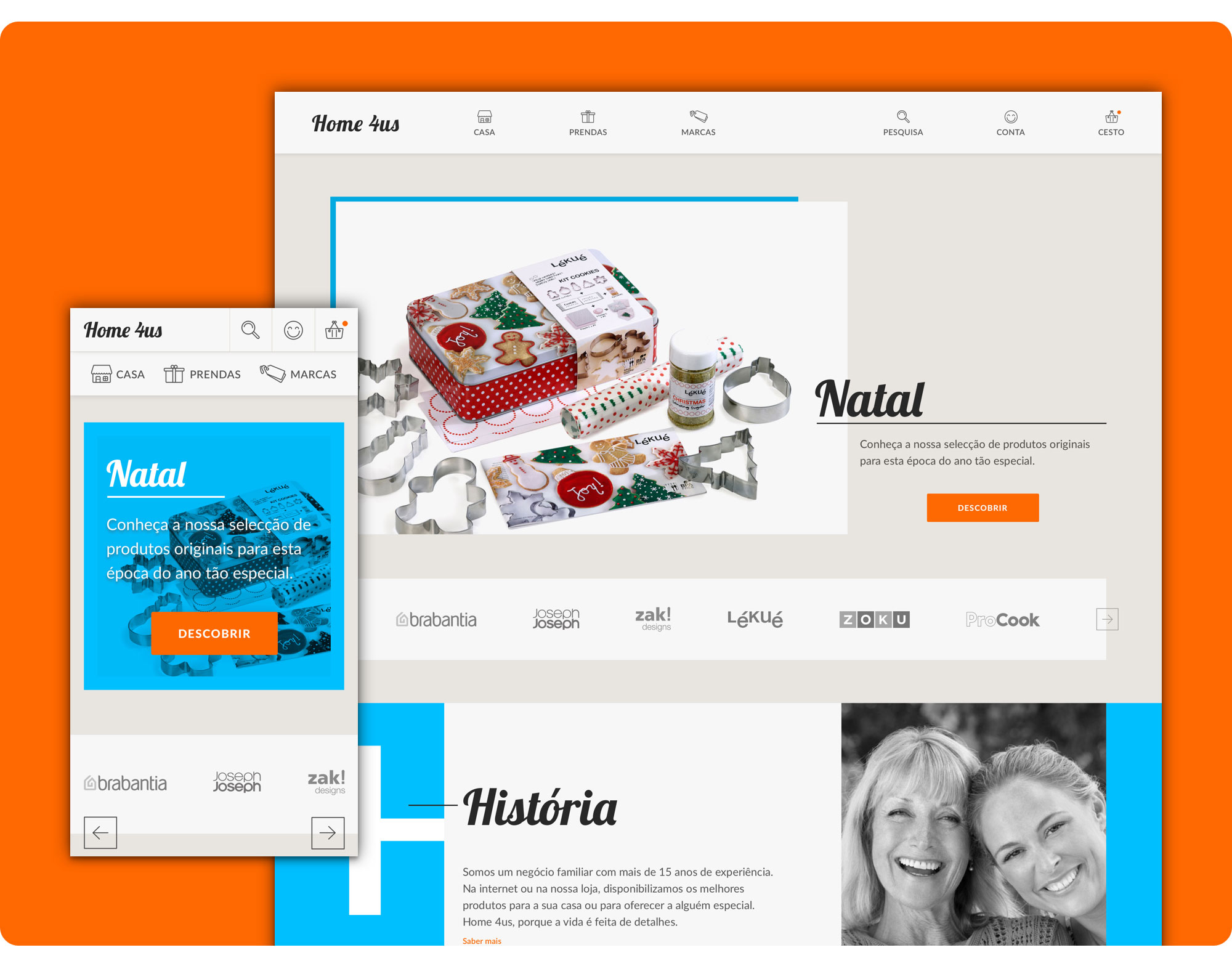
Website redesign and development (proof of concept) for Home4Us, a small Portuguese company that sells household and decoration articles with a gift shop section.
To redesign the homepage, products’ list page, product page and cart, I mapped out the following strategy:
- Client Assessment (Briefing definition, Project Scope and Objectives);
- Research (Target Users definition, Benchmarking Analysis and Proto-personas);
- Interaction Design (Documentation on the current site's Information Architecture and Content Inventory [as-is analysis], User Flows, New Information Architecture, Wireframes);
- Visual Identity;
- User Interface Design (Mockups);
- Non-functional Prototypes;
- Development.
👉 Redesigned Desktop Version https://filipago.github.io/home-4-us-desktop-site-prototype
Desktop Website Prototype Flow (InVision):
- Enter the Homepage;
- Scroll down to “Casa” section and click “Para Arrumar”;
- Go to “Caixote do Lixo New Icon” Product Page;
- Add the product to favourites;
- Add the product to the basket;
- Go to cart.
👉 Redesigned Mobile Version https://filipago.github.io/home-4-us-mobile-site-prototype/
Mobile Website Prototype Flow (InVision):
- Enter the Homepage;
- Click the menu option “Casa”;
- Select “Para Arrumar”;
- After entering the Products’ List Page, filter products by price (above €50.00);
- Go to “Caixote do Lixo New Icon” Product Page;
- Add the product to favourites;
- Add the product to the basket;
- Go to cart.
Home4Us is a multi-brand store, founded 10 years ago and a family company whose members and unique collaborators are mother and daughter.
Even though the shop is located in a local shopping centre, their business philosophy focuses on proximity trading and offering a personalized service to their customers. The company's main message is “Home 4 Us: Because Life is made of Details”.
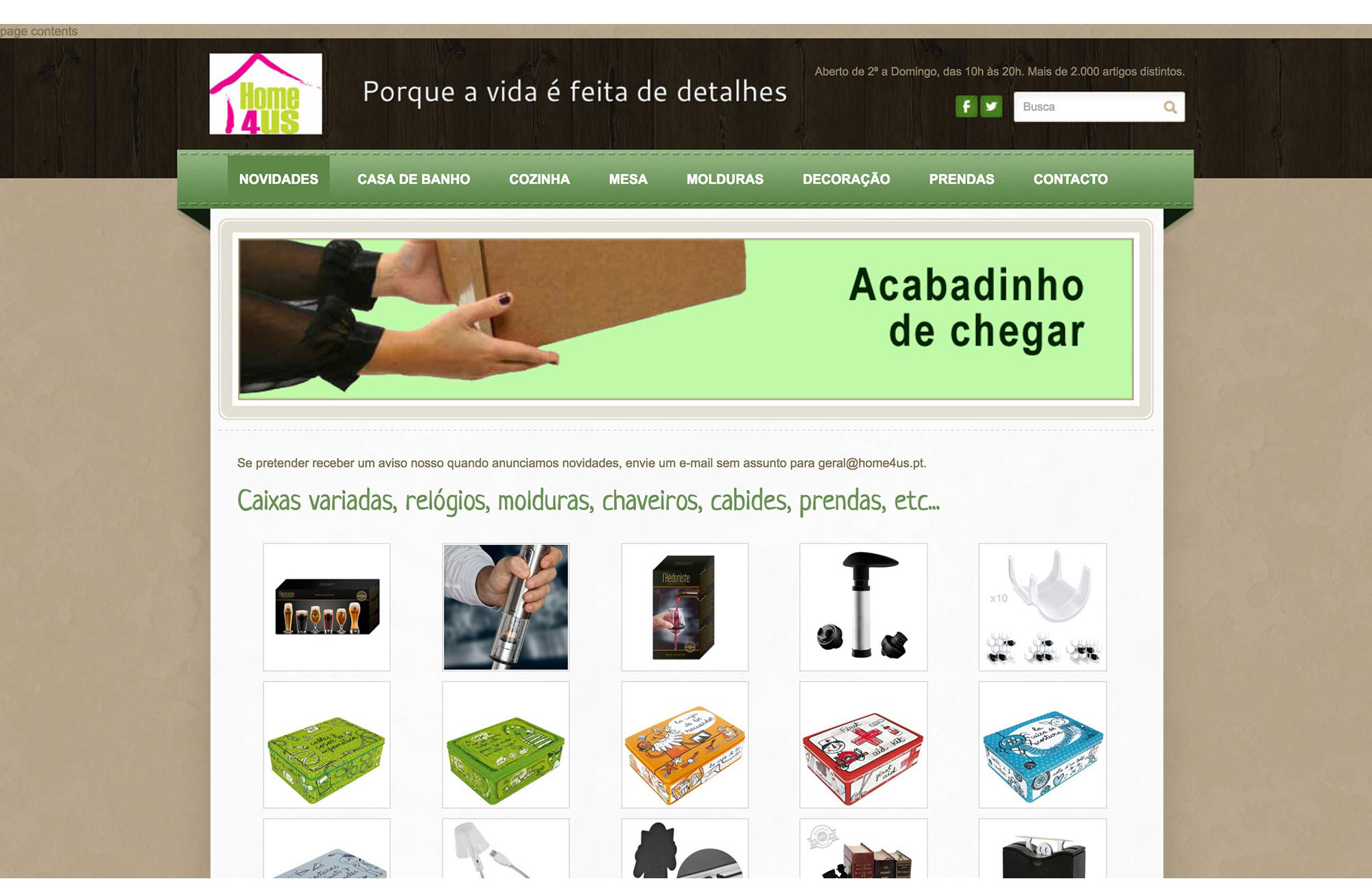
Home4Us' old and outdated Weebly website was unsuitable for the requirements of today's users. The website was not responsive and wasn't an online shop; it had a mobile version but with a lot of navigation problems and low-quality photography that didn't properly showcase the products' quality and brand values.
The website was almost a product catalogue, subdivided by categories and sub-categories, built using a standard template, that was barely configurable.
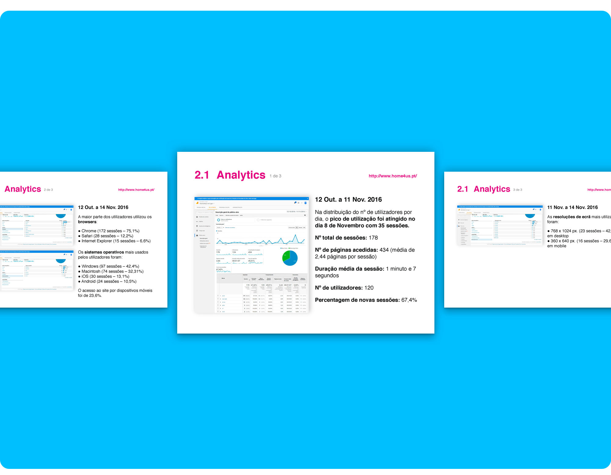 Home4Us Google Analytics Views.
Also, it had a huge bounce rate (45,51%) and wasn’t attracting many customers (about 124 users a month with an average of 1m07s per session).
The project goals included improving the website's navigation and building a responsive online shop that could help extend their customer base to other geographical areas, without investing in the rental of new spaces for physical shops, as well as improve sales, convert occasional users into registered clients, publicize promotional campaigns and new arrivals.
Above all, a design that focuses on the users, the products and reflects the brand's values:
- Modernity;
- Simplicity;
- Attention to detail.
Bring Home4us' outdated website to the 21st century with a bold and edgy redesign that conveys a friendly, neighbourly and positive vibe!
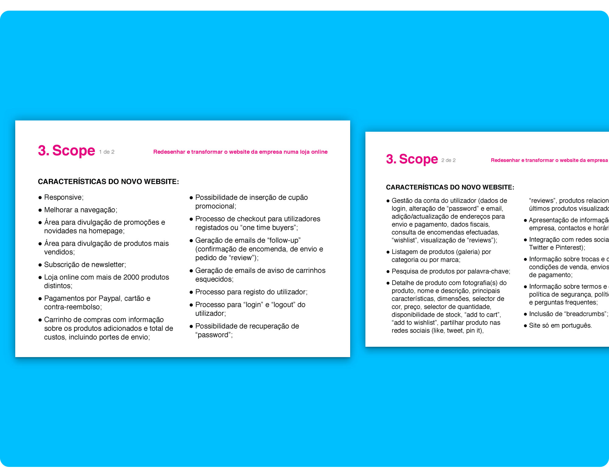 Initial scope presented to the client.
This project involved redesigning the Homepage, Products’ List Page, Product Page and Cart.
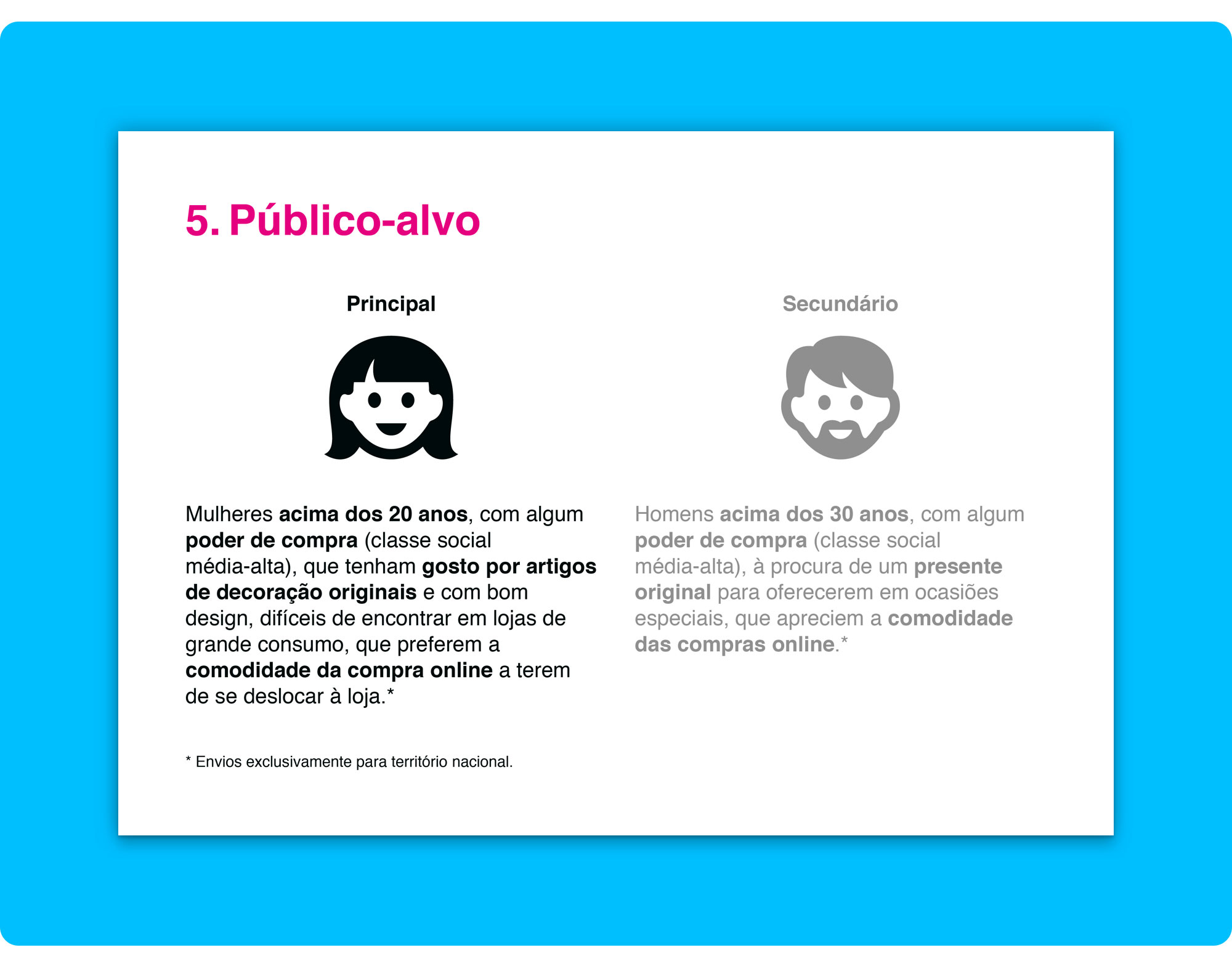
Home4Us clients are mostly young women, looking for cool objects for their first house, who enjoy buying unique good quality products.
Their main needs include checking products' prices, new arrivals and discounts as well as easiness when exchanging or returning an item. They prefer shopping online because it’s more comfortable and they use several digital payment methods.
I conducted a structural benchmarking analysis on 6 competitor websites and assessed their strengths and weaknesses in order to find common points that could help define the design strategy.
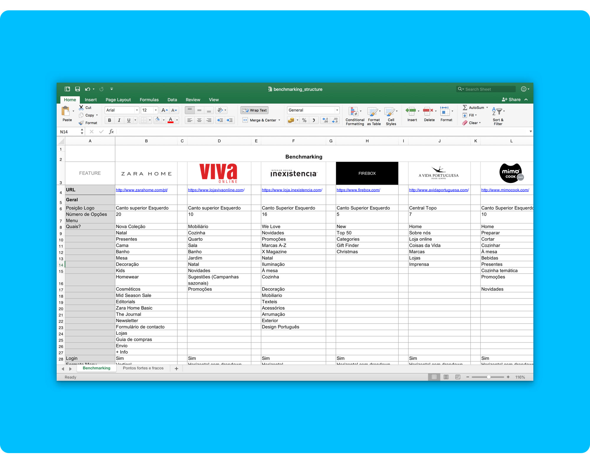 Benchmarking Analysis. You can download the complete benchmarking analysis here.
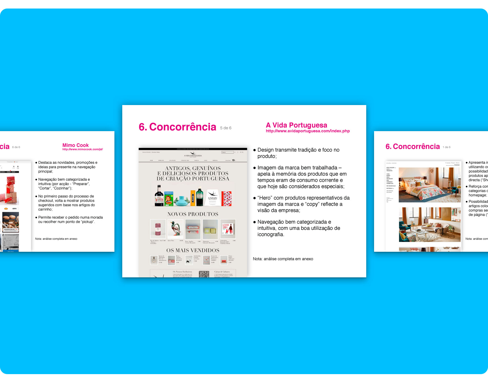 Example pages from the Benchmarking presentation to the client. You can download the complete listing here.
The Benchmarking Analysis helped define a first draft of the content strategy and the look and feel we could be going for.
Together with the client, I outlined the following initial guidelines:
- Simple, clean, contemporary look;
- Design should focus on presenting and highlighting the quality of the products;
- Come across as friendly, positive;
- Make the clients feel welcomed;
- Bold colours;
- Good quality photos (from brands’ catalogues);
- Ambient photography, clients using the products… 😱… great idea… not feasible at this time 💸;
I showed the client a couple of e-commerce websites that I thought conveyed, more or less, the criteria described above so that I could help them have a clearer idea of what they liked and disliked.
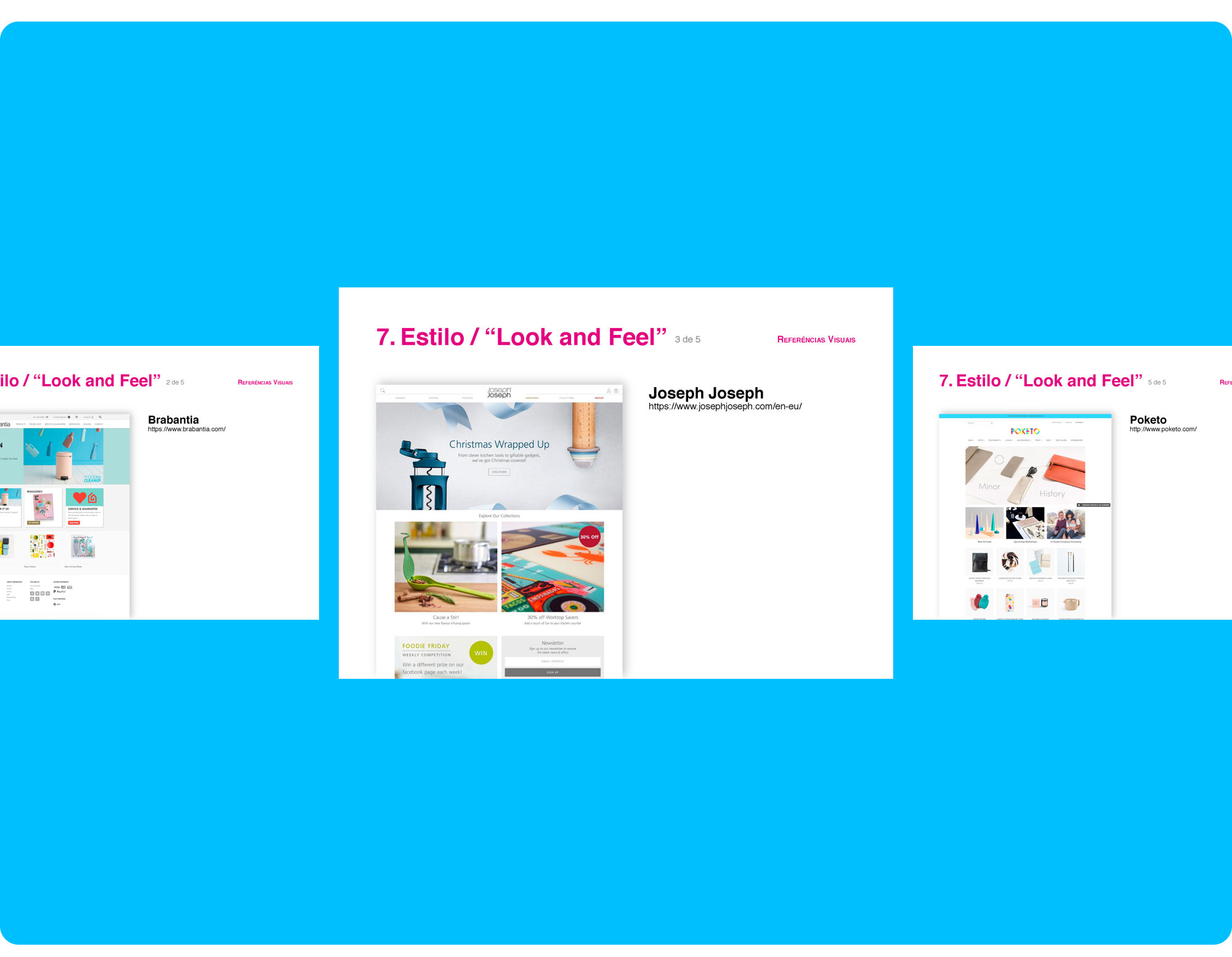 Some reference websites presented to the client.
The following “meetings” outlined other relevant information that helped refine the project scope (not so important for the redesign, though):
- The client already has a domain name;
- Needs some help with copywriting;
- Wants a robust storage and hosting solution at a fair price;
- Needs to manage the Inventory;
- Content management (CMS) that allows the client to create new product pages without asking for a development team;
- Automatically generated breadcrumbs (for example, when the client creates a new product page);
- Add/change images’ alt text;
- Add/update internal and external links;
- SSL Certificate;
- CMS training;
- Optimized SEO:
- Each page should have its own editable metadata – title, keywords, description;
- The page’s URLs should be structured according to the navigation – no crazy web addresses;
- Submit sitemap XML to Google Webmaster Tools;
- Install Google Analytics with conversion rate measurement (completed purchases);
I went on with documenting the current website’s information architecture and content-inventory.
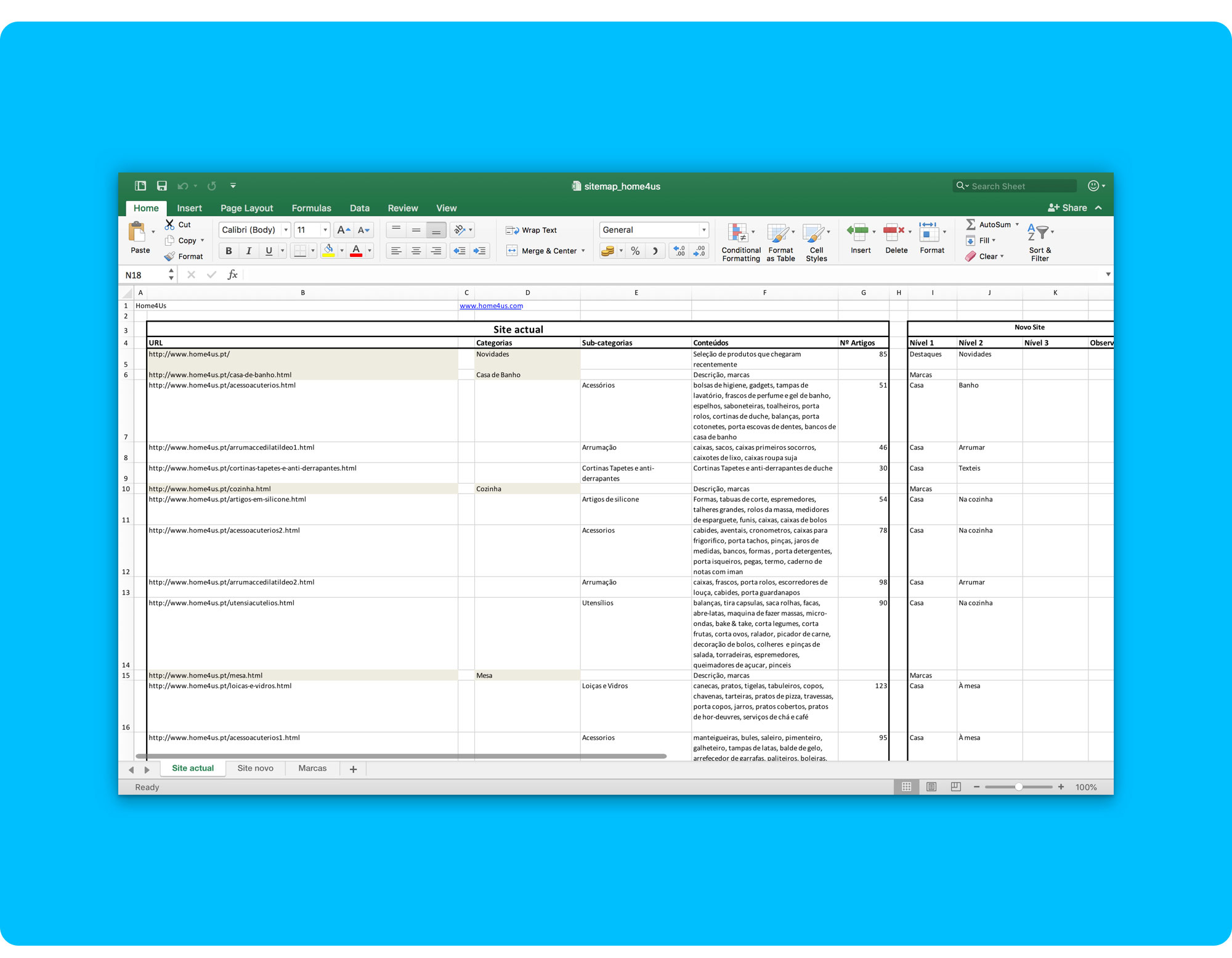 Original Information Architecture.
The original information architecture was quite messy and had too many categories and sub-categories for such a small shop.
I managed to rearrange things, reducing the main navigation and reorganizing the contents on the pages.
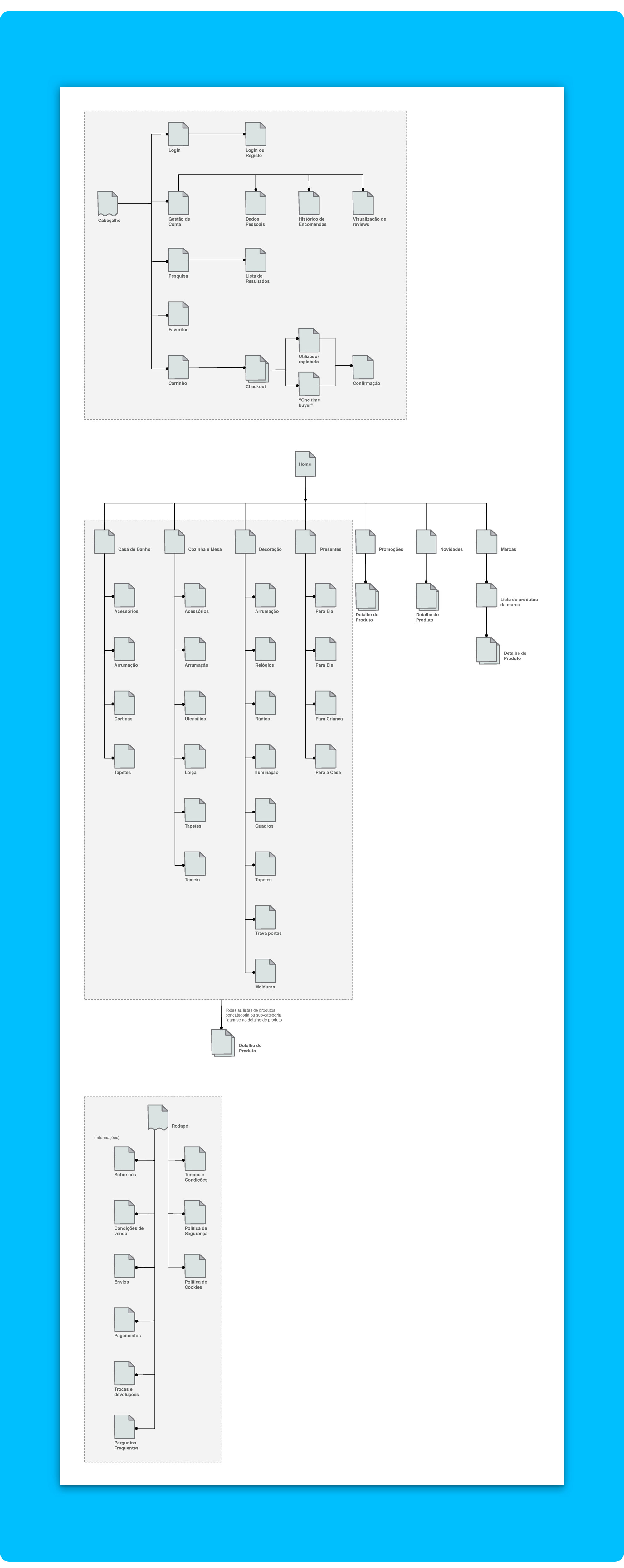 This was the first take on the new Information Architecture. It wasn’t good enough…
I left out the information architecture for a bit and started working on some templates to prioritize information and define content blocks.
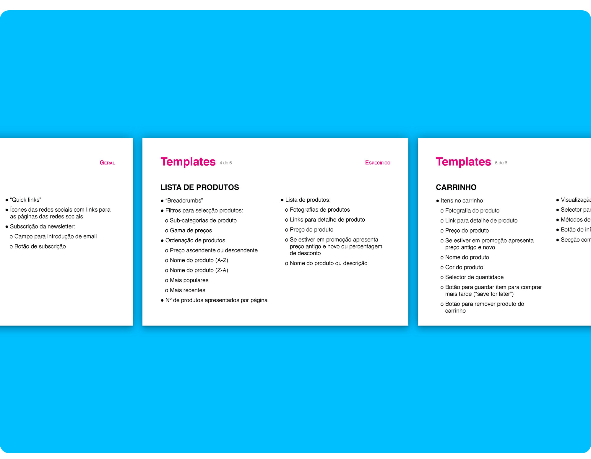 Some initial page templates presented to the client… my priority guides in a list format.
I was having trouble letting go of the regular structure used on most e-commerce websites that sell household items. Most websites match the top level navigation categories to the spaces where the items are used. People are familiar with this and it usually works, but in this case, it wasn’t going to. As I said, the shop is too small, it doesn’t have that many items.
After many iterations I finally came up with a solution I was happier with and that I thought would work, dropping down the main navigation to the top 3 categories that best describe Home4Us: “Casa” (Home), “Prendas” (Gifts), “Marcas” (Brands).
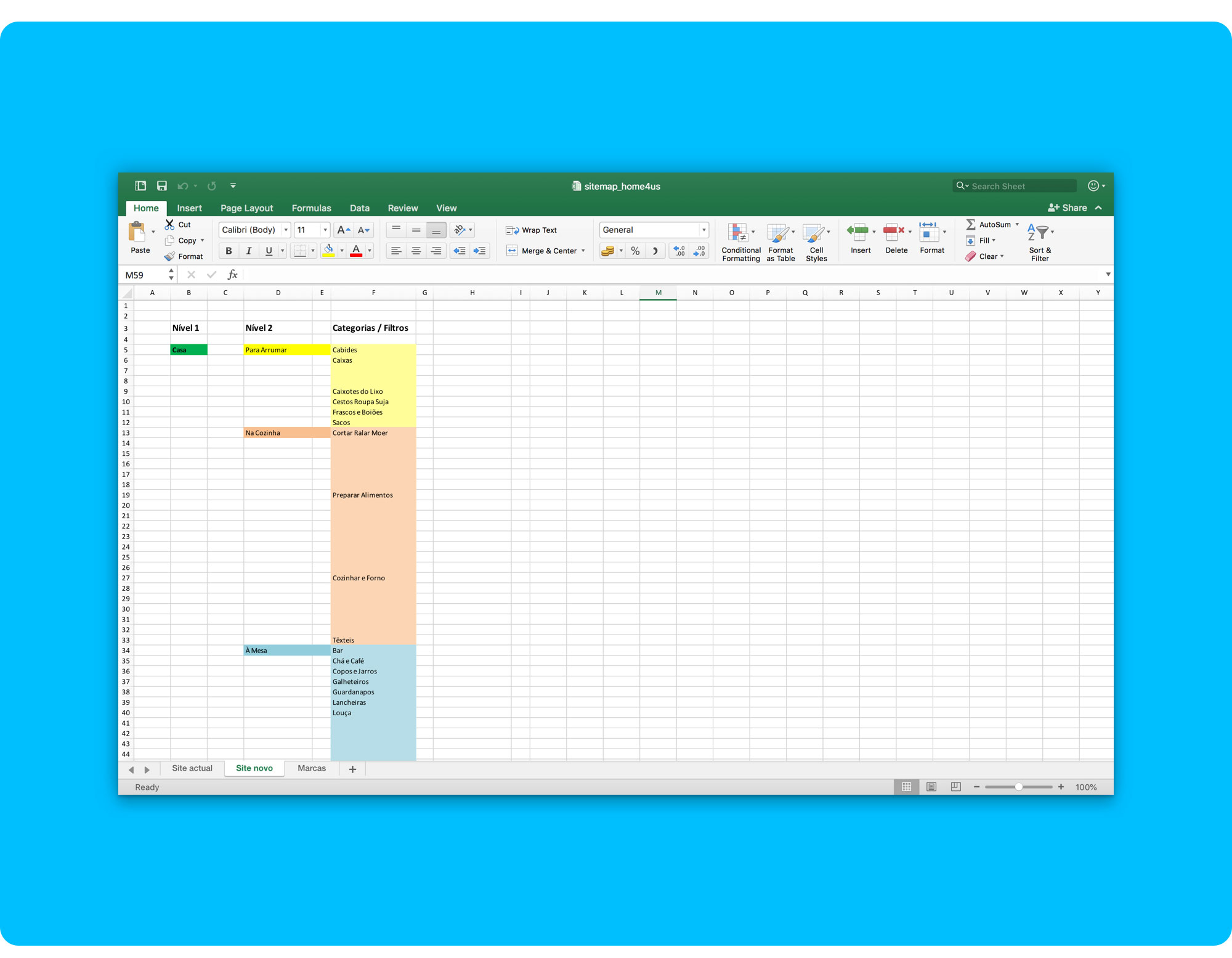 Home4Us new Information Architecture… 5th iteration. You can download the document here if you want to check it out.
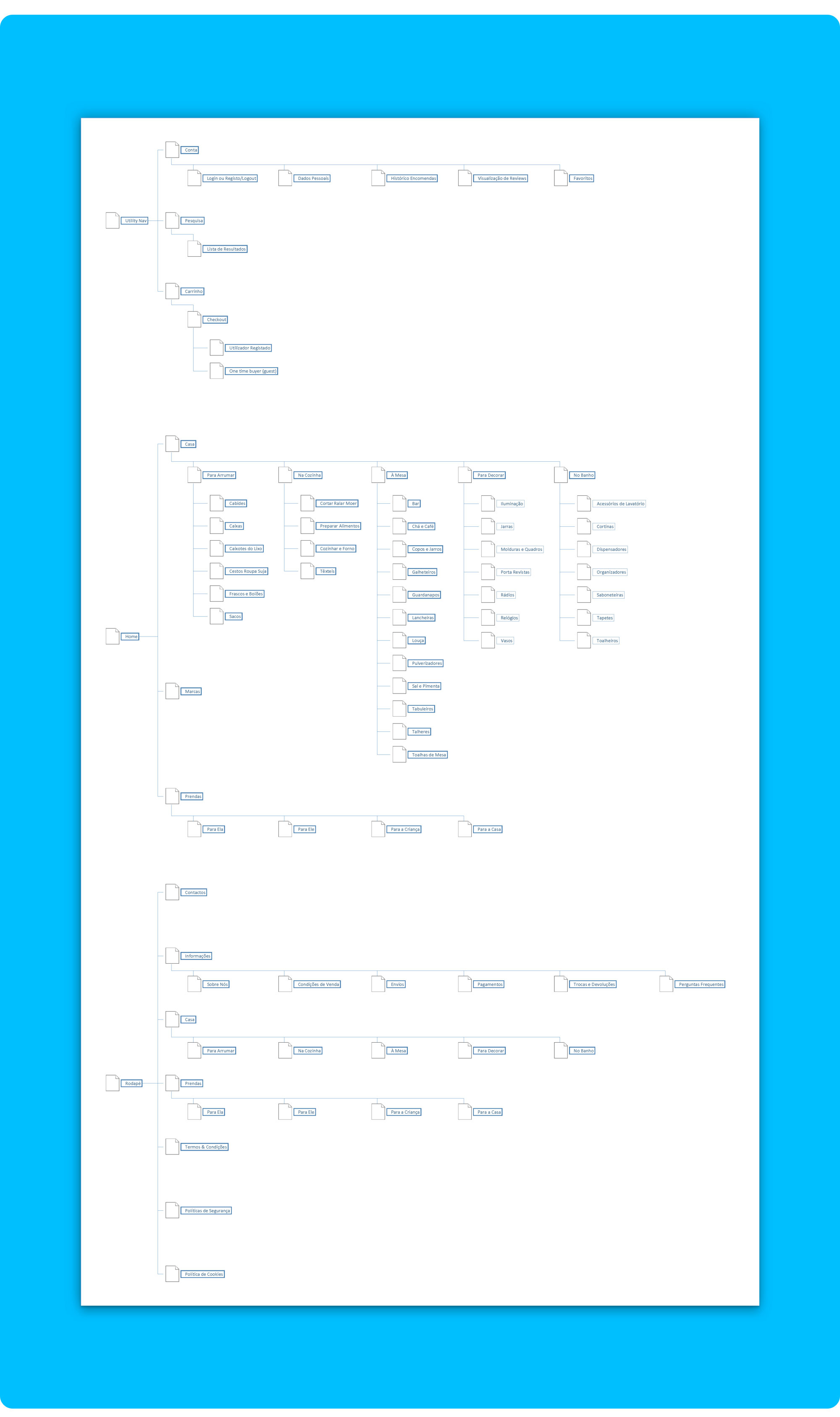 New Sitemap 🏆… Cleaner and a lot more functional. You can download the new sitemap here.
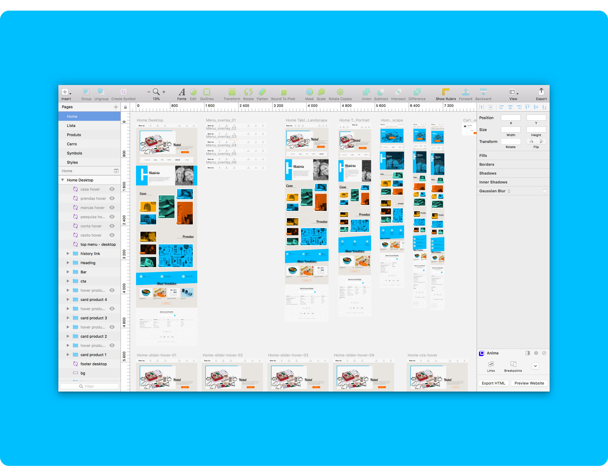
I went on designing the wireframes for the 4 pages I was responsible for, taking close attention to the previously planned templates.
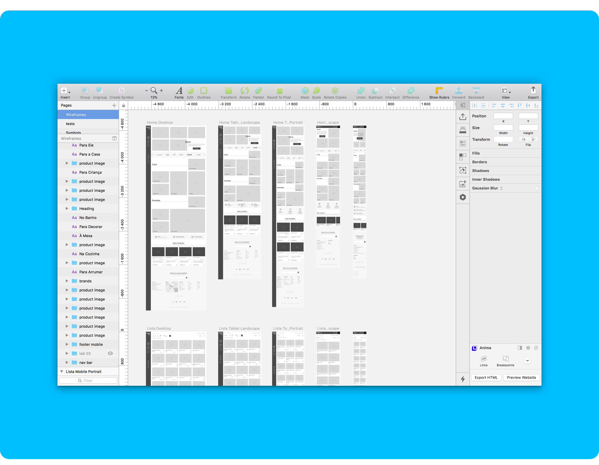 Some early stage wireframes. Always with real content!
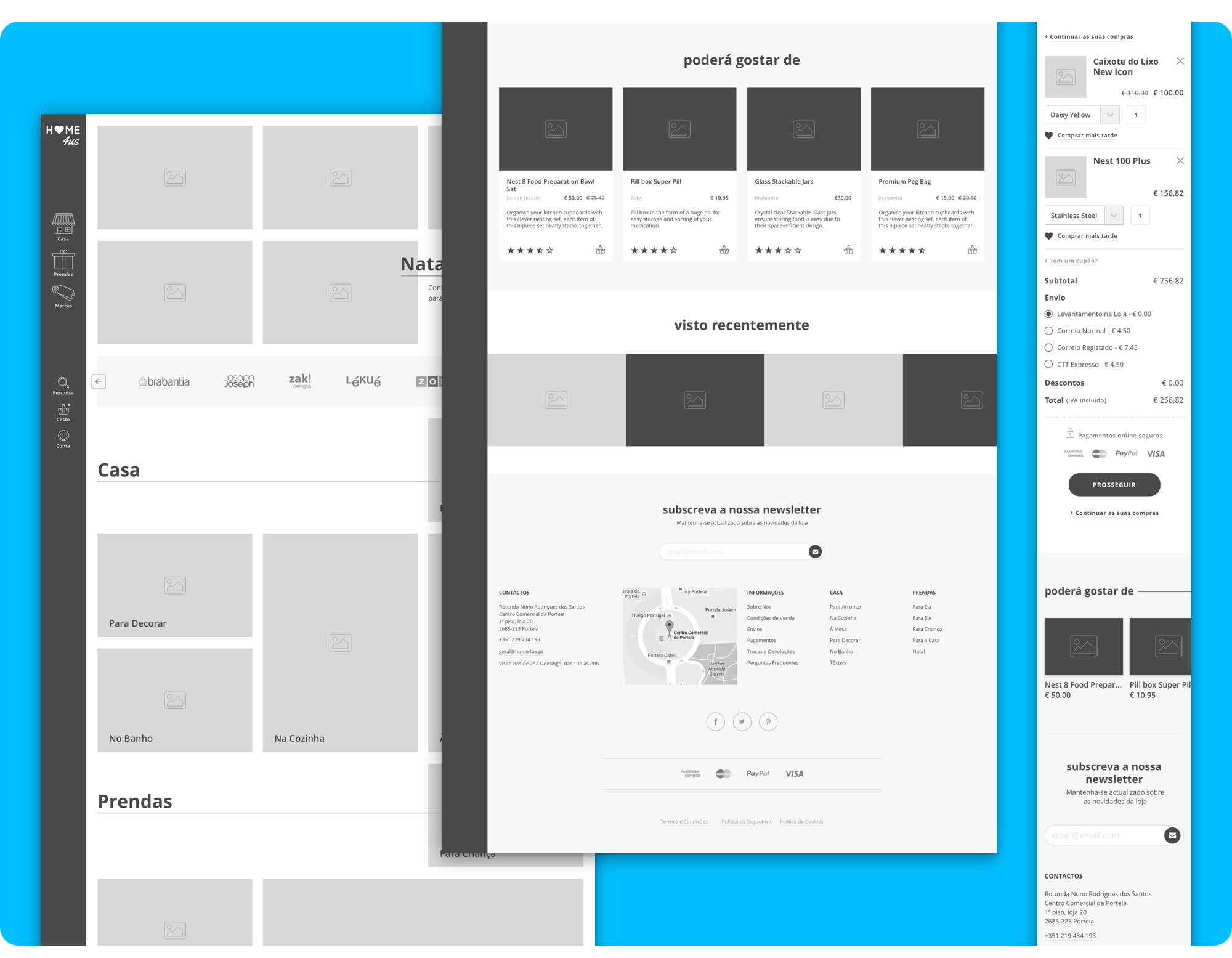 Some wireframes for the Homepage, Product Page and Cart. You can check out all the wireframes here.
When the time came to choose fonts and colours, I went for a hand-drawn font for the headings to add a little charm and personal touch, and a more subtle font for the body text. Bold and vibrant colours were a risky choice that paid off.
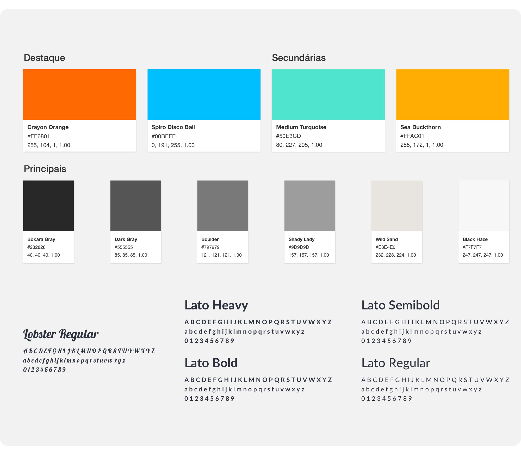 Home4Us new colour palette and fonts.
[Lato is] A typeface that would seem quite transparent when used in body text but would display some original traits when used in larger sizes. (...) He used classical proportions (particularly visible in the uppercase) to give the letterforms familiar harmony and elegance. (...) The semi-rounded details of the letters give Lato a feeling of warmth, while the strong structure provides stability and seriousness. Male and female, serious but friendly.
When designing the Mockups I made a few adjustments to the Homepage structure, as I thought it was still too straightlaced.
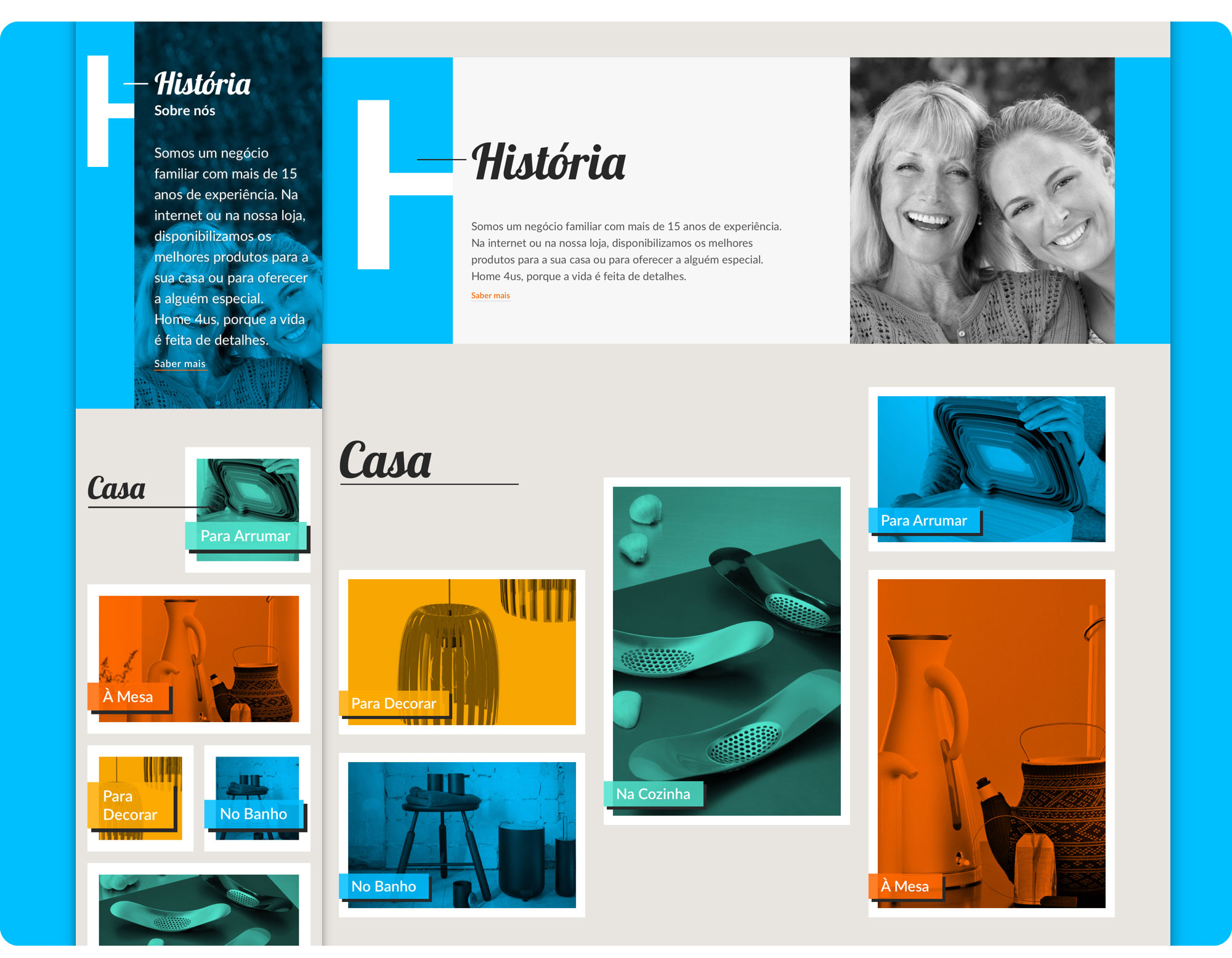
I played a bit more with the image grids that highlight the second level navigation on the page body, making them more dynamic and appealing.
I also realized I had left out an important detail, my client’s story… so right below the hero, I designed a very graphic section that tells a little bit about them and links directly to the About page (which can also be accessed through the footer), where clients can learn more about the history behind the shop.
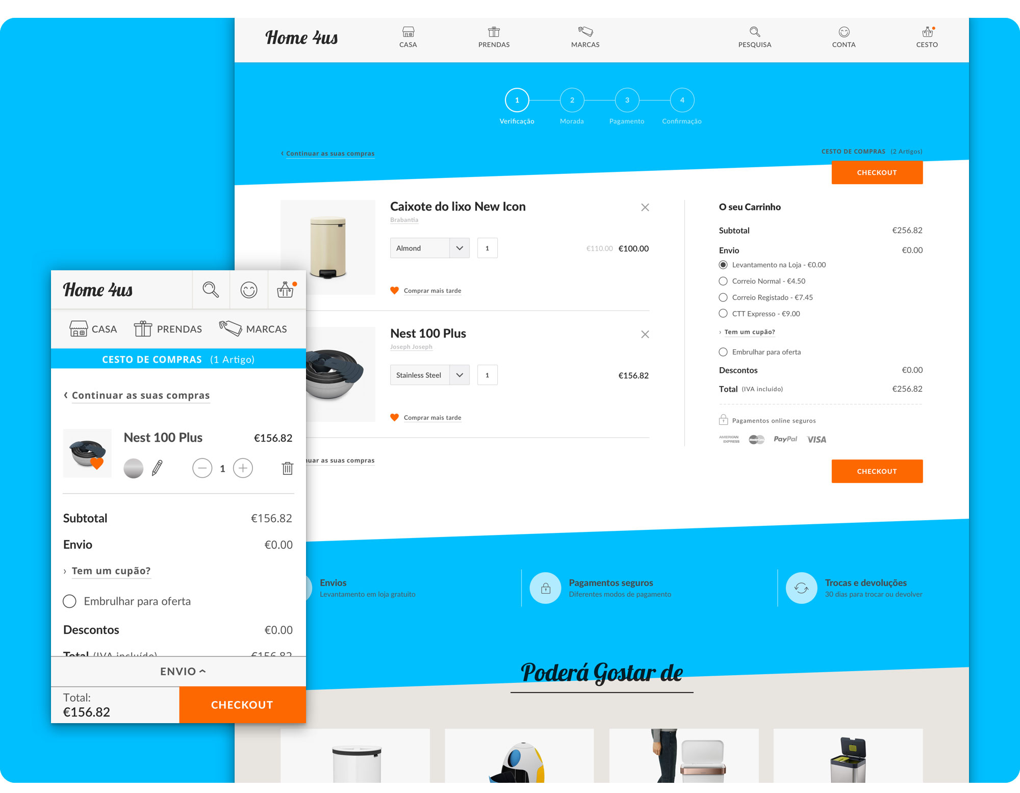
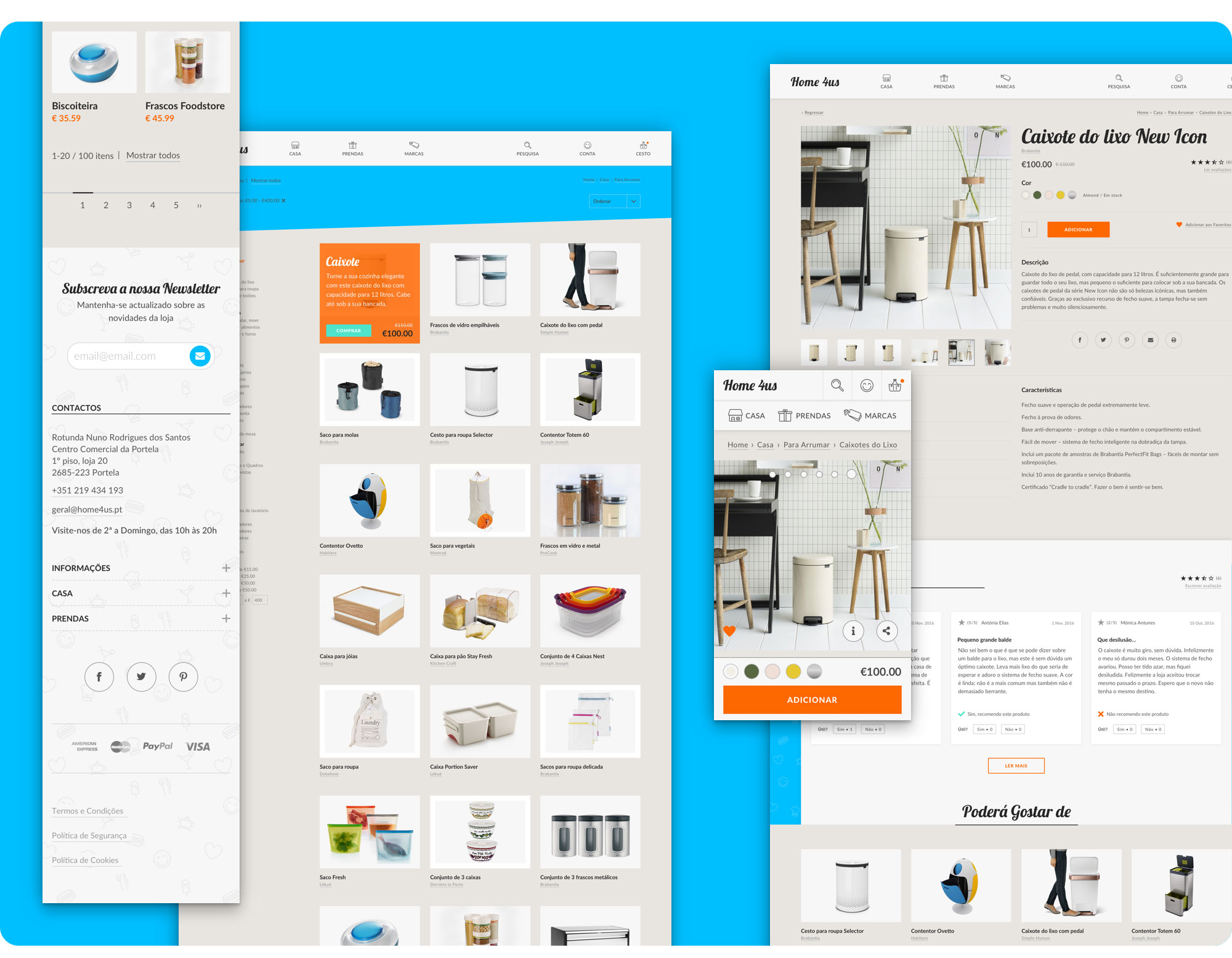 Home4Us Mockups. From left to right, List Page and Product Page.
On mobile, both the Product Page and the Cart Page have fixed sections to the bottom of the screen that facilitate adding products to the cart and proceeding with checkout without making the user scroll too much.
The first step in the checkout process already delivers a complete summary of everything that may influence the final price, avoiding late surprises regarding total cost and thus reducing friction.
Thank you for reading my case study 🙂
If you didn’t check the project prototypes, here they are:
👉 Redesigned Desktop Version https://filipago.github.io/home-4-us-desktop-site-prototype
Desktop Website Prototype Flow (InVision):
- Enter the Homepage;
- Scroll down to “Casa” section and click “Para Arrumar”;
- Go to “Caixote do Lixo New Icon” Product Page;
- Add the product to favourites;
- Add the product to the basket;
- Go to cart.
👉 Redesigned Mobile Version https://filipago.github.io/home-4-us-mobile-site-prototype/
Mobile Website Prototype Flow (InVision):
- Enter the Homepage;
- Click the menu option “Casa”;
- Select “Para Arrumar”;
- After entering the Products’ List Page, filter products by price (above €50.00);
- Go to “Caixote do Lixo New Icon” Product Page;
- Add the product to favourites;
- Add the product to the basket;
- Go to cart.
I coded part of this project for a class taken during a Digital Experience Design Post-Graduation.
The main requirements were:
- Write semantic HTML, keeping in mind the wide compatibility of user agents (browsers);
- Write SCSS and CSS following good practices;
- Concern with accessibility and application of concepts of Progressive Enhancement and Graceful Degradation;
- Good adaptability to different types of devices (screen size, multi-touch, etc.);
- Compatibility with high-density displays;
- Cross-browser compatibility (last version of most popular browsers).
homepage // product page // contact form
I gave a presentation on this project explaining how I structured its development. You can download it here.
