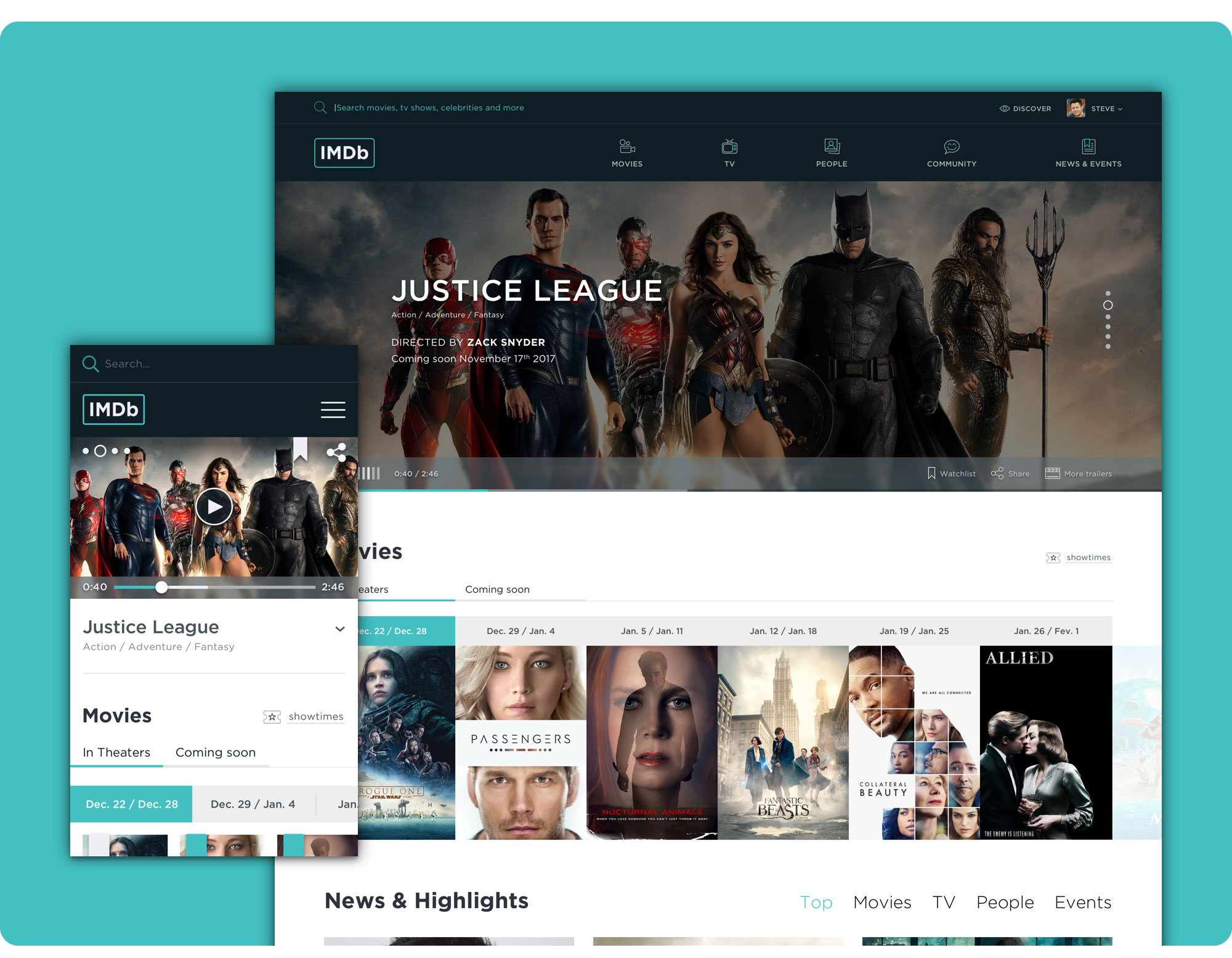
 Homepage Redesign (mobile and desktop).
📖 Estimated reading time: 14 minutes (2718 words)
Table of Contents
A Project developed under the Postgraduate Diploma in Digital Experience Design which consisted in redesigning IMDb’s website, for desktop and mobile, in order to enhance the website's usability and navigation capabilities, reinvent the Company’s brand and increase the number of registered users and active participants.
To redesign the navigation, search, homepage, movie page and celebrity page, I mapped out the following strategy:
- Research (Benchmarking Analysis, SWOT Analysis, Proto-personas);
- Interaction Design (Content Inventory and Documenting the current website’s Information Architecture [as-is analysis], User Flows, new Information Architecture, Wireframes);
- Rebranding;
- User Interface Design (Mockups Design and non-functional Prototype).
👉 Redesigned Desktop Version https://filipago.github.io/imdb-redesign-desktop-site-prototype/
Desktop Website Prototype Flow (InVision):
- Login;
- After entering the Homepage as a registered user, scroll down to “Popular this Week” section and click to see the “Tetro” movie page;
- After entering the movie page, click on the tab “Cast & Crew” and select “Alden Ehrenreich” to check out the celebrity page.
👉 Redesigned Mobile Version https://filipago.github.io/imdb-redesign-mobile-site-prototype/
Mobile Website Prototype Flow (InVision):
- Enter the Homepage;
- Scroll down to “Popular this Week” section and click to jump to the “Tetro” movie page;
- After entering the movie page, click on the tab “Cast & Crew” and select “Alden Ehrenreich” to check out the celebrity page.
IMDb was first built in 1990, as a hobby, by a group of international TV and movies aficionados. Currently, it is the world's most popular and comprehensive internet source for finding information on movies, TV shows and celebrity-related content.
According to Alexa, in October 2016, IMDb was the 57th most visited website in the world and number 1 movie website, with a combined web and mobile audience of more than 240 million unique monthly visitors.
With a searchable database of more than 250 million items including about 4 million movies, TV and entertainment programs, 7.5 million cast and crew members and almost 67 million registered users, consumers rely on the information IMDb provides to check local movie showtimes, trailers, reviews by both critics and other users, personalized recommendations, photo galleries, news and so much more, using it to decide what to watch and where to watch it.
IMDb is the largest movie and TV fan community where registered users can submit new website content, ask for existing content revisions, rate movies, TV series and episodes, post reviews, gather in topic related discussion forums and create and manage personal lists.
IMDb’s website design hasn’t changed much over the years, which is noticeable not only visually but also interaction wise. Surprisingly, to this day, the website still isn’t responsive, even though it has a mobile version and a mobile app, both for smartphone and tablet.
 Left to right: IMDb's Website in the early 90's, in 2002 and 2016.
Beyond the website, it’s identity is dated and suggests some stagnation and lack of dynamics, despite the website's very active community.
With a new identity and Website, IMDb can reaffirm itself as a credible and comprehensive online source, but also as a reliable and competent repository, capable of helping it’s users search for information on movies, TV shows and people (celebrities), and suggesting them relevant content.
Main Goals:
- Enhance the website's usability and navigation capabilities;
- Reaffirm the website as a permanently updated reference for movies;
- Reinvent the Company’s brand, making it more dynamic and current;
- Increase the number of registered users and active participants.
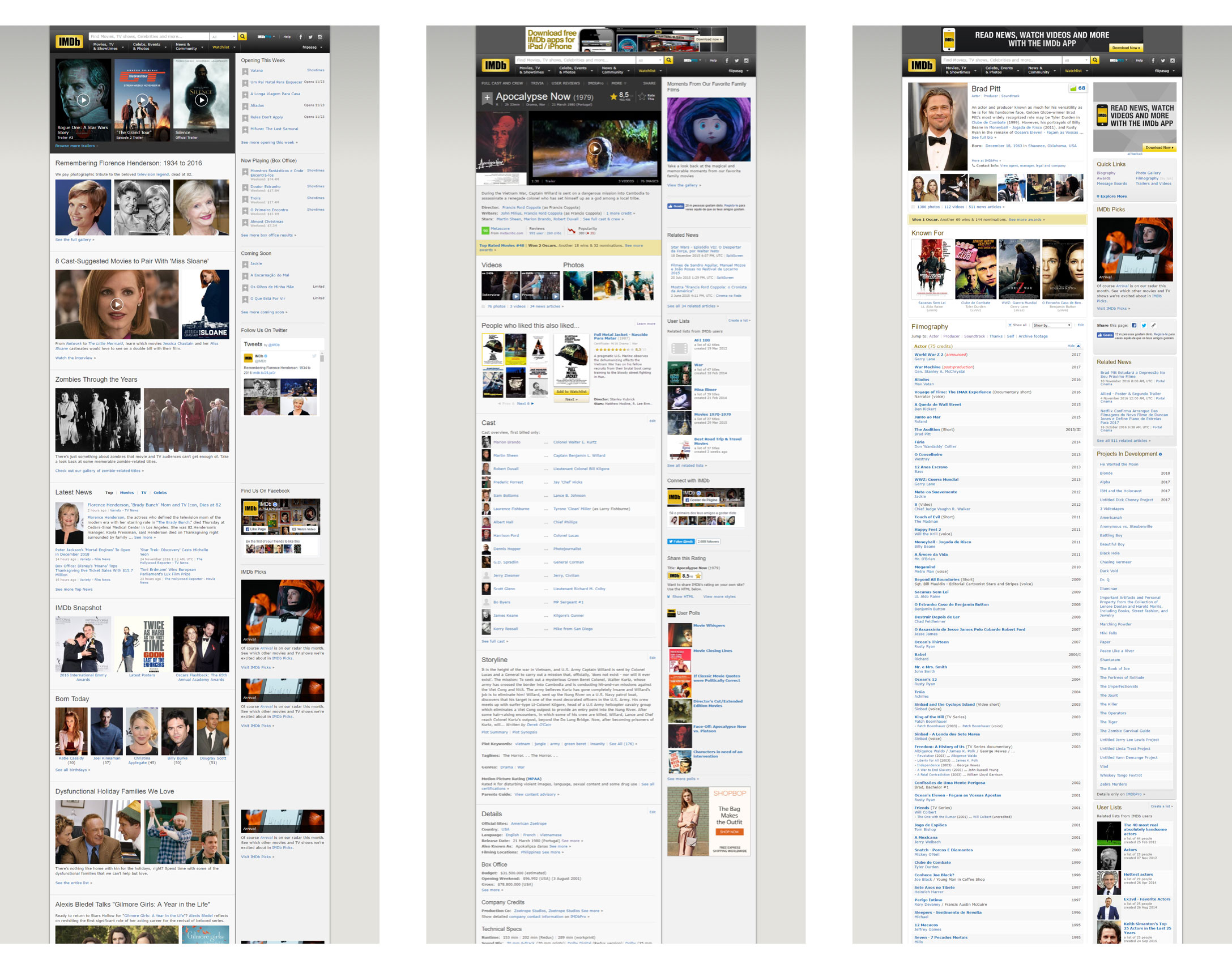 IMDb's original Website in late 2016. Left to right: Homepage, Movie Page and Celebrity Page.
Due to the extension of the website, only a few page typologies were redesigned. New designs were developed for the homepage, search, movie page and celebrity page, with two variations: Desktop and Mobile
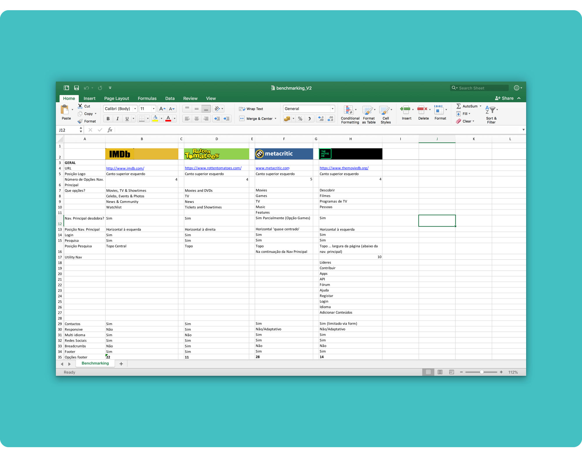
I kicked off this project by conducting a benchmarking analysis on 3 competitors’ websites:
- Rotten Tomatoes
- Metacritic
- The Movie DB
Looking at the competition, it was clear that even though IMDb was by far the most comprehensive movie database, it had to step up its game in terms of clearness, usability and polish.
All three competitor websites were easier to navigate, more organized and cleaner, specially The Movie DB, which is a great example of a website that has a lot of content, but doesn’t really distract the user from its goal, as the main navigation is quite simple and the content related to what the user is seeing can be accessed through body links that appear contextually. Not only does this enable a more fluid and effective navigation but it also increases the number of page views per user, which ultimately benefits the website’s owners.
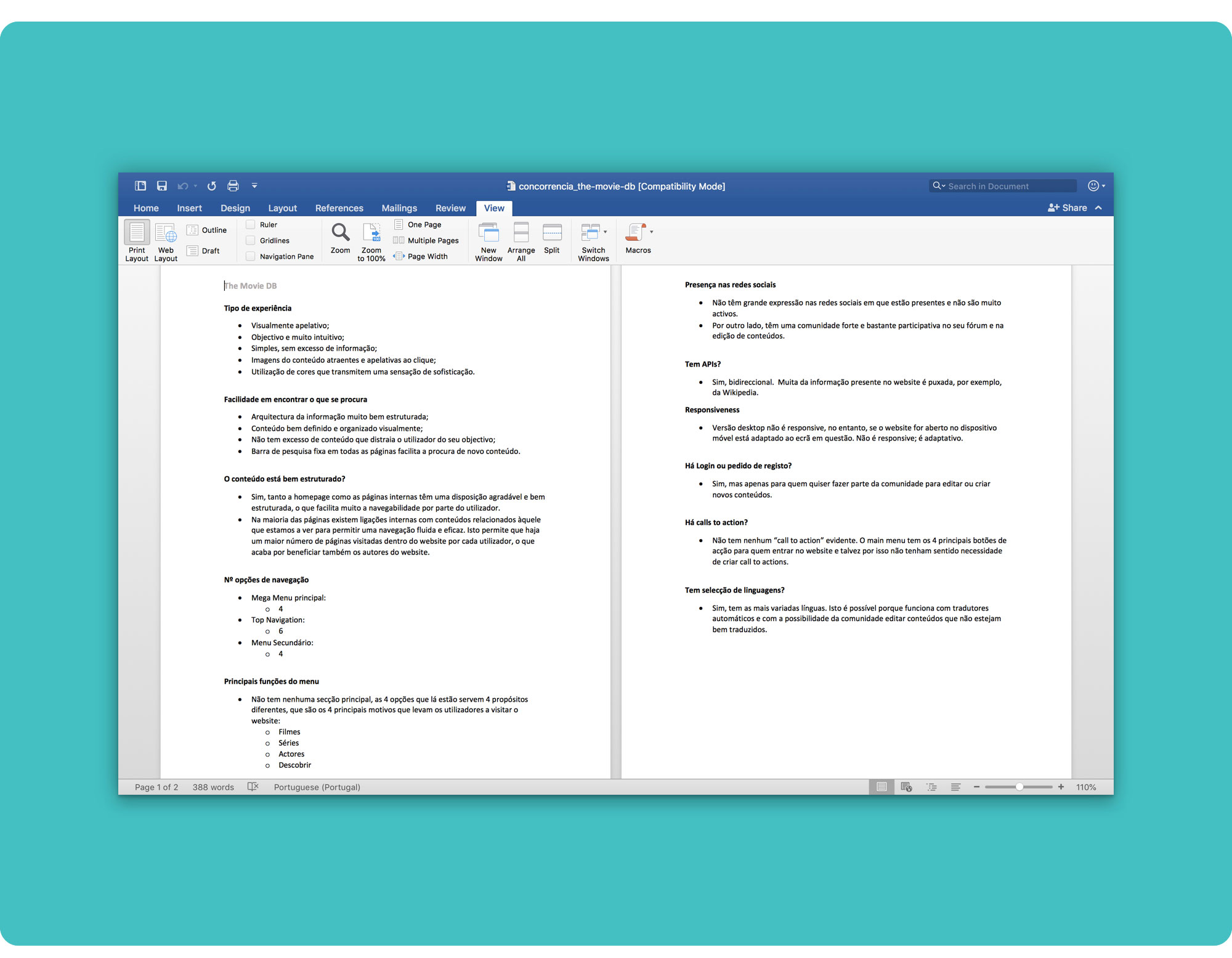 The Movie DB Benchmarking Detail.
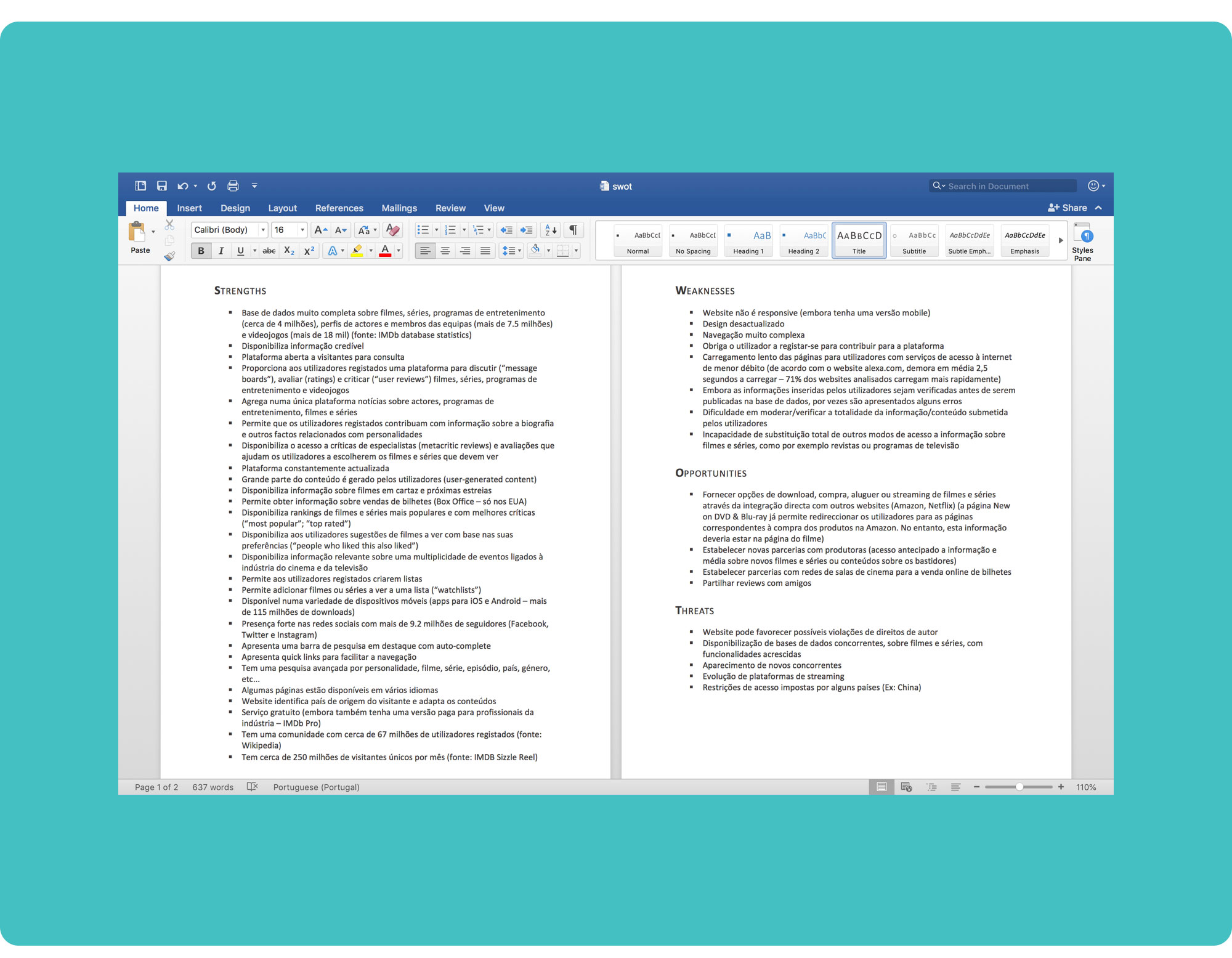
I carried on with a SWOT Analysis on IMDB’s website and came to the conclusion that its major strength is the richness and diversity of the information it provides, the most notable weakness is the complexity of the site’s navigation, the best opportunity is offering worldwide access to shopping movies and TV series through Amazon’s website directly from IMDb (IMDb was acquired as an Amazon subsidiary private company in 1998), and its biggest threat is the emergence of competing databases with increased functionality and more easily accessible via mobile devices.
IMDb’s users can be quite diverse. With over 240 million unique monthly visitors, IMDb serves both movie buffs and casual users, who drop by intentionally (direct URL, social media…) or through a Google search, while looking for information on a movie/TV related topic.
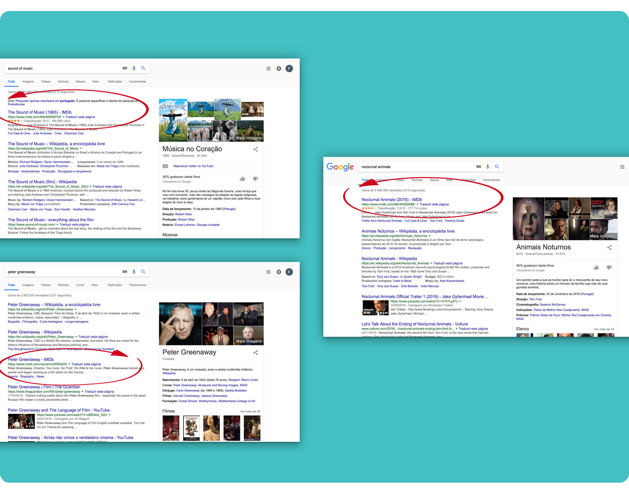
In fact, if you run a Google search on a movie, TV show, actor, director or anything movie/TV related, chances are you will see IMDb consistently popping in the top 3 search results.
So… who are these people? 🤔
Due to time constraints, my user research was mostly done online and talking with some friends.
The 3 proto-personas that seemed to fit my research, helped me develop a sense of empathy for the users and allowed me to think about which actions people might want to take most urgently so I could later provide them with the most relevant content first.
 Proto-personas. Larger images can be found here.
Through this process, I was able to identify IMDb’s main target-audience: individuals who love the movies, enjoy watching trailers and keeping up with the latest premieres and news.
Following the research phase, I did an overall Content Inventory using IMDb’s Site Index, that could later help me redesign the whole site’s Information Architecture and main navigation, as well as prioritize content.
Documenting every little content detail on the Homepage, Movie Page and Celebrity Page was a heavy task!
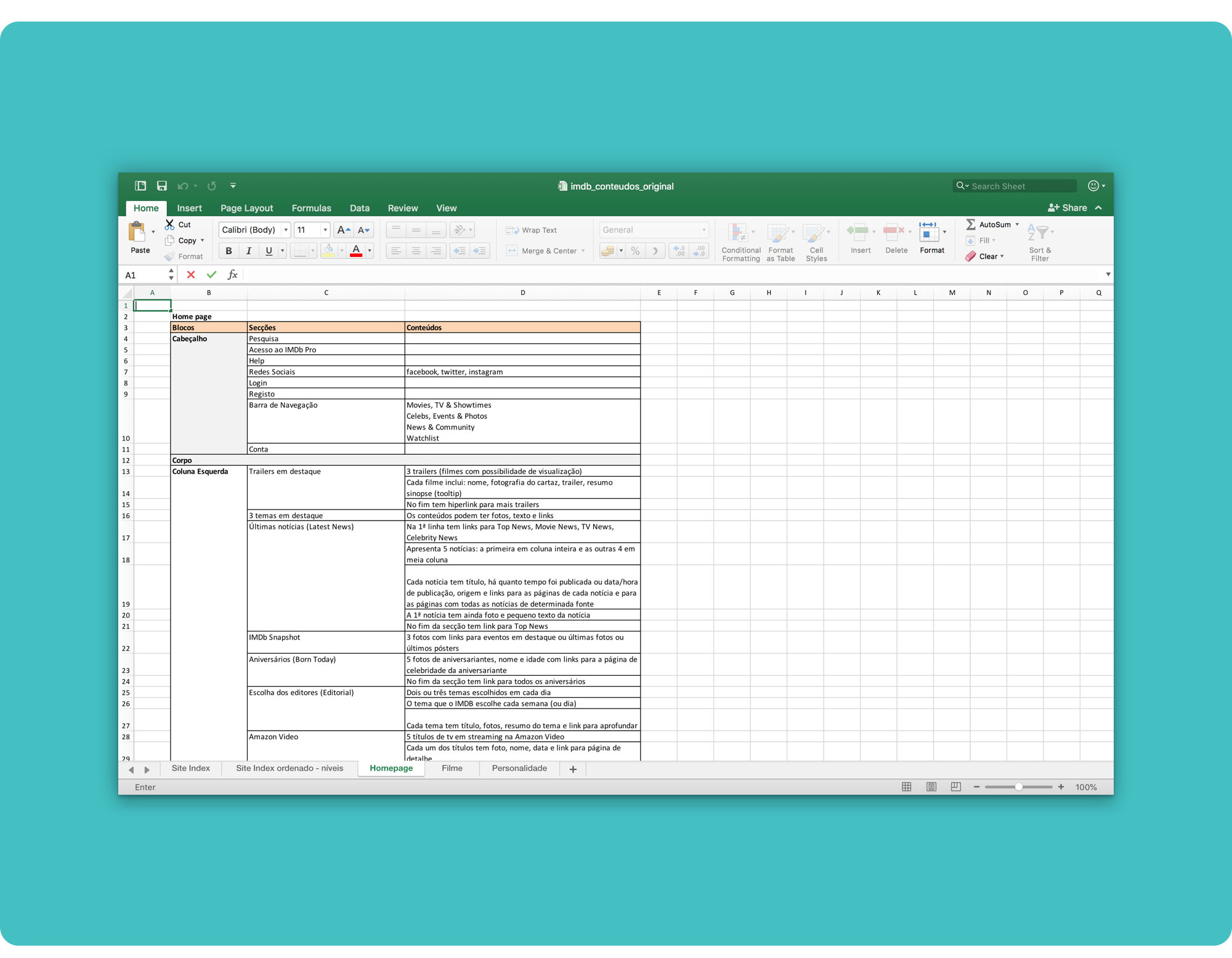 IMDb's Content Inventory 😅. If you want to check the details, download the file here.
Documenting the current website’s information architecture confirmed that the way the main navigation was organized didn’t seem adequate, as it combined options on the top level menu that didn’t relate very well.
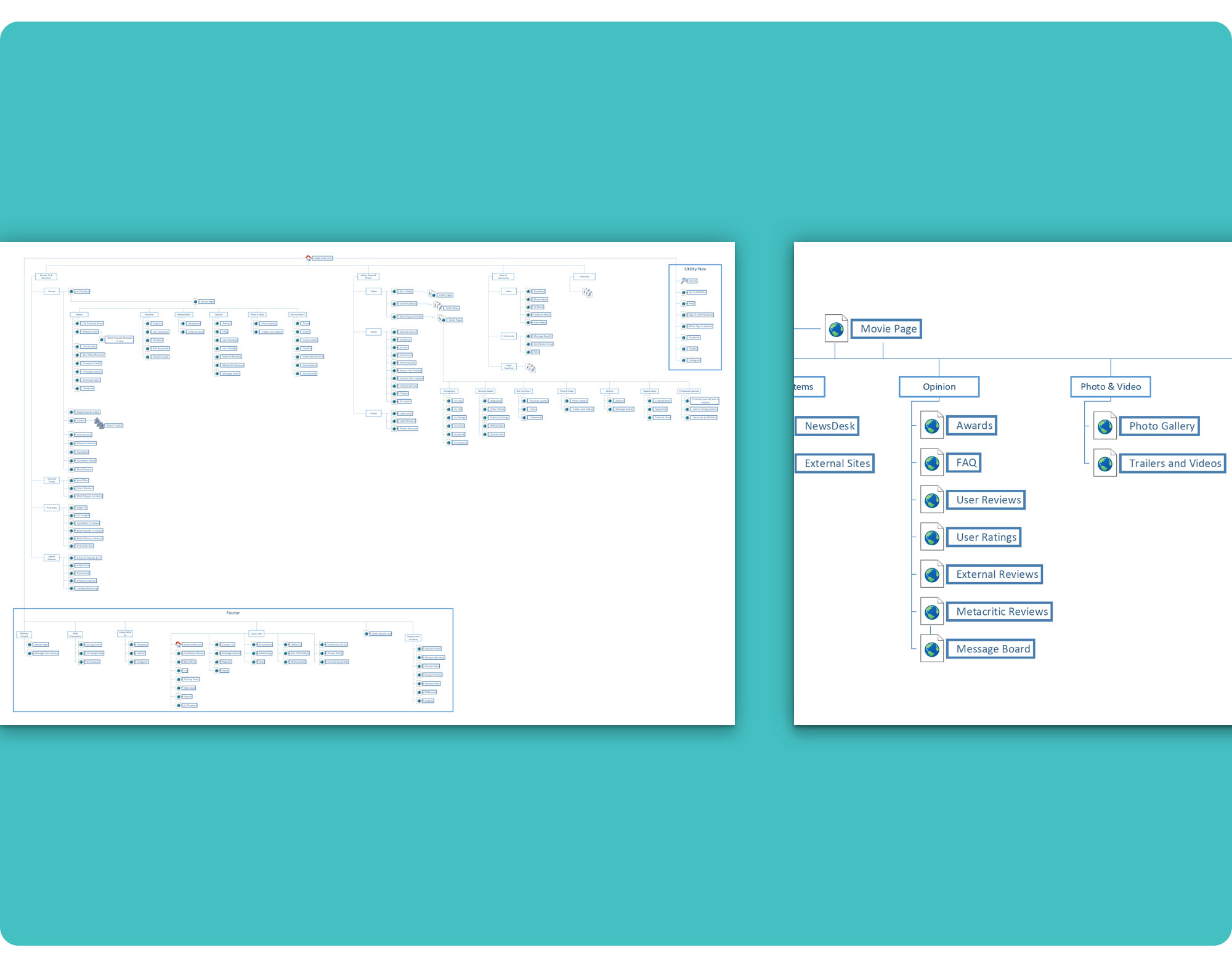 IMDb's original Information Architecture. To check the whole document, download the pdf file here.
I refined the demographic and behavioural proto-personas’ characters and went on creating user flows.
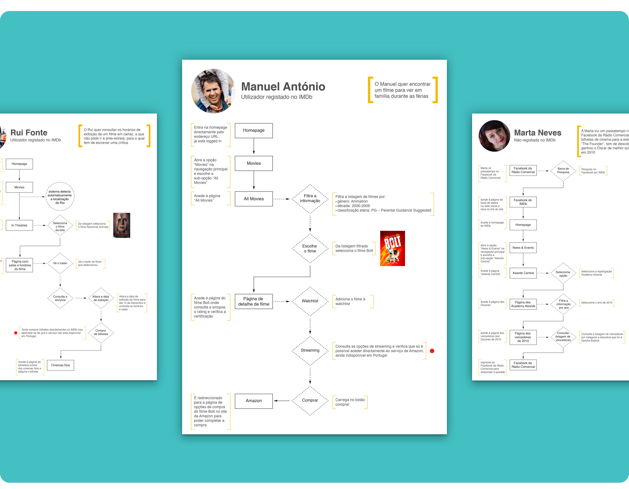 User Flows. Larger images can be found here.
Looking at the original Information Architecture I noticed that grouping together very large subjects into a single menu option raised the number of second-level options, increasing the navigation’s complexity.
To solve this issue, the new information architecture separates “movies” from “TV shows” and “community” from “news”, as these are very different subjects. I also created a top-level menu option just for “celebrities”.
I chose to name the “news” menu entry “news and events”, placing the “events” that were grouped with “celebrities” together with the “news”. It just seemed more structured as contents published under “events” are usually news about awards’ ceremonies and film festivals.
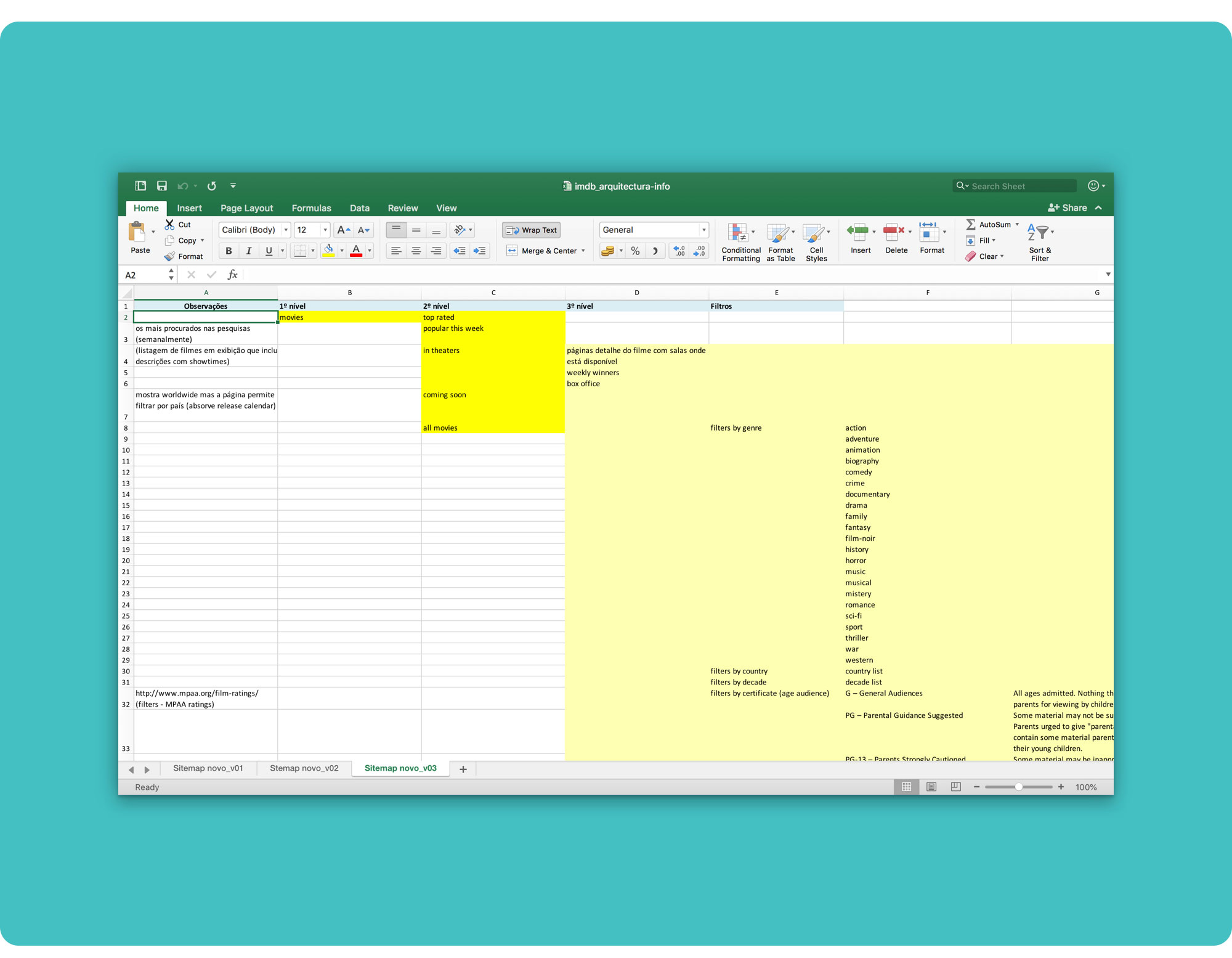 To move things around with ease and iterate faster, I decided to first use a spreadsheet to design IMDb's new Information Architecture. You can download the file here if you're curious.
 IMDb's new Information Architecture detail. Download the pdf file here to check the whole tree.
By adjusting the top level menu, I was able to redesign a more consistent and simple main navigation, substantially reducing the complexity of the unfolded menu.
 IMDb's new Main Navigation. Makes more sense, right?
The main navigation was built upon my user research and perception of what most people might look for at IMDb’s website, as I wasn’t given access to any analytical data that could allow me to effectively know which menu options are most clicked and which contents are most sought after.
Based on the premises of having relevant information first and an easy navigation, I started sketching and designing the website’s wireframes.
With my previous research in mind and the content inventory, I tried to design for what most users are looking for, prioritizing information by placing attractive content first and bringing value to the overall experience. Or so I thought…
 IMDb's Wireframes. From left to right: Homepage, Movie Page, Celebrity Page. You can check the larger images here.
IMDb is a content-heavy, exceedingly detailed website, but it didn’t seem right to just start cutting things off. As I said before, IMDb has a large and very diverse audience, from casual users to movie lovers, so what may not appeal to some, might be a treasure to others.
As I didn’t want to strip the database of its’ essence, which is the richness and depth of its’ contents, the first wireframes versions didn’t come out quite right. The movie and celebrity pages were excessively long, overloaded with information, which ultimately damaged usability and the overall experience, especially on mobile devices.
Exposing every detail on the pages was creating a lot of clutter so I took a deep breath, a few steps back, and started working on a simplified version of the wireframes.
I bared the design to content blocks, grouped the pages' contents by themes and designed a tabular sub-navigation that could ease the user’s experience by reducing the amount of information displayed on the page. 😌
 My content blocks for the Movie Page… You can check the larger images here
When designing a webpage with so much information and details, the user can easily feel lost; it was imperative to establish a clear hierarchy of information so that just by scanning the page, people could get a clear idea of what they could find and read about.
 My content blocks for the Celebrity Page…
I placed the general information that seemed to appeal to a broader audience on the first tab (“Overview”), easily accessible in smaller, digestible parts, and hid the more detailed content on the other tabs, thus reducing the pages’ complexity and cognitive load.
Giving people enough content to understand what’s available and provide further details upon their “request” turned out to be a better strategy.
 IMDb's new colour palette and fonts.
A font with many voices. Friendly without being folksy, confident without being aloof, Gotham's many moods run from hip to nostalgic to brash to eloquent.
With this redesign, I aimed to create more visually impactful and appealing pages, easy to use, and highlight engaging content.
I kept the contents that are updated more frequently on the homepage, to stimulate and encourage frequent access and consultation by the users.
 IMDb's desktop Homepage before the user logs in (detail).
I separated the login from the registry, giving more prominence to the registry button, in order to boost the number of registered users.
The login page is also more captivating, as the background image randomly changes on each load.
 IMDb's Homepage after the user logs in. First level mobile menu and user's menu on desktop when clicked.
All the registered users’ options were grouped in the utility nav. I also created a “discover” area which aims to present curated contents to registered users (movies and TV shows) based upon their preferences, ratings, watchlist and check-ins.
As searching is a major entry point while navigating IMDb’s website, I gave the search bar a prominent placement and displayed the field “in focus” on the homepage, so the user won’t have to click to begin searching. This behaviour only happens on desktop, as loading a website with the keyboard open could be a bit odd, confusing the users.
When the user starts typing, the background is dimmed to avoid distractions, and the most relevant search results start being displayed.
All search results present a coloured label to enable a quick and easy scan (search results can belong to 1 of 4 categories: movies, TV, people or news).
 IMDb's Homepage detail. Hovering a movie unveils the film details.
The homepage’s hero displays 6 highlighted trailers or news videos (like interviews or events) and its’ corresponding info. When the user presses play, all complementary info and controls are hidden (reappearing on hover) and the background is dimmed to avoid distractions while the video is playing. Like turning the lights off in a movie theatre!
The “Movies” section displays a slider with a list of all movies available to watch in theatres, on the current week and the following 5, according to the user’s IP address. There is also a quick link to showtimes.
A second tab allows the users to check which films will premiere in their country each month.
On desktop, hovering each movie displays more detailed information like its’ name, director and leading actors.
Each film displayed can be added to the user’s watchlist and provides direct access to the movie’s schedules by location and movie theatre name.
News and highlights were condensed in a masonry grid layout that enables the users to filter content by trending news (top) or topic related news (movies, TV, people and events)
 IMDb's Homepage "Popular this Week" section. Hovering an item unveils more detailed information.
“Popular this Week” slider displays a weekly list of movies, TV shows and people that are trending on IMDb, as well as a list of the highest-grossing films in theatres.
 IMDb's Homepage "Born Today" section. Hovering the user's photo on desktop shows him a special birthday message.
“Born Today” is a special treat to IMDb’s registered users, privately displaying the users’ photo alongside famous people on their birthday.
IMDbPro’s commercial subscription only appeals to a smaller audience of industry professionals. As such, it didn’t seem right to keep it in the header so I moved it down to the footer, alongside a small introductory text linking to the professional platform.
To keep things interesting, the footer’s background image randomly changes, displaying a different movie or TV character on each load.
I changed the hero in the Movie Page to display a trailer. The section behaves similarly to the one on the Homepage, but it also allows the users to access several streaming services, buy the DVD, Blu-ray and original soundtrack on Amazon, monetizing the website, and add the movie to their watchlist.
To boost the number of active participants I added a quick-edit floating action button to enable faster content editing and a leaderboard that displays top contributors who help keep IMDb up to date.
To reduce clutter but still keep all the information IMDb provides, the Movie and Celebrity Page’s contents were grouped by theme, in tabs, in order to present the information in a more concise, graphical way, that both provides a quick look as well as detailed, in-depth content without cluttering the pages.
In the Celebrity Page, I deleted the “Known for” section where IMDb displays the films for which the actor is best known for and created a hero with a montage that showcases those films.
 IMDb Mockups. From left to right: Homepage, Movie Page, Celebrity Page. Check the prototypes for more details!
With this project, I aimed at an easy to use interactive experience, both for new and registered users, that allows them to hop by and easily grab the information they need, without slowing down the user’s flow.
Even though IMDb is a content-heavy website, with lots of options, I tried to redesign it in such a way that most could be clear the first time people viewed the website.
Quality content and displaying it right was key!
Thank you for making it all the way this far reading my case study 😊
I hope you liked it!
If you didn't check the prototypes yet, here they are (there's no need to scroll back to the top):
👉 And here is the redesigned Desktop Version
Desktop Website Prototype Flow (InVision):
- Login;
- After entering the Homepage as a registered user, scroll down to “Popular this Week” section and click to see the “Tetro” movie page;
- After entering the movie page, click on the tab “Cast & Crew” and select “Alden Ehrenreich” to check out the celebrity page.
👉 Here is the redesigned Mobile Version
Mobile Website Prototype Flow (InVision):
- Enter the Homepage;
- Scroll down to “Popular this Week” section and click to jump to the “Tetro” movie page;
- After entering the movie page, click on the tab “Cast & Crew” and select “Alden Ehrenreich” to check out the celebrity page.
