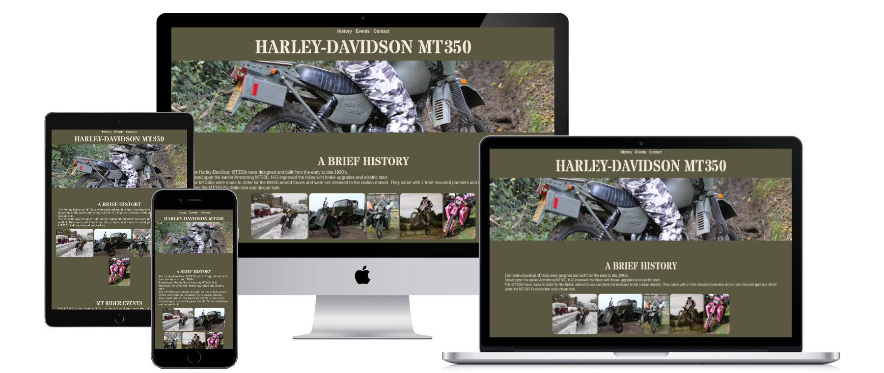
This is an informative website for owners, fans and people who are curious about the Harley-Davidson MT350 motorcycle.
The goal is to provide these users with a brief history about the bike, a few gallery photos and also to list some annual events that take place so other owners can join in.
The live link can be found here - https://madstu.github.io/HTMLCSSEPP/
It is designed to be responsive and accessible on a range of devices, making it easy to navigate for all users.
-
Typography
- For the main and subsequent headings I chose the "Stardos Stencil" font from Google Fonts.
- This font is of a military style which I felt was in keeping with the main subject of the website.
- I chose to style the headings that use Stardos Stencil font in uppercase, again to be in-keeping with the military style.
-
Colour Scheme
- I intially used the colormind.io to generate a matching colour scheme which generated some initial colors.
- I kept the first colour as the main background colour and tweaked the others for contrast reasons. I used 4 colours in total.
- Due to the military style of the MT350, I chose to go with a military style colour scheme, with some pink highlights to soften it all a little.
-
Navigation Bar
- Featured at the top of the page, the full responsive navigation bar includes links to the History, Events and contact sections on the website.
- This section will allow the user to easily navigate to the section of the page that most interests them.
- The styling changes as you hover and activate each link to give the user positive feedback confirming the action they've taken.
-
The Landing Page Image
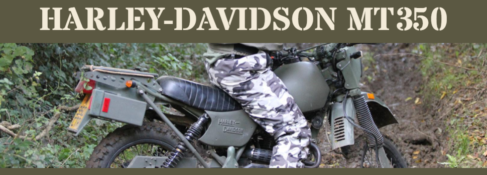
- The landing includes a bold title of the website name and photograph of the motorcycle being used in a competition.
- This section displays to the user exactly what the subject of this website is about.
- The image stretches the entire width of the screen and no matter what your screen size, you should always be able to see the "Harley-Davidson" name on the side of the bike.
-
History Section
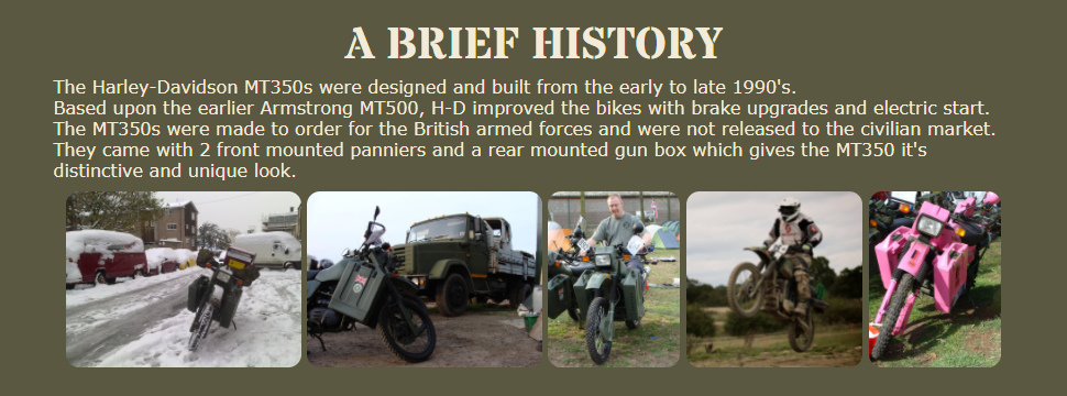
- The history section gives the user a brief history about these motorcycles.
- The user will also see a small gallery of images of the motorcycle in various situations.
- The images border colors change as the user hovers over them.
-
Events Section
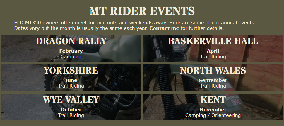
- This section allows the user to see an overview of our annual events and locations.
- This section will be updated as more events are held by users.
- This section's description also provides a link to the contact form.
- The event box borders change colour when the user hovers over them.
-
Contact Form
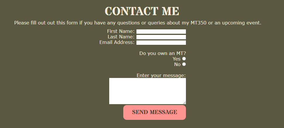
- The contact form allows users to send me a message if they have questions regarding the motorcycle or events.
- The form ensures they have filled out all their details correctly and asks whether they own a motorcycle or not.
- The input labels are fully responsive giving the user good feedback.
- The submit button is responsive to let the user know their mouse is in the right place and when they've submitted the form.
-
Footer
- The footer section provides links to some social media websites which all open in a new window.
- It also tells the user who created the website and links externally to my github page.
- Add image gallery.
- Provide further information about events.
I tested the website on a number of browsers and devices and all is working as intended.
The responsive design allows for different screen sizes as proven by using Responsinator
There was a bug where if the screen became too narrow, the header image would repeat itself vertically but adding no-repeat into CSS solved this.
- HTML
- No errors were returned when passing through the official W3C validator
- CSS
- No errors were found when passing through the official (Jigsaw) validator
- Other Tests
- No problems were discovered when testing with the WAVE tool
- Accessibility
- I confirmed that the colours and fonts chosen are easy to read and accesible by running it through lighthouse in devtools.
- None found.
- The site was deployed to GitHub pages. The steps to deploy are as follows:
- In the GitHub repository, navigate to the Settings tab
- Then navigate to the Pages section
- From the source section drop-down menu, select the Master Branch
- Once the master branch has been selected, the page will be automatically refreshed with a detailed ribbon display to indicate the successful deployment.
The live link can be found here - https://madstu.github.io/HTMLCSSEPP/
- The "Stardos Stencil" font was used from Google Fonts https://fonts.google.com/
- All text content for the website was written by me.
- The README.md file structure is based on the template provided by the Code Institute.
- I often used W3Schools and MDN web Docs as a guide for finding the best solutions and using the code in the correct format.
- The Event boxes with the background image CSS was inspired by the code institute's Love Running project and their code was used as the base.
- I used Colormind to generate an initial colour scheme although I tweaked some of the colours for contrasting reasons.
- All photographic images on the website are owned by me.
- The social media icons were downloaded from https://iconmonstr.com/
- The responsive mockup image at the top of the README.md was created at https://websitemockupgenerator.com/
