-
Notifications
You must be signed in to change notification settings - Fork 2
New issue
Have a question about this project? Sign up for a free GitHub account to open an issue and contact its maintainers and the community.
By clicking “Sign up for GitHub”, you agree to our terms of service and privacy statement. We’ll occasionally send you account related emails.
Already on GitHub? Sign in to your account
[FR] Plot axes names on another scale #10
Comments
|
Can you clarify what exactly is the feature request? Which keyword argument
is missing that should be forwarded to the internal Makie functions?
Em seg., 5 de fev. de 2024 14:21, jbrea ***@***.***> escreveu:
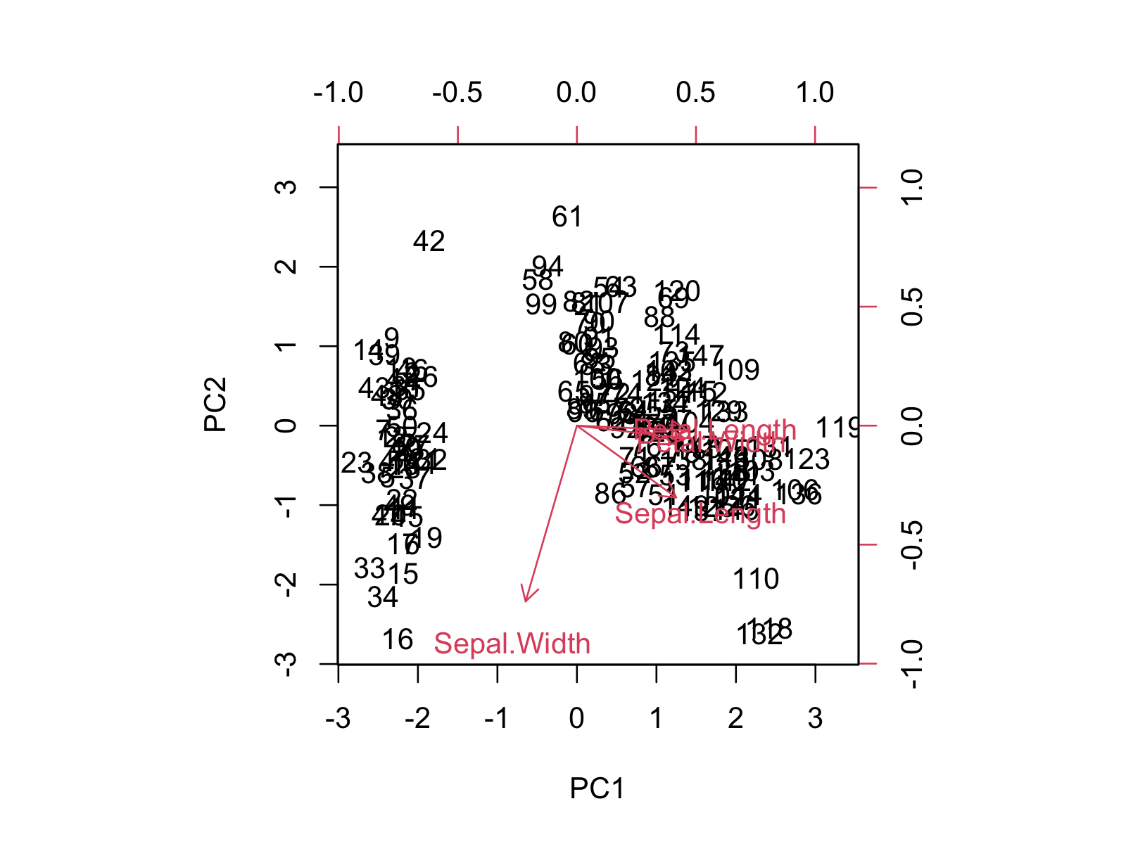
… Sometimes it is useful to plot the data points and the axes names on a
different scale, like e.g.
<https://camo.githubusercontent.com/5bcd2bfcf503cbf460614d75a2c5e67945e39d1928b4cb026f3f556caa767390/68747470733a2f2f73746174697374696373676c6f62652e636f6d2f77702d636f6e74656e742f75706c6f6164732f323032332f30332f6269706c6f745f62617365525f312d312e706e67>
where the data is shown on the black scale and the axes names on the red
scale.
Would this be easy to add as a feature?
—
Reply to this email directly, view it on GitHub
<#10>, or unsubscribe
<https://github.com/notifications/unsubscribe-auth/AAZQW3LCB6LSPFABB5LMHHLYSEILDAVCNFSM6AAAAABC2Q5YLWVHI2DSMVQWIX3LMV43ASLTON2WKOZSGEYTSMBXGI2DANA>
.
You are receiving this because you are subscribed to this thread.Message
ID: ***@***.***>
|
|
Not sure this can be done simply by forwarding a keyword argument to an internal Makie function. As you can see in the example, the axes names are plotted on a separate axis (the red one), which shares with the black one the origin, but has a different scale. I dont't even know, how to implement this in Makie. A new keyword argument for |
|
I don't know if I understand it. Do you know that we provide options to control the red axes already, right? The other black axes is the normal Makie axes that you can set with normal Makie functions such as |
|
Can you elaborate why the options EDIT: you mean the ticks on the right and upper parts of the axes? |
Yes. |
Sometimes it is useful to plot the data points and the axes names on a different scale, like e.g.

where the data is shown on the black scale and the axes names on the red scale.
Would this be easy to add as a feature?
The text was updated successfully, but these errors were encountered: