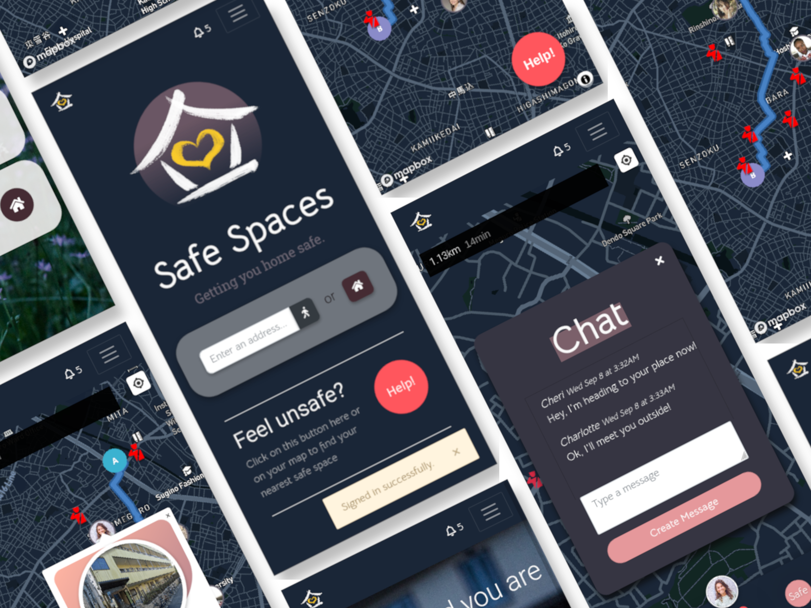
Safe Spaces is a mobile web application developed in two weeks during the Le Wagon full stack web development bootcamp. Our idea was simple but borne out of necessity - to give women who feel unsafe while out the opportunity to find somewhere safe to escape a potentially dangerous situation.
Live: Safe Spaces
Use the following credentials to explore the app:
- Username: cheri@webdev.com
- Password: 123123
Please note that all addresses, users, and images in the current state of Safe Spaces do not represent real-life data. Consider these only for display and demonstration purposes.
Once you've cloned the repository, to get the application running:
bundle install
yarn add
Next you need to set up you PostgreSQL database using Rails:
rails db:create
rails db:migrate
rails db:seed
Finally, to run the app:
rails server
You should now be able to access the app at localhost:3000.
- Back end: Ruby on Rails
- Database: PostgreSQL
- Front end: HTML5, CSS3, JavaScript (ES6), Bootstrap
- Hosting: Heroku
- Real time features including live notifications and chat (ActionCable)
- Calling (Twilio API)
- Map & navigation (Mapbox API)
As Lead Developer I was largely involved in working on front end aspects of the project, creating UI/UX mockups in Figma, and implementing them through a combination of our front end tech stack. As a small team of four we collaborated across the full stack of the project to deliver an MVP within two weeks of development time (check out our live pitch at Le Wagon Tokyo's demo day). We defined two user journeys that we wanted to cater for - women travelling alone and women who wanted to volunteer a space of refuge, whether it be their home, workspace, or anywhere else that could remove someone from danger. There were a few considerations:
As the core focus of our app, we knew we needed to create a robust solution that would cater to multiple use cases. We identified three scenarios that shaped our development decisions - a user is:
- planning their journey ahead of time and wants to see places of safety in the vacinity of their route
- heading straight home and wants similar functionality to above
- is in immediate danger and needs the nearest available place of safety right now
Our solutions to these issues all revolved around location-based functionality delivered by the Mapbox API. We implemented a three button solution on the homepage:
A user can either enter an address to get directions from their current location, press the home button to head directly home from their current location, or press the help button, styled to stand out from the rest of the UI, in order to be connected with their nearest safe space. Through each of these methods, users will have visual feedback on their nearest safe spaces and can click on customised, interactive markers and info windows to learn more about the space owner through their customised bio.
Once the help button has been pushed, we wanted to connect a user in danger with a human on the other end. Our solution to this problem was a series of connected live features that played a few roles:
- Notify a space owner that a nearby user is in need of help
- Create a direct link between these two users
- Provide channels of communication to orchestrate a quick response
In order to offer these types of functionality we crafted our own live notification system using Action Cable, Rails' answer to WebSockets. When a user starts a journey or presses help, the space owner receives an immediate notification letting them know. The former will provide an anonymous notification (i.e. no link to user profile), while the latter creates a new 'incident' in the system which keeps track of the travelling user's location and channels of communication.
Anonymous Notification
Incident Notification
Once users are connected, they have access to communication via Twilio's calling feature or another ActionCable implentation, live chat. These allow users to keep each other updated and create a smooth experience to minimise stress during an already difficult situation.
Our initial design was relatively bright based on a soft colour palette but we shifted direction to a darker UI based on the consideration that this app would likely be primarily used at night. While a light/dark mode toggle was considered, it was deemed unnecessary for the above reason and also time limitations on the project. The colour scheme was chosen to make Safe Spaces feel more inviting and to put users at ease when navigating through its interface.
The interface design, from the homepage through to the map and user profiles, was kept minimal in an effort to reduce clutter and keep the focus on making it easy for users to find help when needed. The map was reduced to its basic functionality - directions and a highly visible help button. The incident map follows similar design principles except the help button is replaced by a new box at the bottom of the screen that houses communication and incident-related actions.
An app of this nature comes with some glaring safety and security issues. While it's built on a trust system, we want users to feel secure in engaging with other users on the app. Someone travelling should have peace of mind that a space owner has their best interests at heart and vice versa. Currently the app has an open sign up policy but some potential solutions outlined were:
- Profile verification through social media connections (e.g. Auth0)
- User ratings system
- ID verification


