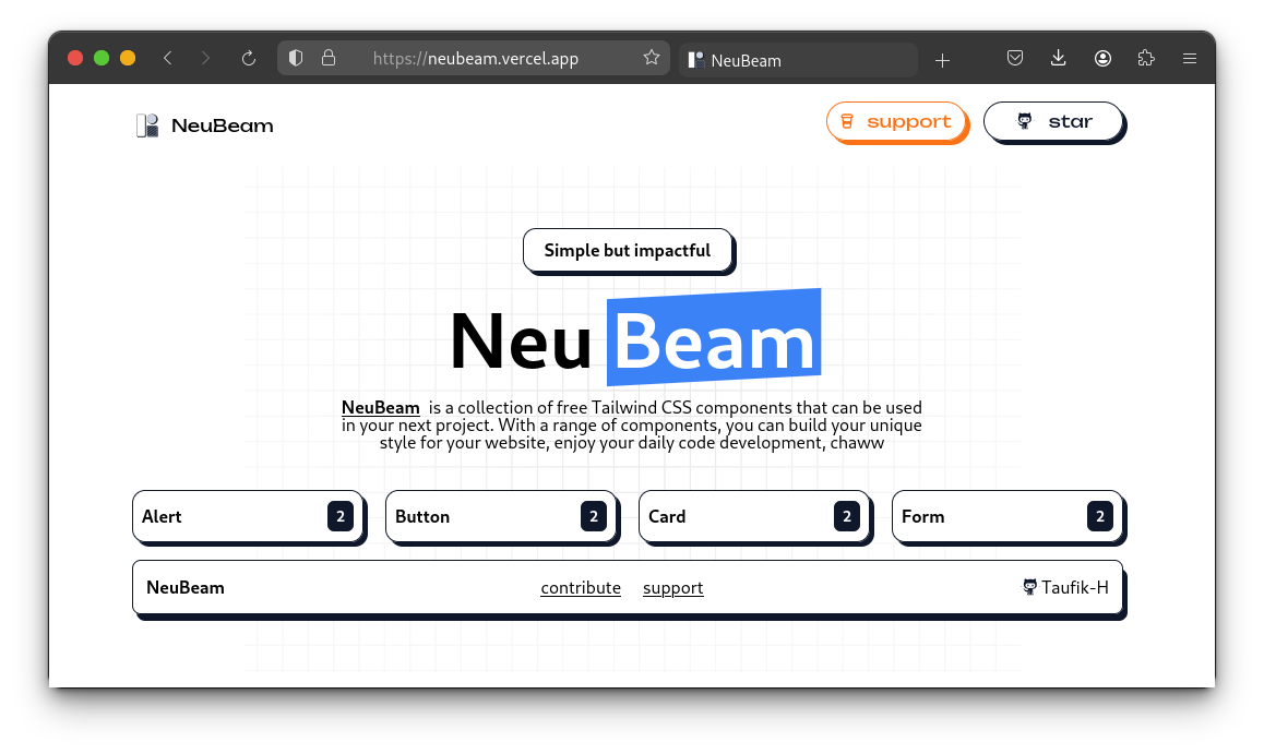
Neubeam is an open-source project components library designed for Tailwind CSS with a Neubrutalism or retro-inspired style. It aims to provide developers with ready-to-use UI components to enhance their web projects with a unique visual aesthetic.
Contributing to Neubeam is greatly appreciated! Here are some ways you can contribute:
-
Report Bugs: If you encounter any bugs or issues while using Neubeam, please open an issue on GitHub.
-
Request Features: If you have any ideas for new features or improvements, feel free to submit them as GitHub issues.
-
Submit Pull Requests: Contributions are welcome! If you have developed a new feature, fixed a bug, or improved existing code, submit a pull request with your changes.
-
Add new Components: Follow the steps bellow
-
Clone this repo
git clone https://github.com/Taufik-H/neubeam.git
-
Go to the Projects
cd neubeam -
go to the
uifolder and choose or create new folder component, then paste youryour-component.tsxinside the folder that you choosenui/ ├── alert/ │ └── SimpleAlert.tsx ├── button/ │ ├── card/ │ └── form/ -
import your component in
constant/component.tsx
//  constant/components.tsx

const components = [
{
  link: "/alert", //create new if you have the new one
  name: "Alert",
  style: [
    {
      name: "simple alert",
      componentCode: <UISimpleAlert />,
    },
    {
      name: "rounded alert",
      componentCode: <RoundedAlert />,
    },
  ],
},
{...}]If you find Neubeam useful and would like to support its development, consider sponsoring the project on GitHub.
Thank you for considering contributing to Neubeam! Your support is greatly appreciated 🤝.

