-
Notifications
You must be signed in to change notification settings - Fork 0
Resource Management
Wiki page for Team 5 - Resource Management
The resource management functionality is accessible throughout the entirety of the game and provides the players with various methods of collecting stone to build other buildings in Atlantis Sinks. Initially, we intended that the player would have three methods of obtaining stone: main character mining the map, enemy drops and a stone mine building. But because the first two methods relied heavily on two other teams, we decided for the MVP we would focus on a Stone Mine Building. Once placed, this stone mine would generate a certain amount of stone per level to aid the player in purchasing other buildings and is intended as an investment.
In terms of inspiration the main ideas we wanted to explore were: mines built into the wall, mine cart / traintracks, atlantean themes and various lighting ideas.
Aesthetics:

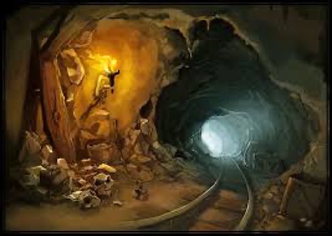
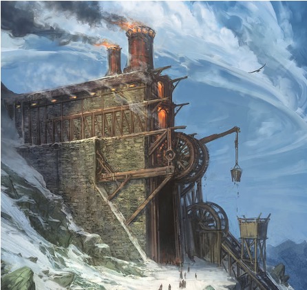
Atlantean Themes:
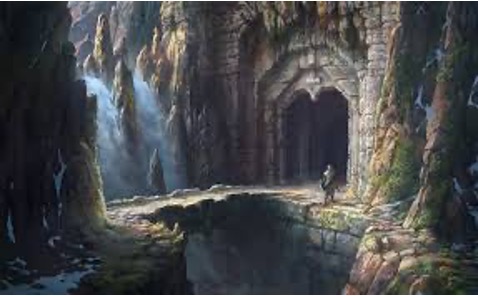
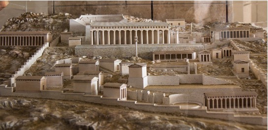
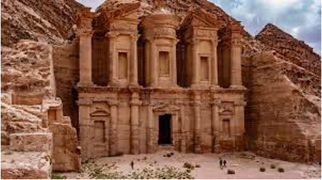
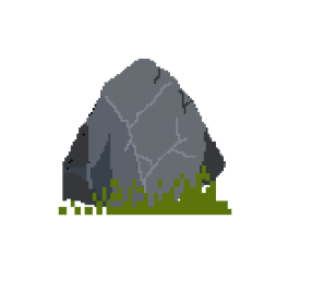
Fake Height / Pixelation / Isometric Design:
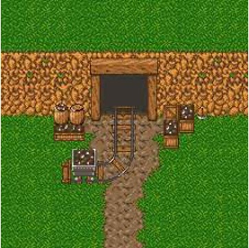
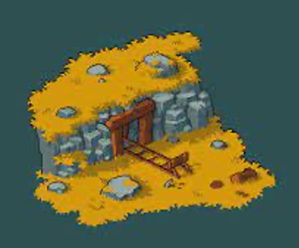
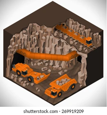
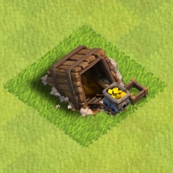
As we were initially told that the mines would be built into the cliff faces that would step down per level, the brainstorming had the mines designed into the cliff face.
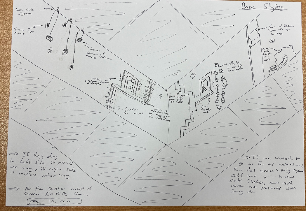
Low fidelity too was designed into the cliff and with as much greek influence as we could find just to help find the aesthetic middle ground.
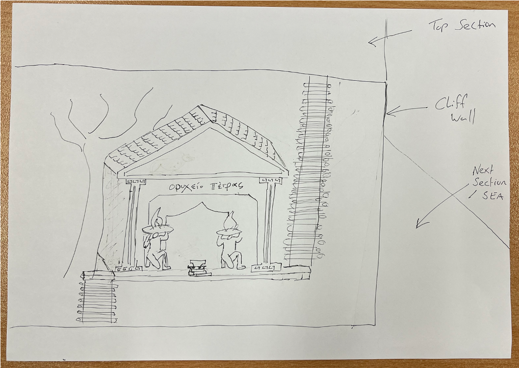
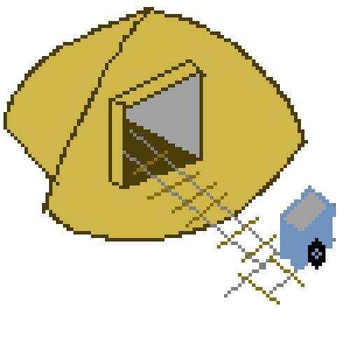
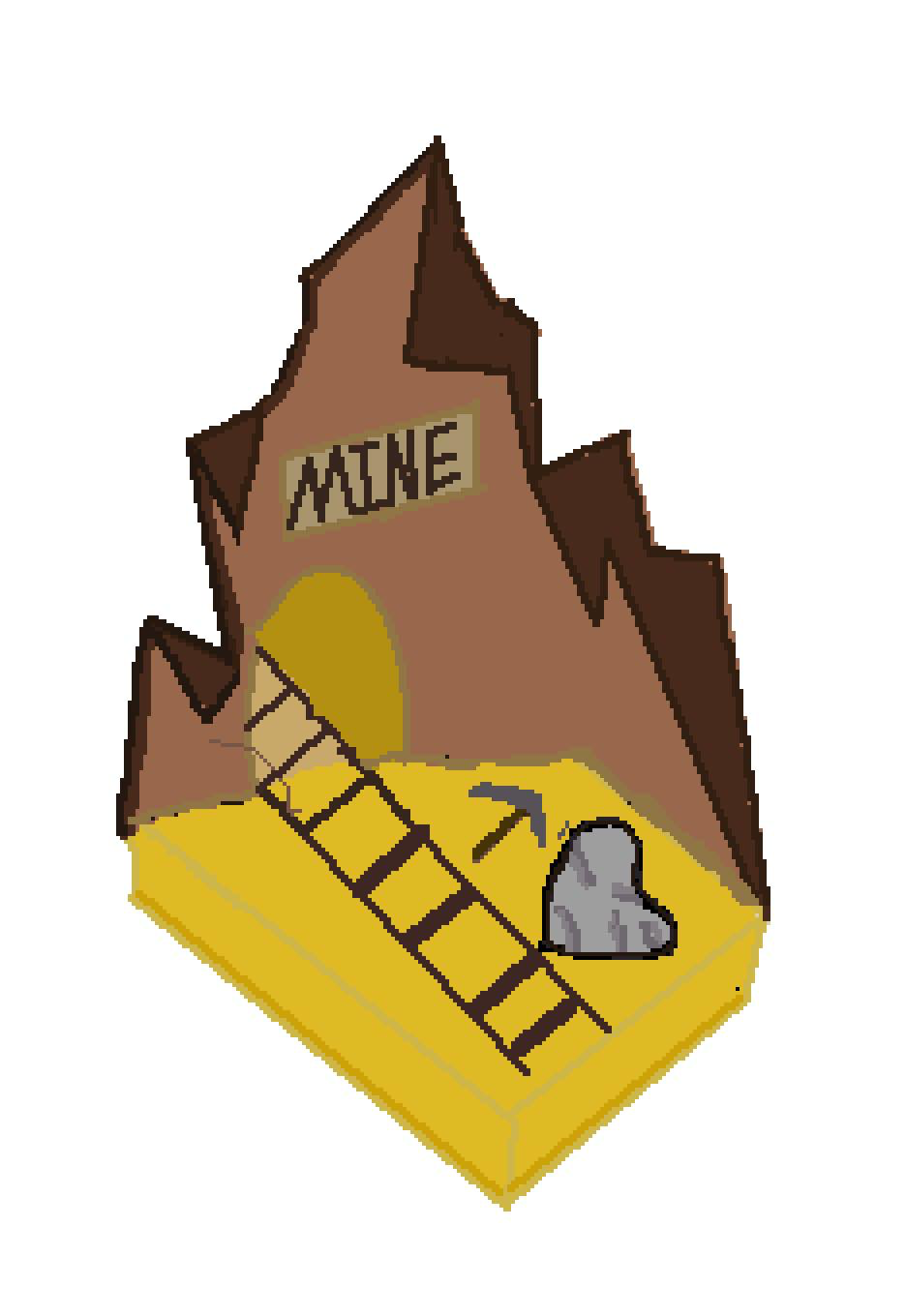
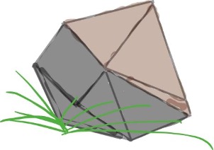
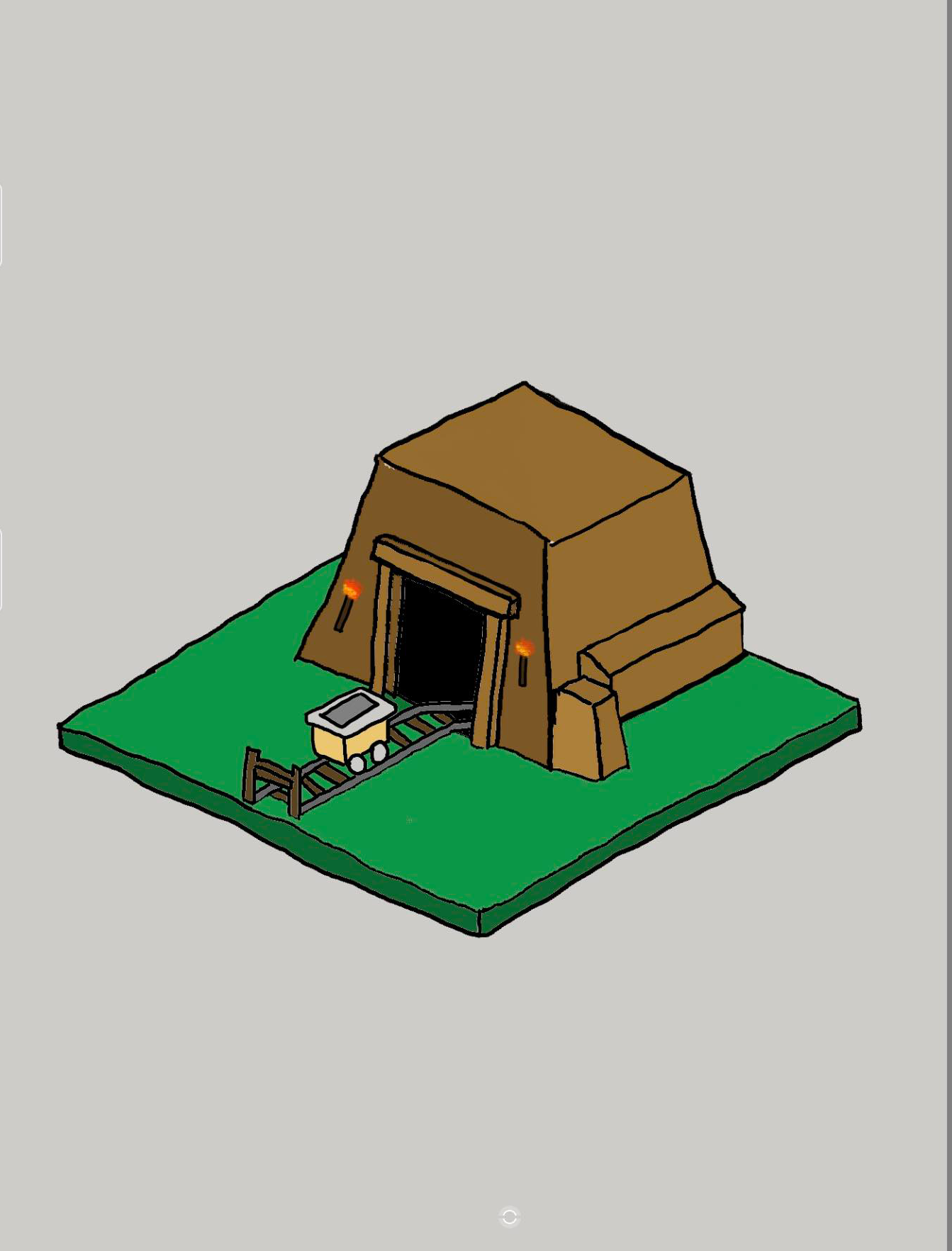
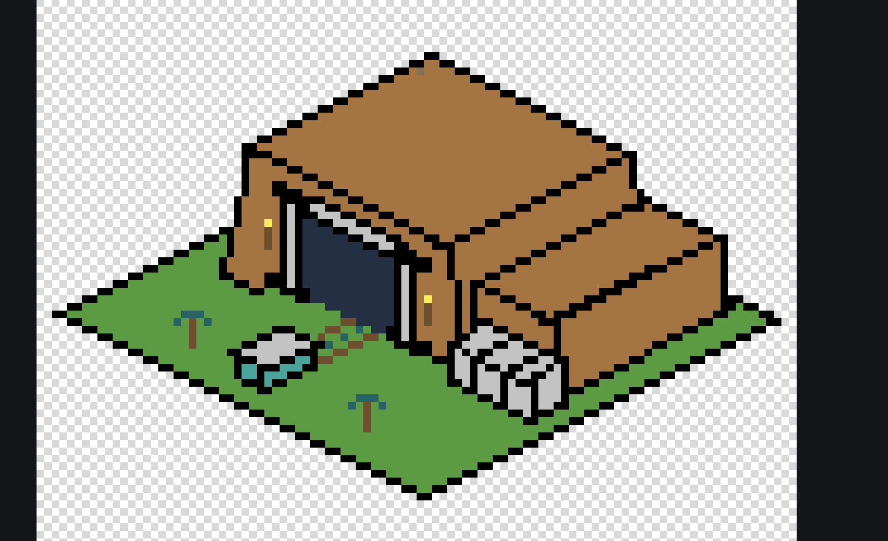
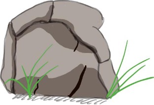

To add an extra layer to the design and functionality of our feature, we thought it was important that small animations were added. Not only did we add the apparent appearing and disappearing of the mine cart, but also flickering of the torches and the cart being emptied every time the cart reappears.
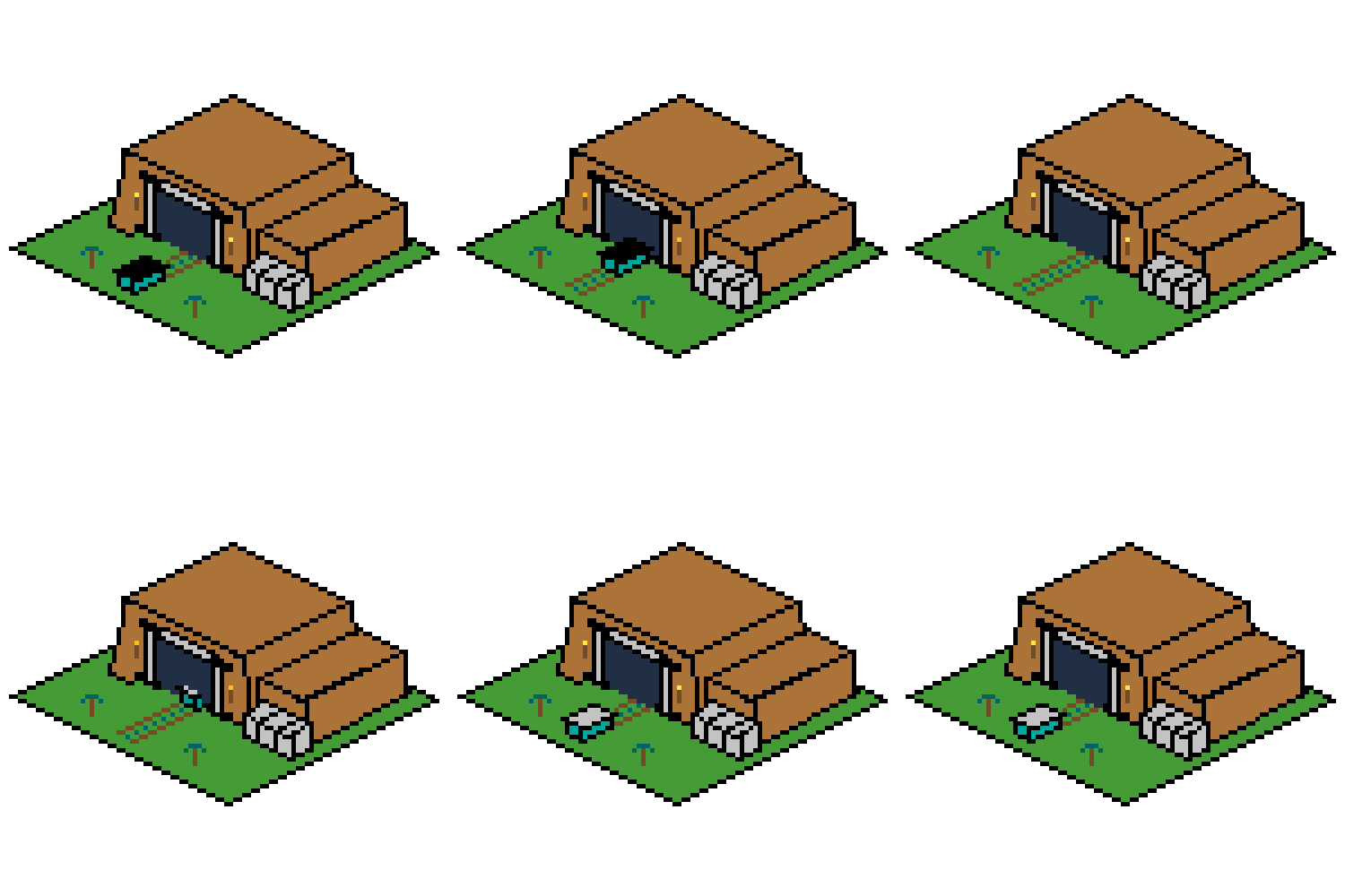
To remove any team biases and to gain another opinion, user testing was conducted. Specifically, we wanted to ask others about colours, shape, animations and any other opinions that they had. To do this, we showed them the individual sprites and then played the gif for them and asked them to complete a small interview afterwards.
The main take aways from this process were as follows:
- Colour Scheme: On initial viewing, most of the people said that some of the colours didn't match and the entire colour scheme could be improved. Despite this feedback, we explained that we were given a design document by the UI team and after they scanned through that, they could acknowledge our initial design decision and most were then happy with it.
- Animations: After the gif played for the viewers, their first reaction was that the fact that the colours inside the cart stayed the same made it look like we were taking stone back into the mine as well. To fix this, we then made the inside of the mine cart black to make it look as though it was being emptied before the process repeated. The rest of the animations they enjoyed.
Functionality testing of the game was conducted in order to identify any errors, bugs or inconsistencies that may affect the user experience adversely. We planned to ask others to look out for any performance issues of the game in the future including:
- Possible issues in the game interface such as issues with animation or any graphical corruptions.
- Possible freezes, crashes or any glitches while testing interactive functionalities.
- Test for areas for any event that may does not trigger or gets triggered incorrectly.
** Operates Left to Right, Top to Bottom... https://images.greeka.com/resized/user_images/krilis/1920/mig9KMYr4.jpeg https://huaban.com/pins/1540673584 https://broncesmestre.com/zh-hans/griferia-exclusiva-mestre-en-jordania-2/ https://www.pinterest.com.au/pin/400820435564325911/ https://id.pinterest.com/pin/542472717618696256/ https://static.wikia.nocookie.net/dont-starve-game/images/6/6e/Boulders_variation.jpg/revision/latest/scale-to-width-down/250?cb=20140120130328
https://twitter.com/startselect__/status/993808320971538433 https://www.pinterest.com.au/pin/824581013021511475/ https://www.shutterstock.com/zh/image-vector/vector-isometric-illustration-underground-mining-quarry-269919209 https://i.ytimg.com/vi/MoLqW2mA27k/maxresdefault.jpg