ThemeSpecs
This specification details all the customizable aspects of a theme, without explaining in detail how they are manually edited. Either use uDesigner along with this guide, or follow this guide along with the manual themeing guide.
Note: for making quick edits to an existing theme, you can always extract the theme, edit any desired images (by maintaining the image size or checking below which sizes may be acceptable), do the same with any desired audio file, optionally edit the theme manifest directly in the JSON and recompress it as a ZIP.
-
Unlike old uLaunch themes, themes are loaded on a
1920x1080(1080p) resolution UI, which means that any old theme assets would have to be rescaled. -
Games are generally referred to as applications (as it is done internally in the console)
-
All images support the following formats: PNG, JPG, WEBP
-
Note that, when saving a theme, uDesigner will save all icons as PNGs inside the ZIP (in case this were to be an inconvenience)
-
Background music must be MP3 files, and sound effects must be WAV files. Both are all optional for any menus. All audio is expected to be sampled at 44100 Hz.
-
All background music has the following optional fields to be customized (for each menu and global default values):
-
Whether the music should loop (boolean value, true or false)
-
Milliseconds while the music fades in (during that interval the music will slowly rise from zero until peak volume)
-
Milliseconds while the music fades out (during that interval the music will slowly decrease from peak volume until it ends)
-
-
All images which are regarded as static are always rendered in the same places, so they admit custom X/Y/align values (other images, like menu entries, are obviously not static and depend on the user's actions).
-
Align can be configured horizontally and vertically, allowing the centering of a UI element without playing manually with its width/height and X/Y value.
-
If using uDesigner, you will automatically see which ones can be edited this way.
-
If making themes manually, only those with fields in any existing themes (like in the default theme) can be edited this way.
-
-
Texts are all static, and X/Y/align/font size can be customized.
- Font sizes are predefined as four kinds: small, medium, medium-large and large.
-
Item menus are all also static, with X/Y/align being customizable.
-
Colors are provided as RGB or RGBA hex strings (like
#313131or#313131FF). -
The default theme can be checked as an example of all the assets (except sound ones) explained in this guide.
The manifest contains fields characterizing the theme's name, description, version and author, as well as an optional icon. There are no particular length limits, although for legibility reasons, the shorter is always the better.
-
Theme name
-
Theme description
-
Theme author
-
Theme version
- No standard is enforced, although it's common practice follow version numbers like
v0.7.6or1.3.
- No standard is enforced, although it's common practice follow version numbers like
-
Theme icon (optional)
- No size is enforced, but it's recommended to use sizes like
256x256(square and not to big neither too small).
- No size is enforced, but it's recommended to use sizes like
uMenu (the uLaunch UI component being themed) has four menus whose names are pretty explanatory.
- The main menu:

- The startup menu:
- The themes menu:

- The settings menu:

(Note that the vast majority of a theme consists of main menu assets)
Certain customizable fields/assets are common for all menus:
-
Suspended application final alpha: final (after animations) alpha value (0-255) of the suspended application image, shown when focusing on the suspended entry (can be set to 0 to disable this feature and show nothing, for example)
-
Text color: color used for all texts (except a few cases below)
-
Toast base color: base color used for toasts (aka small/brief notification popups)
-
Toast text color: text color used in toasts
-
Menu focus color: Item menu color for the item being in focus
-
Menu background color: Item menu background color
-
Dialog title color: color for the title text in dialogs
-
Dialog content color: color for the content text in dialogs
-
Dialog option color: color for the option texts in dialogs
-
Dialog color: background color in dialogs
-
Dialog over color: background color for the focused option in dialogs
-
Background:
1920x1080image, is the background for all menus and will be particularly visible in fade-out-fade-in transitions, usually when moving between menus. -
The font for all uLaunch texts may be customized as well
Note: the "top menu" is a concept corresponding to the default theme: a custom theme could put top menu stuff on the bottom, on a side, the middle... just keep in mind that most UI elements have a particular behavior and are not mere static images (with the exception of some backgrounds and icons)
-
Backgrounds (all static and configured the same way): depending on the currently focused entry, the background of the top menu is different
-
Background for application entry
-
Background for homebrew entry
-
Background for folder entry
-
Background for default/anything else (empty locations and special entries like album, mii editor, etc.)
-
Texts present in the top menu:
-
Battery text: displays the battery value as a percentage (like
69%) -
Time text: displays the current time (in hours and minutes, like
09:31) -
Date text: displays the current date (day, month and day of the week, like
02/07 (Tue))
Top menu icons (square but arbitrary sized) are the icons shown in the top menu:
-
Battery top icons: icons for different battery values: 10%, 20%... all up to 100%, and an extra charging icon drawn over the battery icon if the console is being charged
-
Connection top icons: icons for WiFi connection strengths of 0, 1, 2, 3 plus a no-connection icon
-
Logo top icon: uLaunch's logo, cannot be customized
The entry menu has the following (all static) images:
-
Background
-
Left icon: shown only when there are more entries on the left (as an indicator that the user can navigate to the left)
-
Right icon: same thing, but for the right (always shown in practice since the menu is infinite to the right)
It also has the following texts:
-
Current path text: displays the current folder, not shown in menu root (if currently inside folder
Aand subfolderB, it will show/A/B) -
Current entry main text, only shown in these cases:
-
For applications/homebrew, displays the application name
-
For folders, displays the folder name
-
For special entries, displays their corresponding name
-
-
Current entry sub text, only shown in these cases:
- For applications/homebrew, displays the application version and author
Entry icons (size 256x256 or higher) are the icons for entries in the menu:
-
Empty entry icon: shown in empty locations of the menu
- It is also rendered below non-empty locations!
-
Folder entry icon
-
Default application entry icon: shown for applications/games with invalid/not found icons (keep in mind that these situations shouldn't happen, so the icon will be shown in weird cases)
-
Default homebrew entry icon: same as above, but for homebrews with invalid icons
-
The other entry icons cover special entries: album, mii editor, controller support, settings, themes and web browser
The input bar is simply customized with a (static) background, where the input bar text will be centered with respect to the background height.
These are 90x90 (or higher) icons shown in the quick menu:
-
Power quick icon: for displaying the power options (sleep, power off, reboot) dialog
-
The other quick icons cover special entries as well: album, mii editor, controller support, settings, themes and web browser
These are (square but arbitrary sized) icons shown over entries in the main menu under certain circumstances.
These icons must be made under the assumption that they will be drawn centered over a 256x256 icon, where all scaling due to menu grid size is automatically done by uMenu itself.
They are meant to serve as an overlay, even extending beyond the icon's size (as can be seen with the default over icons).
-
Cursor over icon: the cursor moved by the joysticks/dpad
-
Border over icon: drawn over non-empty non-folder entries, meant to be used as some sort of frame to make icons look better (rather than a borderles square)
-
Selected over icon: drawn over the currently selected entry (being moved)
-
Suspended over icon: drawn over the currently suspended entry (suspended application)
-
Homebrew takeover application over icon: drawn over the application entry being used as donor/takeover for homebrew launching as application
Like any menu, its background music can be customized.
Sound effects to customize:
-
Post suspend: played right after the running application/game is suspended and just when the menu is loaded
-
Cursor move: played each time the cursor moves to another entry, even if empty
-
Page move: played when the user navigates over an entire page (L/R input)
-
Entry select: played when an entry is selected (to be moved)
-
Entry move: played when the selected entry is moved to a new, previously empty location
-
Entry swap: played when the selected entry is swapped with another entry
-
Entry cancel select: played with the selection is cancelled
-
Entry move into: played when the selected entry is moved into a folder
-
Home press: played when HOME button is pressed
-
Logoff: played when the user logs off (and goes back to the startup menu)
-
Launch application: played when an application/game is launched
-
Launch homebrew: played when homebrew is launched (both as an applet or as an application)
-
Close suspended: played when the suspended application is closed by the user
-
Open folder: played when a folder is opened
-
Close folder: played when a folder is closed
-
Open mii editor: played when mii editor is launched (special entry, not from quick menu)
-
Open web browser: played when web browser is launched (special entry, not from quick menu)
-
Open user page: played when user page is launched (special entry, not from quick menu)
-
Open settings: played when settings menu is opened (special entry, not from quick menu)
-
Open themes: played when themes menu is opened (special entry, not from quick menu)
-
Open controllers: played when controller support is launched (special entry, not from quick menu)
-
Open album: played when album is launched (special entry, not from quick menu)
-
Open quick menu: played when the quick menu is opened
-
Close quick menu: played when the quick menu is closed
-
Resume application: played when the suspended application is resumed (and hence the menu is closing)
-
Create folder: played when a new folder is created
-
Create homebrew entry: played when a new homebrew entry is added to the menu
-
Entry remove: played when a homebrew/folder entry is removed
-
Error: played when an error happens (application fails to launch, application crashes after launch or gamecard fails to mount)
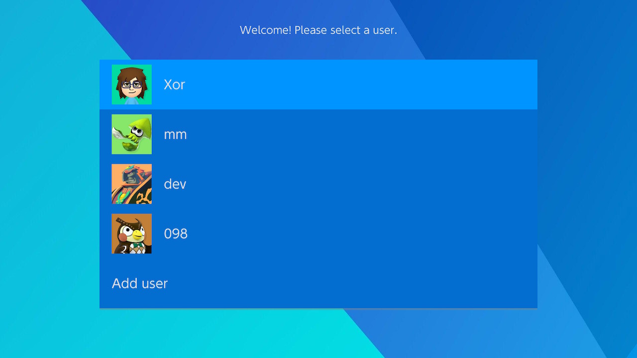
Has a text showing a welcome message.
Contains an item menu displaying the existing users (along with their icons) and a final option to create a new user.
Like any menu, its background music can be customized.
Sound effects to customize:
-
User create: played when the "add user" is selected (played when the user creation menu is launched, not after the user is created!)
-
User select: player after a user is selected (hence just before the main menu gets loaded)
Has a text showing a descriptive message of the menu.
Contains an item menu displaying the available themes (along with their icons) and an extra option to reset to the default theme.
Like any menu, its background music can be customized.
Sound effects to customize:
-
Theme change: played after a new theme (or reset to the default theme) has been selected and loaded (inmediately before rebooting)
-
Back: played after the menu is exited and before going back to main menu
Has a text showing a descriptive message of the menu.
Contains an item menu displaying the available settings.
Icons for editable and non-editable settings may be customized (arbitrary size, although the higher the better since they will get scaled on the settings menu anyways).
Like any menu, its background music can be customized.
Sound effects to customize:
-
Setting edit: played after selecting an editable setting (before it is edited, for those settings which need manual input like keyboard text)
-
Setting save: played after an editable setting has been edited and saved
-
Back: played after the menu is exited and before going back to main menu