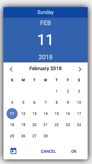
This project includes the CSS, HTML and JS required to create a Material Design inspired Date Picker.
This project works best when included with the Bootstrap Material Design UI toolkit (which in turn requires jQuery).
The required files include:
datepicker.css- The Date Picker Styledatepicker.js- The DatePicker() functiondatepicker.html- The DatePicker HTML, which should be included at the bottom of any page that will use the Date Picker.
When initializing the Date Picker, you can provide the hex color code of the primary accent color of the Date Picker. This color should be dark enough where white text can be clearly displayed in front of it.
var dp = DatePicker("#0D47A1");The Date Picker can be displayed using the show(date, callback) function, where the date argument
is the currently selected date and callback is a function that accepts the newly selected date
let date = new Date();
dp.show(date, function(selected) {
  console.log("Selected Date:");
  console.log(selected);
});
The hide function can be used to hide the Date Picker, if needed.
dp.hide();The example.html file contains a fully working example of the Date Picker.
