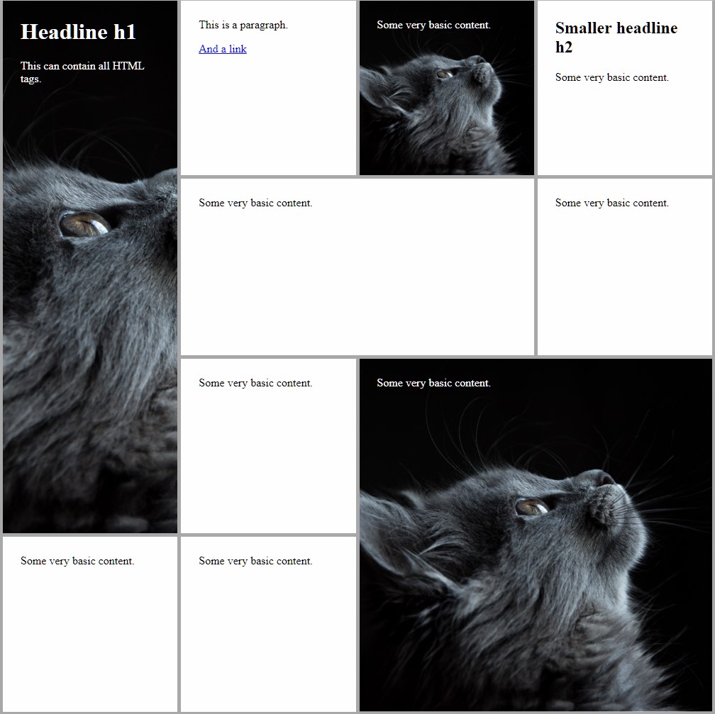
Classes for square (and rectangular) boxes, optionally with some content.
NOTICE: The tiles do not have any colors assigned.
Table of contents:
You can view examples at GitHub.io:
- Example 00: Most basic features
- Example 01: More advanced features
- Example 02: Flip animation
- Example 03: Shrink animation
Please have a look at the LICENSE file.
You can just download the dist/tiles.css and use it locally right away.
Add the dist/tiles-anim-*.css you like the most to add hover animations.
Some provide special features (see below).
Clone this repo and setup gulp to run the gulp tasks (at least sass-default).
Change the src/scss/config.scss to your likings and use the resulting dist/tiles.css.
Feel free to tinker with the src/scss/tiles.scss. If you've found an improvement, send me a pull request.
Refer to the docs/example-##.html files.
When using SCSS tiles, one has to use a specific HTML structure for it to work:
- A container (e.g. a
<div>) with classtiles-container- containing several containers (e.g. a
<div>) having classtileand optionally additional tiling classes- containing a container with class
content- containing arbitrary HTML code
- containing a container with class
- containing several containers (e.g. a
E.g.
<div class="tiles-container">
    <div class="tile">
        <div class="content">
            some HTML content
        </div>
    </div>
</div>All tiles in the tiles-container have to have the tile base class. Additionally, they can have spanning classes, like tile-2-1 or tile-3-3.
These are named like tile-<column span>-<row span>, e.g. tile-3-2 spans three columns and two rows.
You can easily assign colors to the .tiles .content-selector.
NOTICE: This is the intended structure! Do not assign background-colors to the .tiles-class (see below for details).
The tiles can have full-size background images. Just assign the CSS-property background-image on their content container.
DON'T assign the background to the tile container, this breaks the intended structure.
Refer to dist/example-01.html for this.
Similar to the Bootstrap 4 grid logic it is possible to include multiple classes for different breakpoints.
E.g. you can build something like:
<div class="tiles-container tiles-container-2 tiles-container-md-4 tiles-container-xl-8">
    <div class="tile tile-2-1 tile-md-4-2 tile-xl-6-3">
        <div class="content">
            some HTML content
        </div>
    </div>
</div>
The grid can be used for up to 12 columns (please look out to match the tile sizes), and the following breakpoints are predefined:
| name | suffix | ≥ px |
|---|---|---|
| x-small | - | 0 |
| small | sm | 576 |
| medium | md | 768 |
| large | lg | 992 |
| x-large | xl | 1200 |
| xx-large | xxl | 1600 |
NOTICE: There's a bug in Chrome executing the transitions on page loading a first time (this looks ugly).
To circumvent this, add a <script> tag with a space to your body, if no javascript is yet embedded.
<script> </script>The following hover animations are available via including:
A simple flip animation (rotating 180 degree around the Y axis), showing an empty backface or an explicitly set backface when complete.
To set an explicit backface, add the class tile-two-sided to the desired tile. Now you can add a second content container with the additional class back, containing everything that will be on the back of the tile. See docs/example-02.html for an example.
A shrinking animation: The tile gets smaller (5px on each side), but the content stays the same size.
