-
Notifications
You must be signed in to change notification settings - Fork 46
Styling
There are various ways to style components in HaxeUI. The following page will describe the options available for styling as well as their pros and cons (where appropriate).
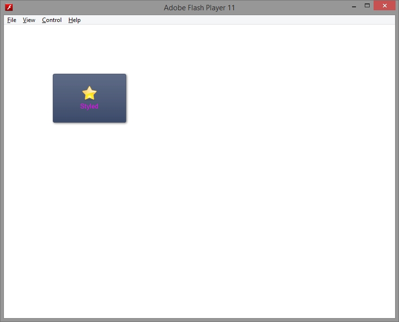
Styling individual components one by one in code is probably the most straight forward method to add custom styles to components, however, because of limitations and verbosity it isnt really recommended and is simply listed here for completeness.
var button:Button = new Button();
button.x = 100;
button.y = 100;
button.style.width = 150;
button.style.height = 100;
button.style.color = 0xFF00FF;
button.style.icon = "assets/fav_32.png";
button.style.iconPosition = "top";
button.text = "Styled";
root.addChild(button);
As you could imagine, styling this way is extremely verbose and would require styling each component individually. A better idea would be to use the StyleManager to define rules that will be applied to components when they initialize.
A much better way to style from code would be to add custom rules to the StyleManager class that will be applied to the correct component each time a match is found. The following rule will result in the exact same button as displayed above.
StyleManager.instance.addStyle("Button", new Style({
    width: 150,
    height: 100,
    color: 0xFF00FF,
    icon: "assets/fav_32.png",
    iconPosition: "top",
}));
The rule here is simply "Button", this means that any button that you create will now have these style properties applied to it, this is clearly not ideal a better way would be to either use an id or a styleName, a new, better rule could be any of the following
Button.myStyle
.myStyle
#myButton
#myButton.myStyle
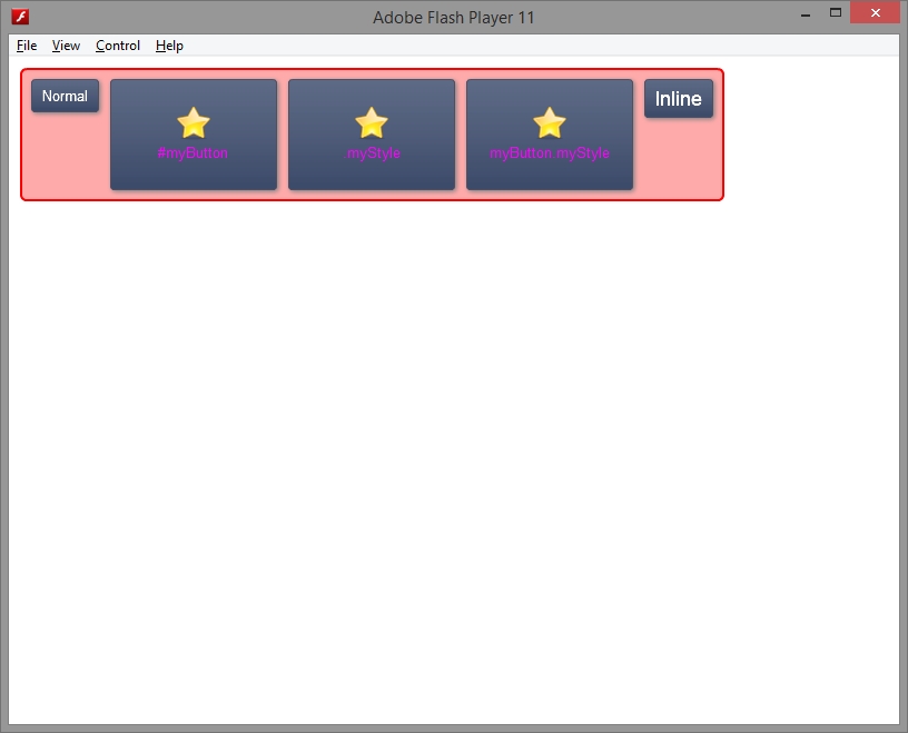
All of these rules will select the same style if you give your button an id of "myButton" or the button a style name of "myStyle". A full example of this is shown below.
import haxe.ui.toolkit.containers.HBox;
import haxe.ui.toolkit.controls.Button;
import haxe.ui.toolkit.core.Root;
import haxe.ui.toolkit.core.Toolkit;
import haxe.ui.toolkit.style.Style;
import haxe.ui.toolkit.style.StyleManager;
import haxe.ui.toolkit.themes.GradientTheme;

class Main {
    public static function main() {
        Toolkit.theme = new GradientTheme();
        Toolkit.init();
        Toolkit.openFullscreen(function(root:Root) {
            StyleManager.instance.addStyle("Button.myStyle, .myStyle, #myButton, #myButton.myStyle", new Style({
                width: 150,
                height: 100,
                color: 0xFF00FF,
                icon: "assets/fav_32.png",
                iconPosition: "top",
            }));

            var hbox:HBox = new HBox();
            hbox.x = 10;
            hbox.y = 10;

            var button:Button = new Button();
            button.text = "Normal";
            hbox.addChild(button);

            var button:Button = new Button();
            button.text = "#myButton";
            button.id = "myButton";
            hbox.addChild(button);

            var button:Button = new Button();
            button.text = ".myStyle";
            button.styleName = "myStyle";
            hbox.addChild(button);

            var button:Button = new Button();
            button.text = "myButton.myStyle";
            button.id = "myButton";
            button.styleName = "myStyle";
            hbox.addChild(button);

            root.addChild(hbox);
     });
}
Another useful feature of the style system is being able to apply styles based on where a component is inside the component hierarchy, for example rules like this are completely valid:
HBox #myButton
Root HBox #myButton
The rule set doesnt have to list all the components between nodes. The style system will match the next available component, so if you had
Root -> VBox -> HBox -> VBox -> Button
On the display tree then the rule set
Root HBox ButtonWould match it fine. A good example of how this works is found inside gradient.css. The snippet below (extracted from gradient.css) shows how the buttons (up,down,thumb) are styled differently in the vertical scrollbar from the standard gradient buttons and how each one has a different icon.
VScroll Button {
	backgroundColor: 0x606c88;
	backgroundColorGradientEnd: 0x606c88;
	borderColor: 0x606c88;
	cornerRadius: 1;
	filter: null;
	iconPosition: "center";
}

VScroll Button:over {
	backgroundColor: 0x4b546a;
	backgroundColorGradientEnd: 0x4b546a;
	borderColor: 0x4b546a;
}

VScroll Button:down {
	backgroundColor: 0x4b546a;
	backgroundColorGradientEnd: 0x4b546a;
	borderColor: 0x4b546a;
}

VScroll Button:disabled {
	backgroundColor: 0x8C8C8C;
	backgroundColorGradientEnd: 0x8C8C8C;
	borderColor: 0x8C8C8C;
}

VScroll Button.up {
	icon: "styles/gradient/arrow_up.png";
}

VScroll Button.down {
	icon: "styles/gradient/arrow_down.png";
}

VScroll Button.thumb {
	icon: "styles/gradient/gripper_vertical.png";
}

VScroll Button.thumb:disabled {
	icon: "styles/gradient/gripper_vertical_disabled.png";
}

VScroll Button.up:disabled {
	icon: "styles/gradient/arrow_up_disabled.png";
}

VScroll Button.down:disabled {
	icon: "styles/gradient/arrow_down_disabled.png";
}
As you might have noticed from the css above each control can also define a set of "states", this are denoted with the ":{stateName}" selector. Each of the states are component specific and will be listed on their respective wiki and api pages pages. So the ruleset
VScroll Button.up:disabledWill select any Button that has an ancestor of VScroll, a styleName of "up" (ie, the deincrement button) and will set the ":disabled" state style.
As usual for HaxeUI you can also load resources from the file system at compile time or from assets at run time. Loading compile time style resources is done with the call
Macros.addStyleSheet("assets/myStyles.css");This is really just a utility function to generate the code as if you loaded the style by hand and added it to the StyleManager. Loading style assets at runtime is achieved in a similar fashion with the following snippet:
StyleManager.instance.addStyles(StyleParser.fromString(ResourceManager.instance.getText("assets/myStyles.css")));As you can see loading styles in runtime takes a few more steps and it is recommended just to use the Macro.addStyleSheet approach. The runtime styles are mainly used if you are using styles inside xml (covered below)
As discussed previously, a much better way to create HaxeUI interfaces is using xml markup to define interface components. As well as including ui components, it is also possible to add style definitions in xml also. Consider the following example that will result in exactly the same output as full example used here
<?xml version="1.0" encoding="utf-8" ?>
<hbox x="10" y="10">
	<style>
		Button.myStyle, .myStyle, #myButton, #myButton.myStyle {
			width: 150;
			height: 100;
			color: #FF00FF;
			icon: "assets/fav_32.png";
			iconPosition: "top";
		}
	</style>
	<button text="Normal" />
	<button text="#myButton" id="myButton" />
	<button text=".myStyle" styleName="myStyle" />
	<button text="myButton.myStyle" id="myButton" styleName="myStyle"/>
</hbox>Quite often is needed that we simply want to tweak a current style and not go through the bother or setting up a specific rule for it inside the StyleManager, this can be achieved in an XML based UI by simply using the style attribute to define inline styles as follows:
<?xml version="1.0" encoding="utf-8" ?>
<button text="Inline Style" x="100" y="100" style="fontSize: 40" />
A full example of how to use styles from XML is listed below
<?xml version="1.0" encoding="utf-8" ?>
<hbox x="10" y="10" style="padding: 10; spacing: 10; borderColor: #FF0000; borderSize: 2; cornerRadius: 5; backgroundColor: #FFAAAA">
	<style>
		Button.myStyle, .myStyle, #myButton, #myButton.myStyle {
			width: 150;
			height: 100;
			color: #FF00FF;
			icon: "assets/fav_32.png";
			iconPosition: "top";
		}
	</style>
	<button text="Normal" />
	<button text="#myButton" id="myButton" />
	<button text=".myStyle" styleName="myStyle" />
	<button text="myButton.myStyle" id="myButton" styleName="myStyle"/>
	<button text="Inline" style="fontSize: 18" />
</hbox>
Then to load the xml definition
import haxe.ui.toolkit.core.interfaces.IDisplayObject;
import haxe.ui.toolkit.core.Root;
import haxe.ui.toolkit.core.Toolkit;

class Main {
    public static function main() {
        Toolkit.theme = new GradientTheme();
        Toolkit.init();

        Toolkit.openFullscreen(function(root:Root) {
            var view:IDisplayObject = Toolkit.processXmlResource("assets/styles.xml");
            root.addChild(view);
        });
    }
}
- Getting Started
- Hello World Example
- Using Multiple Roots
- XML Based UIs
- Styling
- Using Themes
- Using Popups
- Using Layouts
- Using Controllers
- Dynamic Values
- Events and Handlers
- Custom Components
- Custom Layouts
- Buttons
- Calendars
- Checkboxes
- Images
- Menus
- Optionboxes
- Progressbars
- Scrollbars
- Sliderbars
- Spacers
- Tabbars
- Text Fields
- Text Inputs