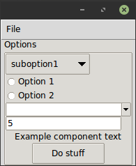
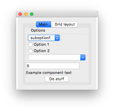
tkpf is a library for building Tkinter GUIs in a paradigm
influenced by WPF (Windows Presentation Foundation) and Angular.
Main features are:
- Declarative view hierarchy and layout in XML or YAML
- One-way and two-way data binding
- Componentization support
You specify the GUI in XML or YAML format. Here is a simple example, ExampleWindow.xml:
<Frame pack-anchor="nw" pack-padx="5">
     <LabelFrame text="Options" pack-anchor="w" pack-fill="x">
        <Radiobutton pack-anchor="w" variable="[(choice)]" value="option1">
            Option 1
        </Radiobutton>
        <Radiobutton pack-anchor="w" variable="[(choice)]" value="option2">
            Option 2
        </Radiobutton>
        <Combobox pack-anchor="w" textvariable="(selected_suboption)" values="[available_suboptions]"
                  name="combobox"/>
        <Button command="do_stuff">Do stuff</Button>
    </LabelFrame>
</Frame>
As you can see, the XML tag names correspond to Tkinter widget class names,
while XML attributes to their arguments.
tkpf is opinionated in that it always uses the better looking ttk themed widgets
when available.
Options such as pack-anchor="nw" or grid-row="0" specify the layout and will be passed to the appropriate
Tkinter layout manager method, in this case .pack(anchor='nw').
On how to specify a GUI in YAML format, see example/ExampleWindow.yaml.
You display the GUI by creating a class derived from Window and showing it.
You have to supply the viewmodel in the constructor.
class ExampleWindow(Window):
    template_path = 'ExampleWindow.xml'  # 'ExampleWindow.yaml' works too

ExampleWindow(ExampleModel()).show()
If you want to keep the layout XML in this file inline, you can do that too:
class ExampleWindow(Window):
    template = '<Label>Some text</Label>'
or
class ExampleWindow(Window):
    template_yaml = '''
    Label:
      text: Some text
    '''
Setting the window title:
    def __init__(self, model):
        super().__init__(model)
        self.title = 'My application'
In the view class you can write event handlers. Make that button work for example:
    def do_stuff(self):
        self.combobox.config(state='disabled')
This also shows how you can access widgets by name in methods of the view class. But if you prefer you can access them dynamically like this:
self.named_widgets['combobox']class ExampleModel(ViewModel):
choice = Bindable(AutoProperty(1))
available_suboptions = Bindable(AutoProperty())
selected_suboption = Bindable(AutoProperty())
def __init__(self):
super().__init__()
self.available_suboptions = ('suboption1', 'suboption2')AutoProperty is similar to a C# autogenerated property. By default its datatype is str.
You can supply either a default value or a type to its constructor.
Bindable is a decorator that you can use on any property to return a bindable property.
It has to know the data type of the wrapped property, so please specify its return type with a type annotation:
@Bindable
@property
def foo() -> int:
    return 1
AutoProperty takes care of that for you.
Only int, bool, float and str types are supported for Tkinter bindings, though for the combobox
values, you can assign a Python tuple.
If an event handler is not found on the view class, it will be looked up on the viewmodel as well.
In the XML you specify the direction of data binding with a syntax similar to that of Angular:
values="[available_suboptions]"
is a one-way binding from data source to view target,
textvariable="(selected_suboption)"
is a one-way binding from view target to data source, and
variable="[(choice)]"
is a two-way binding.
You can use custom widgets derived from Tkinter widget classes. The only thing you have to do is call
Directive.Registry.register(YourCustomWidgetClass)before loading a template that uses it.
tkpf supports breaking up your GUI into components.
Here's an example of a progressbar component with its own viewmodel:
class ProgressbarModel(ViewModel):
    value = BindableProperty(0)
    target = BindableProperty(100)


class CustomProgressbar(Component):
    template = '<Progressbar name="progressbar" variable="[value]" maximum="[target]"/>'
and you can use it like this:
<CustomProgressbar tkpf-model="[progressbar_model]"/>where progressbar_model is an attribute or property on your main viewmodel.
On Python 3.5 you have to register your component before using it. On Python 3.6+ that is automatic.
Directive.Registry.register(CustomProgressbar)It is planned that you will be able to add add custom, bindable attributes to components, like this:
class ExampleComponent(Component):
    template = '<Label name="thelabel">Example component text</Label>'

    def config(self, **kwargs):
        self.thelabel.config(text=kwargs['custom-text'])
and then use them like this:
<ExampleComponent custom-text="Custom text"/>The only requirement is that the attribute name contains a hyphen.
tkpf only supports Python 3.5+.
This is a work in progress. Also my first attempt at creating a library. Look at the project issues to see what's not supported yet.

