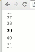
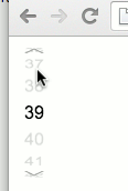
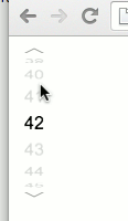
DrumJs is a jQuery plugin, which allows to replace a simple native HTMLselect Element with 3d cylinder as an alternate selector.
The user can, similar to the ios datepicker, select a value by rotating the cylinder vertically with the mouse or with touch gestures.
This plugin is based on HammerJS, a JavaScript library which provides a canonical treatment of touch gestures for different operating systems and a simulation for desktop browser with the mouse.
DrumJS appends a new DOM element to the HTMLselect element, which provides all the ingredients for the 3d projection of a vertical roller, called the drum. The drum consists of a fixed amound of panels where each represends the content of one option from the HTMLselect element.
The highlighted Item of the drum is the currently selected option of the HTMLselect element. The user can now dail a another option by clicking on the upper or lower area of the widget or, if HammerJS is sourced, by vertical swiping over the widget with touch gestures.
To achieve a uniform presentation, the number panels is fixed. The plugin makes sure that optionlist are also added with more or less items as the panelCount properly in the drum.
The root element of the appended DOM holds the className drum-wrapper. An element Id is added to the rootelement, if the HTMLselect itself has an {id} or {name} attribute. In this case, the id of the widgets root element is set to drum_{id} or drum_{name} in this order.
<select id="foo" name="bar"> ... </select>
<div class="drum-wrapper" id="drum_foo"> ...

<select name="bar"> ... </select>
<div class="drum-wrapper" id="drum_bar"> ...
Thus, the widget can be uniquely addressed with CSS.
The following examples demonstrate what is possible with the DrumJS widget:
The plugin follows the progressive enhancement approach and works on an HTMLselect element as a data source. A selected item is stored and read from the selectedIndex value of the the Htmlselect element.
The plugin consists of a JavaScript and a CSS file:
<link rel="stylesheet" href="drum.min.css"></link>
<script src="drum.min.js"></script>
The enhancement to a drumjs widget is done by calling calling the plugin on a selected HTMLselect element:
<select>
  <option>1</option>
  <option>2</option>
  ...
  <option selected>39</option>
  ...
  <option>5</option>
</select>
<script>
$("select").drum();
</script>
Doing so, the HTMLselect element is hidden and the values are shown as a cylindrical 3d projection.
Without the HammerJS library, the plugin only works by clicking on the upper and lower area of the widget. This functionality allows the use even if no touch gestures are supported.
A hover effect indecates where the active areas are. By clicking on the areas the drum is turned up or down. The highlighted item is immediately written as selected index element in the HtmlSelect.
Touch gestures are active if the HammerJS lib is loaded.
<script src="hammer.min.js"></script>
HammerJS also supports the simulation of gestures with the mouse. For this purpose, the fakemultitouch-plugin could loaded and activated.
<script src="../contrib/hammerjs/hammer.fakemultitouch.js"></script>
<script>
Hammer.plugins.fakeMultitouch();
</script>
The plugins supports some options:
The panelCount option sets the amount of panels within the drum. The default value is set to 16 panels. With this option in particular the curve of the roller can be changed. Default: 16
If no manual change of the value is desired, this can be disabled with set interactive to false. Default: true
The following options relate to the icons which are displayed when hovering over the widget. The icons are SVGs which are prepared in accordance by the plugin.
The width of the SVG icon. Default: 20
The height of the SVG icon. Default: 5
The stroke color of the SVG icon. Default: #999999
The width of the SVG icons stroke. Default: 1
The plugin fires a event if the index is changed. A callback function could set to the options map to register for the event:
If an event happens, the callback function is called with the associated HTMLselect element as the argument. This is sufficient for analysis and manipulation of the widget.
$("select.drum").drum({
  onChange : function (e) {
    alert(e.value);
  }
});
The plugin provides methods for reading and writing the selected index. With this methods, the drum could be set to a specific index with JavaScript.
The getIndex() simple returns the currently selected index of the widget (and HTMLselect element)
var index = $("select").drum('getIndex');
The setIndex() method sets the index of the drum to a specific value. The widget is changed accordingly.
$("select").drum('setIndex', 42);
Changing the layout is mainly done by changing and overriding the CSS provided by the plugin. In the examples is some of the options are presented.
One option is already prepared in the plugin css and allows the display of the Dail icons inside or outside the drum.
By default, the Icons for dailing the drum are rendered inside the drum area. For rendering the dial icons outside the drum area, the classname outside could added to the body element (or any other element wrapping the corresponding HTMLSelect Element)
<body class="outside">
<select>
  <option>1</option>
  <option>2</option>
  ...
  <option selected>39</option>
  ...
  <option>5</option>
</select>
<script>
$("select").drum();
</script>
</body>
which results in a following view of the widget:
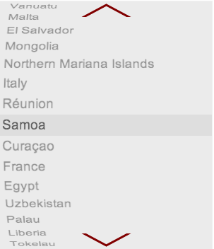
In particular, when changing the panel count an adjustment of the widget css is required. The following example demonstrates how a larger number of panels and adjusted css changes the appearance of the widget. (The ID of the widget DOM was generated from the ID of the HTMLselect element)
<style>
#drum_country {
  width: 300px;
}
#drum_country .container {
  top: 160px;
}
#drum_country, #drum_country .inner {
  height: 350px;
}
#drum_country .container, #drum_country figure {
  height: 30px;
}
#drum_country figure {
  text-align: left;
  font-size: 1.2em;
  line-height: 30px;
}

#drum_country .dial {
  height: 190px;
}
#drum_country .dial div {
  width: 75px;
}
</style>

<select id="country">
	<option value="GL">Greenland</option>
	<option value="DJ">Djibouti</option>
	<option value="JM">Jamaica</option>
	...
	<option value="SK">Slovakia</option>
	<option value="SY">Syria</option>
	<option value="BD">Bangladesh</option>
</select>

<script>
$("#country").drum({
  panelCount: 48,
  dail_w: 75,
  dail_h: 20,
  dail_stroke_color: '#810000',
  dail_stroke_width: 3
});
</script>
Results into:
Many thanks to David DeSandro for his extensive tutorial about 3d animations with css.


