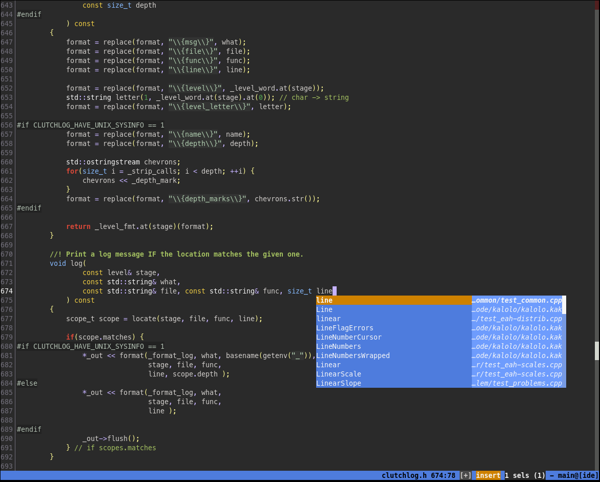
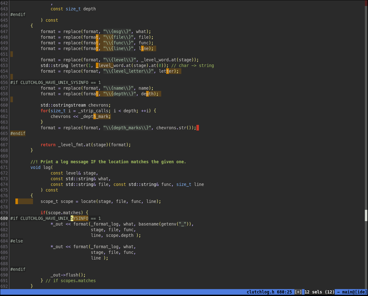
Kalolo is a dark 256-colors scheme for the kakoune editor, designed with usability and consistency in mind.
-
Selections and status line are in shades of yellows in normal mode and of blues in insert mode.
-
Selections let the syntax coloring appear ("alpha blending").
-
Cursor(s) and status line give an immediate visual clue on the mode:
- Insert mode cursors are in shade of blues, normal mode cursors in shades of yellow.
- Status line background color matches the cursors shade.
- Primary selection, secondary selection, primary cursor, secondary cursor and end-of-line cursors all have slightly different colors.
-
It tries to stay semantically consistent:
- Green is only used for comments (because comments are important),
- with documentation in bold (because documentation is very important),
- and strings (because messages are often close to comments).
- Variable-related objects are in blues.
- Operator and delimiters are (lightly) highlighted, to ease the visual parsing.
- Attributes are in yellow.
- Builtins keyword are slightly more highlighted than normal text, to allow for an immediate visual typo checking.
- Keywords are in red, with flow-related ones (if, for, etc.) in bold.
"kalolo" (New-Caledonia familiar adj.) means "beautiful, cute".
Some faces depends on additional highlight keywords: flow, state and Search.
Color schemes are often perceived as a matter of taste. While this is true in essence, there are still some usability guidelines that may be followed. Most of color schemes for text editors show some of the following anti-patterns:
- themes with too few colors (e.g. the default theme for Eclipse),
- fancy rainbows which tries to pack so many colors on each lines that it becomes difficult to parse the text visually (e.g. the "one" theme for Atom),
- use of colors without semantic consistency (e.g. some control-flow keywords are red, some are blue),
- a lack of understanding of what information are important (e.g. making comments less visible),
- no visual clue on the current status of the (modal) editor (e.g. grey status bar, single-color cursors).
Kalolo tries to address those kind of problems.
- So far, Kalolo only exists as a dark theme (but contributions are welcomed).
- The design is limited by a compromise with the syntax parsing engine: less keyword types necessarily means less color shades. Adding more keyword types would mean more configuration.

