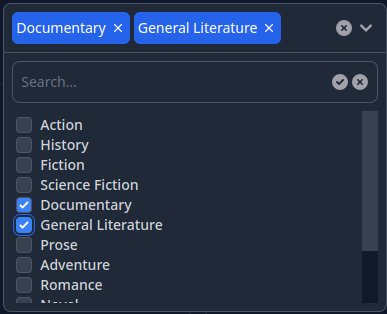
This project implements an Elixir Phoenix LiveView component that has a capability of selecting multiple check-boxed items from a list.
The component supports the following options:
- Selection of multiple items from the given list of options
- Limit the max number of selected items
- Ability to either wrap the selected tags in the main div of the component or collapse them in a single tag
- Ability to search in the list of options on the client side or on the server side
- Support of light/dark color themes
- Support of AlpineJS and LiveView.JS javascript libraries
Here's a sample video illustrating what this component looks like in action.
This component is inspired by this article but is a complete rewrite with added features for usability.
Serge Aleynikov
Include the project in the mix.exs as a dependency:
defp deps do
  [
    {:phoenix_multi_select, "~> 0.1"},
    ...
  ]
Run mix deps.get, and mix multi_select.install. This will modify the following
files:
assets/tailwind.config.js- to add the necessary color alias, and search pathassets/package.json- to add the tailwind scrollbar customizationassets/js/hooks/multi-select-hook.js- copied from the multi_select sourceassets/js/hooks/index.js- add the MultiSelectHook
Install the javascript packages with your preferred package manager e.g cd assets && npm install or cd assets && yarn install
If the AlpineJS support is requested (:use_alpinejs options), the root.html.heex
and app.js will be checked for installation of AlpineJS.
In your assets/js/app.js be sure to add the hooks entry with the live socket
initialization:
import hooks from "./hooks" // <--- add this line
...
let liveSocket = new LiveSocket("/live", Socket, {
  params: { _csrf_token: csrfToken },
  hooks: hooks, // <--- add this line
});
In your project locate this file {{your_project}}_web.ex, and add:
  defp html_helpers do
    quote do
      ...
      import Phoenix.LiveView.Components.MultiSelect   ## <--- add this line
      ...
    end
  end
Now in the *.html.heex templates you can use the multi_select LiveView
component like this:
<.multi_select
  id="some-id"
  options={[
    %{id: 1, label: "Option1"},
    %{id: 2, label: "Option2"},
    ...
  ]}
/>
For list of the available component's options see
Phoenix.LiveView.Components.MultiSelect.multi_select/1
- In order to add a custom class name to the
multi_selectcomponent that will be added to the top-mostdivelement, and that it can be customized in your CSS files, add the following configuration option:
config :phoenix_multi_select,
class_prefix: "some-class-name"- You can also override the build-in CSS classes for every aspect of the
component's presentation by defining a custom callback module, that implements
a
apply_css/3function, which will be called to get a string of CSS classes for every part of the component. Here is an example where theprimarycolor is replaced bypink. The first argument to theapply_css/3function is the ID of the element that needs to apply customization. This way if the page has multiple multi selects, they can be styled differently. See the@cssattribute in multi_select.ex for the list of permissibletagvalues passed to theapply_css/3function.
config :phoenix_multi_select,
  class_module: MyModule
Here is an example of implementation of such a module:
my_module.ex:
=============
defmodule MyModule do
  def apply_css(_id, _tag, def_css_classes), do:
    String.replace(def_css_classes, "primary", "pink")
end- In order to enable AlpineJS support instead of LiveView.JS, set this config option:
config :phoenix_multi_select,
use_alpinejs: trueThe demo project is located in the examples/ directory, and can be compiled
and run with:
cd examples
make
make run
Now you can visit localhost:4000 from your browser.
