Python/Pandas/SQLAlchemy, Jupyter Notebook, SQL, Postgres/pgAdmin4, QuickDBD, Tableau Public, AWS, GeoPandas, scikit-learn, Matplotlib, Numpy
Data sourced from a database of U.S. temperature outliers from 1943-2013 collected from NOAA
Resource referenced for execution of the c.execute function
Link to Google Slides presentation for this project
Tableau Dashboard for this project
A collaboration between Stefan Williams, Eric Cregger, and Lucy Harris utilizing GitHub, Slack, and Zoom for communication and cooperation.
The purpose of this first segment/project deliverable is to sketch out our overall question by determining what question we wish to ask our dataset. From there, we will use the various skills in data analytics and visualization we have honed over this course to create a prototype.
The topic chosen for our project is based on a dataset of temperature/weather anomalies aggregated from reported records across the United States.
This topic was chosen because of the variety of the dataset (over 3 million records from 1964-2013, lots of different time periods and stations to filter/choose from, can focus on strong/weak anomalies, hot/cold anomalies) as well as the neutrality of weather (relatable to everyone, not very specific of a topic in practice). This allows for a variety of analyses/visualizations to be performed on the data depending on what we’re looking for.
The dataset is sourced from Carl V. Lewis on the data.world website, the data is sourced from the National Oceanic and Atmospheric Administration, and the source dataset analysis was performed with Enigma.io calculations.
"Each entry represents a report from a weather station with high or low temperatures that were historical outliers within that month, averaged over time."
This prototype will include a draft of a machine learning model to train/employ using Pandas and Jupyter Notebook. This will be connected to a database created within Postgres that holds the tables with the cleaned/organized data we will end up performing our analysis on. A dashboard created within Tableau will serve as a collection of visualizations that explores the question we have asked our data in a presentable and readable format.
There are many questions that can be asked about this data that go beyond machine learning. Which stations reported the most temperature outliers? Which years within a specific decade have the most amount of temperature outliers? Are there more hot or cold outliers? What are the highest/lowest degrees from mean? Where are the most outliers located (within a certain time span)? Are there more weak or strong outliers? Which specific outlier is the most common?
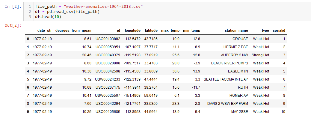
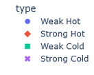
When reading the original data, the relevant columns for the weather anomalies lie in how "degrees_from_mean", "max_temp", and "min_temp" relate to the "type" column. The "type" column falls under four categories of description for the outlier: "Weak Hot", "Weak Cold", "Strong Hot", and "Strong Cold". How do these factors contribute to a weather anomaly being described as one of these types and can a machine learning model accurately group and predict a classification? There doesn't seem to be a definite filter or range on how the type is labeled, which is what we wish to explore.
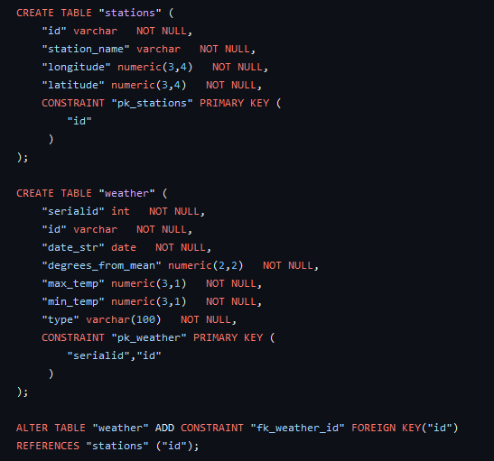
A provisional database was created using Postgres to hold two tables separating our data, "stations" and "weather". This will likely be the same database used to connect to the machine learning model to the data. The stations table holds each station's name, unique ID, as well as longitude and latitude. The weather table holds serial IDs (basically an index), the same station ID key, date, degrees of the anomaly away from the mean temperature, maximum temperature, minimum temperature, and the "type" of anomaly as described before.

An ERD of the drafted database was created to show relationships between the two tables. As of right now, they only share the key of the "id" column. The ID of each station is not unique to the data, and often repeats, but is strictly unique to each station and is therefore used to identify a weather outlier's location and station recorded from.
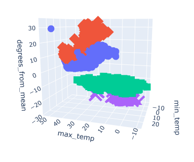
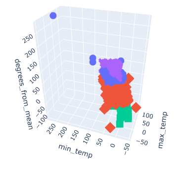
The provisional machine learning model will utilize an unsupervised model format using a clustering algorithm. The database created previously is to be connected to Jupyter Notebook using SQLAlchemy through an SQLite file, then converted into a DataFrame and explored from there. For the purpose of creating a provisional model, data was read in through a CSV file and a 3d plot was created to see the relationships between the "max_temp", "min_temp", "degrees_from_mean" columns to the initial 4 classifications of temperature anomalies.
The goal is to test whether our model can classify weather anomalies as either "Weak Hot", "Weak Cold", "Strong Hot", or "Strong Cold" as they are classified in the original dataset. After exploring and preprocessessing the data, the model should be able to visualize the trends and relationships of these classifications and what may contribute to them being labeled as such.
Now that we have a base idea for where our project is going, the next step is to implement our plans. We have decided to trim down the original database containing over 3,000,000 entries across the U.S. into just stations reporting from North Carolina, which brings the rows down to about 90,000. This keeps the data relevant to us (as NC residents), brings up a point of focus for our project, as well as drastically reduces the file size of the data which allows for quicker processing and sharing.
An ETL process was performed on the data to load in the original dataset, process it to only include NC stations, create a new table utilizing this new data, and export it. The database is now hosted using AWS (Amazon Web Services). This allows for the data to be shared remotely beyond just a Postgres database.
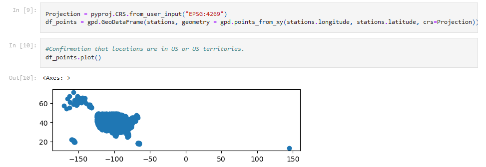
Using GeoPandas, confirmation was first done to verify that all of the records were within the U.S. and its territories.
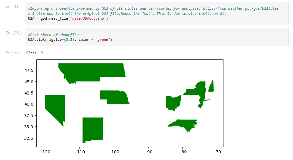
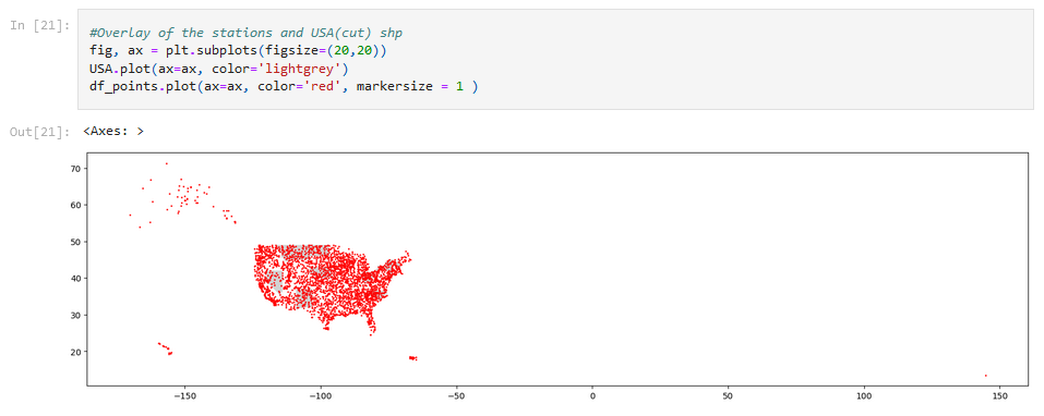
A shapefile for the U.S. was read and plotted for a closer look, as well as the stations being plotted.
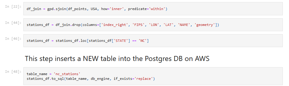
The data was filtered for only N.C. stations, and then saved into a new table into the database on AWS.
Now that the data has been trimmed down, it's simple enough to load it into a new DataFrame on a new notebook to be used with the model.
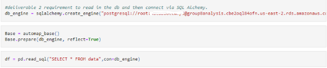
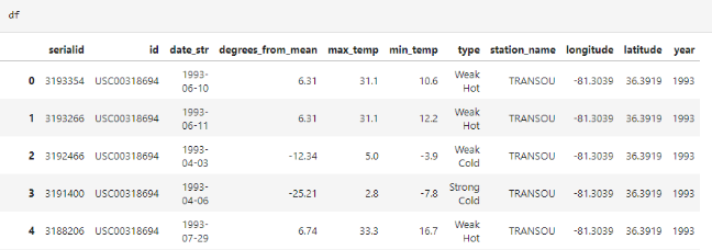
Using SQLAlchemy along with the connection link to the database allows the table previously created to be loaded.
The data is now able to be properly loaded into the machine learning model notebook. We decided to continue with an unsupervised model utilizing the K-Means algorithm to cluster the data from the "max_temp", "min_temp", and "degrees_from_mean" columns into its own machine-generated classification to view the results.
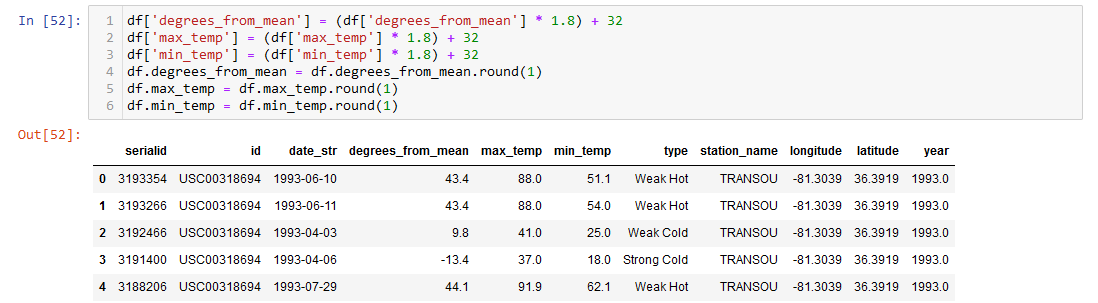
The dataset was processed into Fahrenheit instead of Celsius for the final visualizations and plots. This has no impact on the machine learning model due to the scaling of the data, but allows for more readability in the end result.
The data that was loaded in was then graphed into a 3D scatter plot. Given that the original plot created in the provisional model was only utilizing about 3,000 entries, it's interesting to see how this one varies in shape now that its using the whole 94,178 records for the N.C. weather data. This looks a lot more unpredictable compared to the first graph.
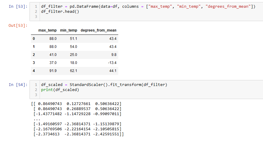
The DataFrame was filtered into the 3 necessary columns needed for the machine learning model, and then scaled using the scikit-learn StandardScaler() function.
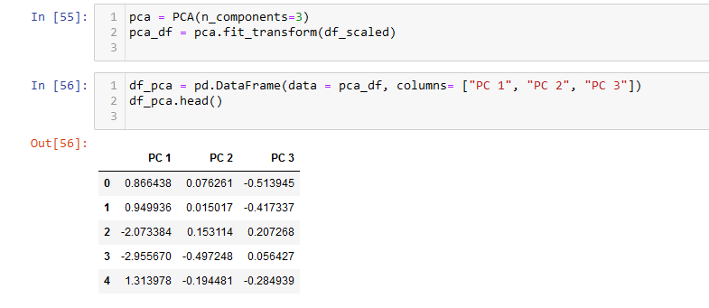
PCA (Principal Component Analysis) was then performed on the scaled data into 3 components (to match the original factor columns). This essentially reduces the variables into smaller ones for use with the model.
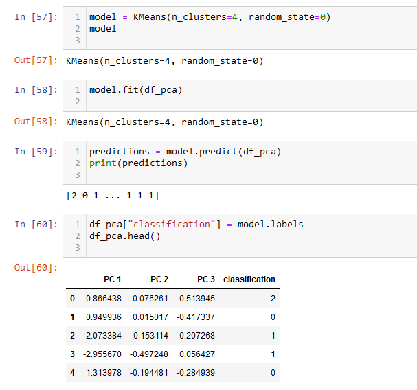
We already know from the original data that we want 4 clusters, so it's easy enough to specify that when using K-Means. The data was fit for use in the model, and then the predictions of the classifications were printed and inserted into the DataFrame with the principal components.
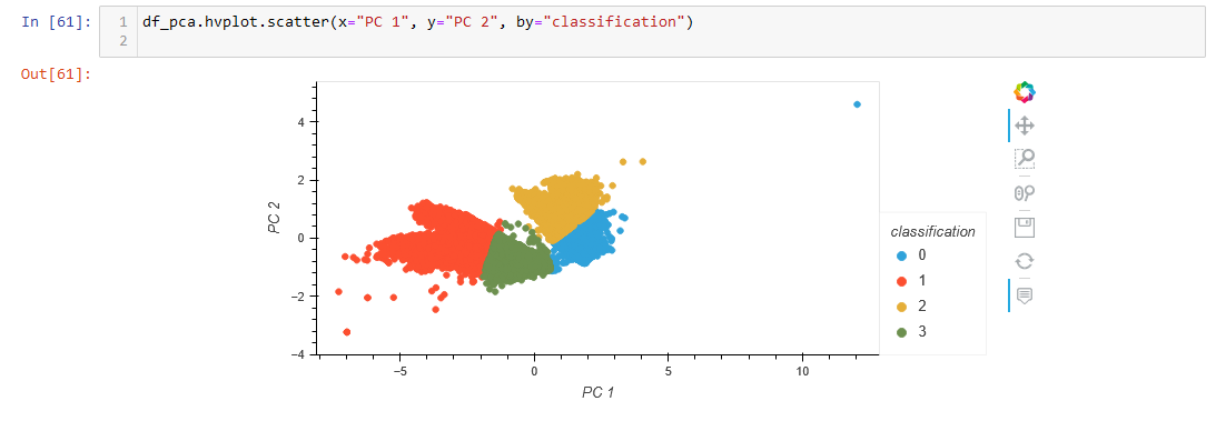
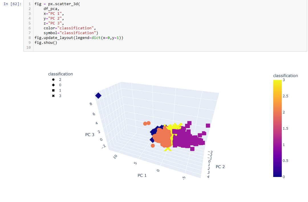
A 2D scatter plot only utilizing the first two PCs was created, as well as a 3D plot utilizing all three.
Viewing the end graphs from the machine learning model and comparing that to the first plots created using the pre-classified data is interesting. The first plot seemed to have very clear distinctions on the typing, while the later plots have much more overlap between the classes. They are still separated, in a way (with some outliers), but much more clustered together the more records there are.
In the original data, the classes are separated by the "degrees_from_mean" axis. However, in the clustered model, the predicted classes are mainly separated by the "PC 1" (which is created directly from scaling the "max_temp" column) axis. As degrees from mean was originally predicted to be how the types were created, it seems that a big limit of using this model is that it doesn't read that as the main factor.
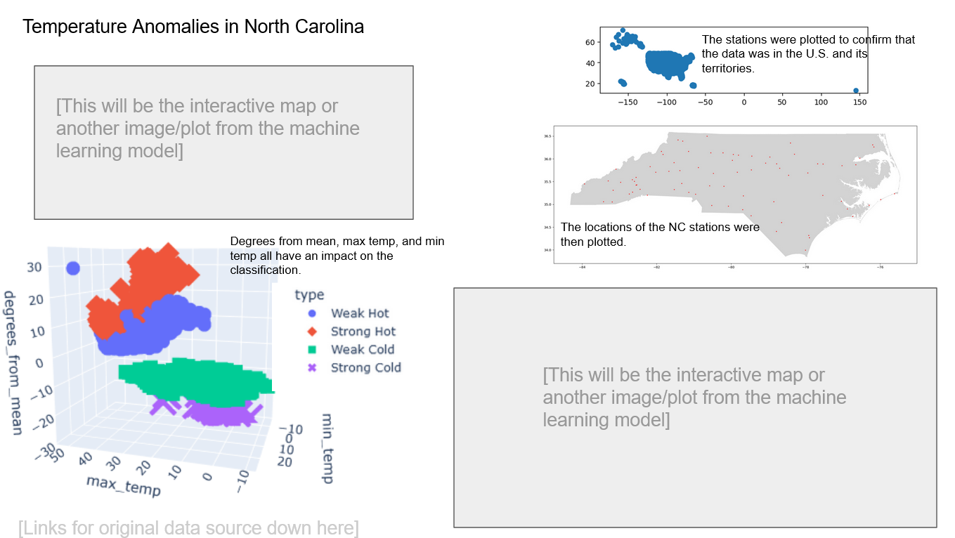
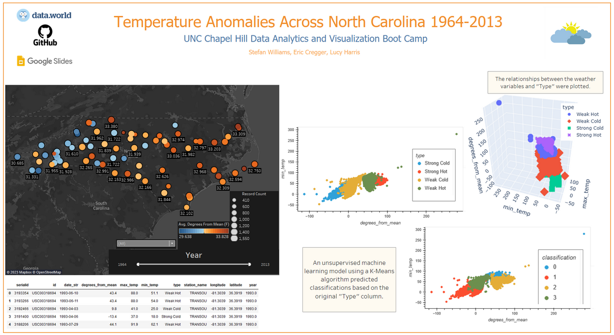
The draft for a final dashboard to present our findings with was drafted in Google Slides. The placement of the elements is not final, but an example of what the dashboard could look like. The plan is so use Tableau to show images from the initial data analysis/ETL, data from the machine learning model, and at least one interactive element using the program to display our findings as well. We wish to include a 3D scatter plot (like the one created earlier), but that may have to be implemented with just screenshots.
Captions will supplement any static images, and links to the original data as well as the original dataset will be provided near the bottom. The initial idea right now is a map of North Carolina utilizing the data created during the ETL process created in this segment that will feature tooltips for the stations when clicked on. This could be a count of how many strong/weak hot/cold classifications there are in each station, their longtitude/latitude, the maximum/minimum temperatures, the highest/lowest degrees from the mean, and so on.
Now that we have a working database that connects to a machine learning model, as well as a provisional dashboard to present our findings, there are just a few more steps left in this project.
For our final phase, we performed a join of the new DataFrame created by the model with the original DataFrame that was loaded in. This is used to create a few 2D scatter plots to compare the weather variables to the typing of the original data, as well as the classifications the model created to view our results. After that, our project dashboard was completed and published.
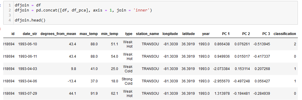
The original "df" and machine learning generated "df_pca" DataFrames were joined together.
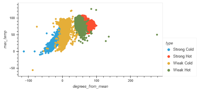
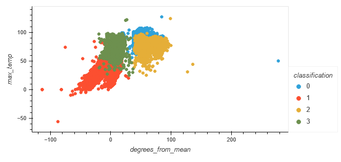
The relationship between "degrees_from_mean" and "max_temp" was plotted for the original typing, as well as the machine-generated classification.
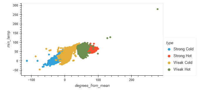
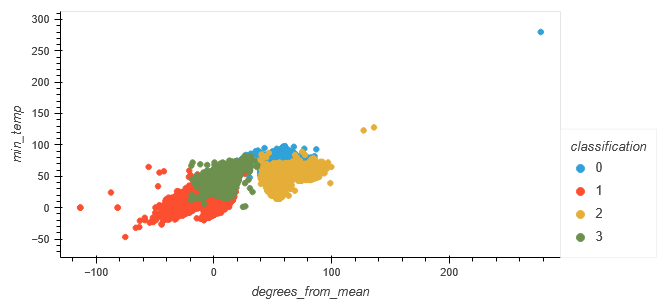
The relationship between "degrees_from_mean" and "min_temp" was plotted for the original typing, as well as the machine-generated classification.
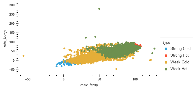
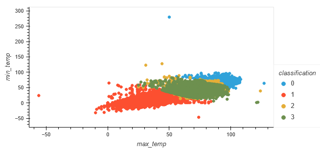
The relationship between "max_temp" and "min_temp" was plotted for the original typing, as well as the machine-generated classification.