-
Notifications
You must be signed in to change notification settings - Fork 20
splitting_cohorts
library(tree)Some functions for exploring introduction times.
This is similar to tree::cohort_introduction_times(), but does not
do the 2^floor(log2()) transformation.
cohort_introduction_times <- function(max.time, multiplier=0.2,
                                      min.step.size=1e-05,
                                      max.step.size=2) {
  if (min.step.size <= 0)
    stop("The minimum step size must be greater than zero")
  trim <- function(x)
    max(min(x, max.step.size), min.step.size)
  times <- numeric(0)
  dt <- time <- 0
  while (time <= max.time) {
    times <- c(times, time)
    time <- time + trim(time * multiplier)
  }
  times
}
interleave <- function(x) {
n <- length(x)
xp <- c(x[-n] + diff(x)/2, NA)
c(rbind(x, xp))[-2*n]
}insert_time <- function(i, x) {
j <- seq_len(i)
c(x[j], (x[i] + x[i+1])/2, x[-j])
}run_with_times <- function(times, ebt) {
ebt$reset()
ebt$set_times(times, 1L)
ebt$run()
ebt$seed_rain(1L)
}This should really move into tree
cohort_seed_rain <- function(ebt) {
  cbind(t=ebt$cohort_schedule$times(1),
        seeds=ebt$seed_rain_cohort(1))
}
p <- new(Parameters)p$add_strategy(new(Strategy))p$seed_rain <- 1.1p$set_parameters(list(patch_area=1.0)) # See issue #13p$set_control_parameters(fast_control())Three progressively more closely spaced times:
eps <- p$control$parameters$schedule_default_patch_survivalt_max <- p$disturbance$cdf(eps)tt_1 <- cohort_introduction_times(t_max)tt_2 <- interleave(tt_1)tt_3 <- interleave(tt_2)ebt <- new(EBT, p)ebt$cohort_schedule$max_time <- t_maxsr_1 <- run_with_times(tt_1, ebt)sr_2 <- run_with_times(tt_2, ebt)sr_3 <- run_with_times(tt_3, ebt)Seed rain increases as time is cohorts are introduced more finely, though at a potentially saturating rate. We're doing lots more work at the more refined end though!
c(sr_1, sr_2, sr_3)## [1] 69.27 70.54 71.04
Are we just geting more accurate resolution of some of the time courses? Is it mostly coming from the beginning individuals or the end ones?
By brute force, split cohorts along the time course and see how we do; that might give some clue:
run_with_insert <- function(i, t, ebt) {
  run_with_times(insert_time(i, t), ebt)
}
This takes a little while because we're re-running the entire simulation (about 3 minutes). This would be a bit easier to do if we could easily restart the entire simulation because we could just to that for the point just before the new introduction. See issue #40.
i <- seq_len(length(tt_1) - 1)res <- sapply(i, run_with_insert, tt_1, ebt)This is really interesting; refining most cohorts does not change anything, but there is a little period around the 47th cohort where it makes a massive difference, increasing seed rain by about 30, which is most of the difference that we saw between the refined and non-refined sets (total increase from doubling resolution is 52)
dsr_1 <- res - sr_1tm_1 <- (tt_1[-1] + tt_1[-length(tt_1)])/2plot(dsr_1, xlab="Cohort insertion point", ylab="Seed rain difference")
plot(tm_1, dsr_1, xlab="Cohort insertion time",
     ylab="Seed rain difference")
plot(tm_1, dsr_1, xlab="Cohort insertion time",
     ylab="Seed rain difference", log="x")
The reason for the change in total seed rain is how we compute the contribution to seed rain. Pulling apart the seed rain calculations above to get the per-cohort contributions:
tmp <- cohort_seed_rain(ebt)And plotting this with the position (vertical line) of the most influential cohort introduction time. Dashed vertical lines are the 5 next most important splits, from darkest (2nd most important) to lightest (6th most important).
plot(tmp[-1,], log="x", las=1,
xlab="Introduction time", ylab="Seed rain contribution")abline(v=tm_1[order(abs(dsr_1), decreasing=TRUE)[2:6]],
col=grey.colors(5), lty=2)abline(v=tm_1[which.max(abs(dsr_1))], col="red")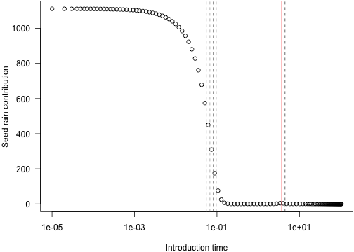
Characterising the decrease in seed rain seems to be the important step, especially as the derivative of seed rain with time increases and as
Here is the same figure on a non-log basis, covering the important range of times.
r <- range(tm_1[order(abs(dsr_1), decreasing=TRUE)[1:6]])plot(tmp[-1,], las=1, xlim=r,
xlab="Introduction time", ylab="Seed rain contribution")abline(v=tm_1[order(abs(dsr_1), decreasing=TRUE)[2:6]],
col=grey.colors(5), lty=2)abline(v=tm_1[which.max(abs(dsr_1))], col="red")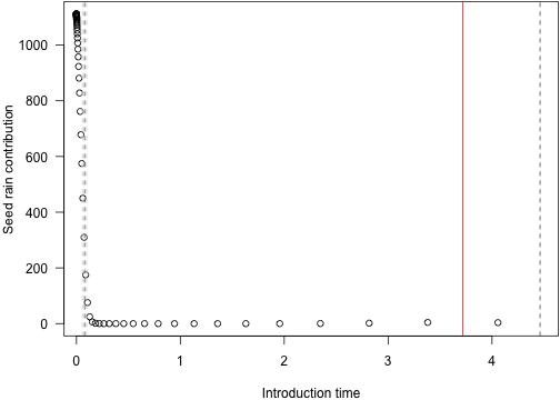
3: What is it about this point that is important?
idx <- which.max(abs(dsr_1))sched <- new(CohortSchedule, 1)sched$max_time <- max(tt_1)sched$set_times(tt_1, 1)res_0 <- run_ebt_collect(ebt$parameters, sched)sched$set_times(insert_time(idx, tt_1), 1)res_cmp <- run_ebt_collect(ebt$parameters, sched)Confirm where the new cohort is (at idx)
identical(res_0$times, res_cmp$times[-idx])## [1] TRUE
Look at the light environments over time
env_0 <- res_0$light_envenv_cmp <- res_cmp$light_env[-idx]show_env <- function(i) {
plot(env_0[[i]], type="o")
lines(env_cmp[[i]], col="red", type="o", cex=.5, lty=2)
}These give basically the same light environment until 74 -- at this point they even have the same dimensions:
n <- cbind(sapply(env_0, nrow),
           sapply(env_cmp, nrow))
idx2 <- which(n[,1] != n[,2])[1]The light environments are basically the same looking the whole way through here, though refined quite differently:
show_env(idx2 + 5)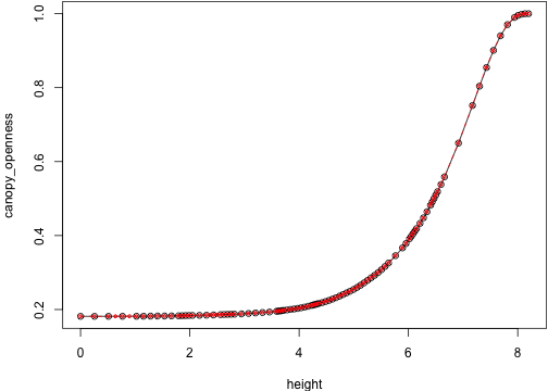
show_env(idx2 + 10)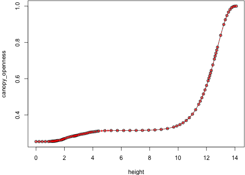
show_env(idx2 + 15)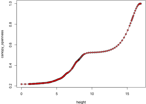 that difference persists:
show_env(idx2 + 20)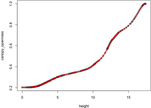
show_env(idx2 + 30)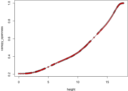
show_env(idx2 + 40)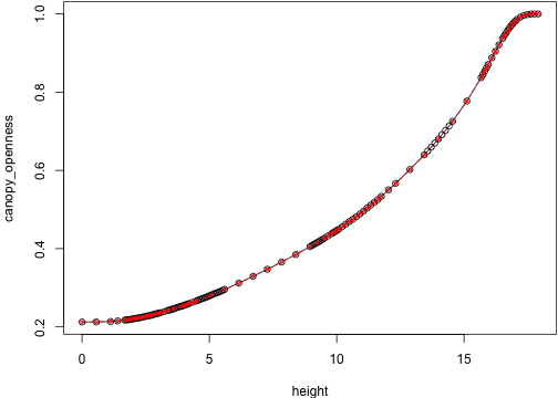
show_env(length(env_0))