-
Notifications
You must be signed in to change notification settings - Fork 182
#2 Ubuntu Theme Refresh: why and how?
Unlike Ubuntu's default applications - which stayed gtk based throughout the years - its desktop environment changed from the upstream gnome desktop environment to the canonical made unity desktop environment. Yet since 17.10 Ubuntu is back at GNOME and with this change the decision was made to stay as close to the upstream GNOME DE as possible.
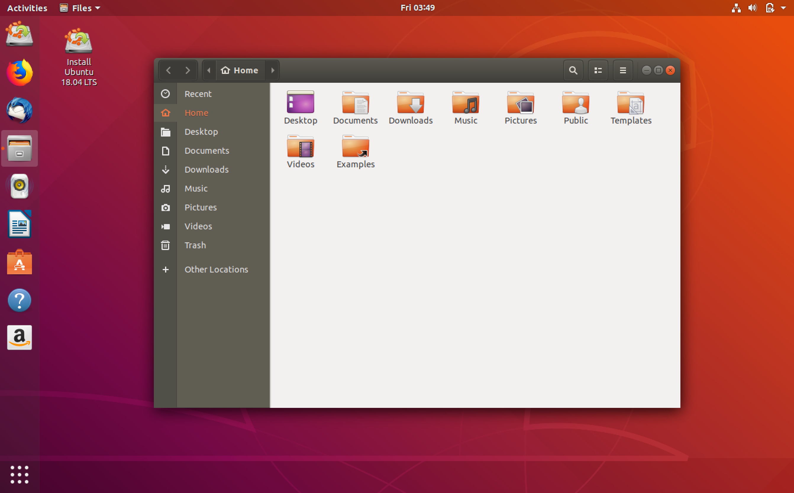
This decision was followed closely with the exception to include a customized dash-to-dock-gnome-extension, to utilize the popular features of the Ubuntu dock from unity7 and the user desire to include the popular black and orange color combination in form of the ambiance theme. The branding theme Ubuntu grown popular with.
Since eight years Ubuntu uses the ambiance theme:
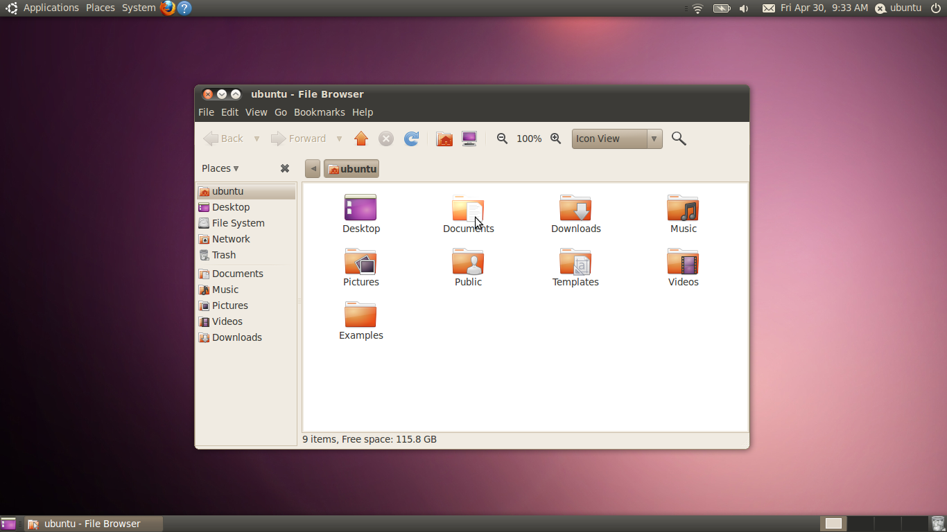
Ubuntu 10.04 with the ambiance gtk theme and the humanity icon theme:

Although the underlying gtk changed a lot, ambiance and the icon theme adapted to that. With
the base dark color as a window title bar background color:
a base light color for window backgrounds:
and the classic ubuntu orange we know from ambiance as an accent color:
Though the ambiance gtk theme brought the "Ubuntu feel" to the GNOME shell and the design ideas still work, in terms of usability, most of it's design metaphors started to look a bit antiquated.
- The header bar uses a gradient
- the buttons use a gradient and a very deep press effect
- the colors look rather soft or "washed out"
- there are not many colors and orange is used for many things including selection of elements, text, radio buttons and checkboxes
Most popular user interfaces followed the general trend to utilize a rather flat surface and soft effects for buttons or other control elements, including Unity8.
During the Artful development cycle (17.10) Didier Roche was blogging about the Fit and Finish sprint where people who were experienced with CCS/themeing were invited to help out with the transistion back to Gnome. The goal was to fix inconsistencies, performance, behavioural or visual issues, but a general wish in the community arose to bring a fresh, modern and sharp look to Ubuntu. This was probably because the community followed the long developed but sadly discontinued creation of Unity8 and it's very popular design ideas.
Thus a call was made - to participate in the creation of the new default GTK3&GNOME Shell Theme for Ubuntu.
Starting in design discussions and design mock-up threads on the community hub, one of the more or less set portions of extracted design were
-
use and improve the Suru Icon Theme with the Freedesktop compatible Suru Icon Theme as a starting point:


-
orientate at Unity8 were it makes sense and fits into GNOME
-
Use the color palette from the vanilla framework made by canonical and the colors from the Ubuntu brand as a starting point
While upstream is clearly doing a marvelous job with design, not everything fits exactly to the visual design language of Ubuntu and Canonical. After several iterations of modifying the upstream themes quiet heavily, we've ended with a less invasive approach which is described on this wiki page.


