ReactNative: Native Styled Dialogs (Android/iOS)
If this project has helped you out, please support us with a star 🌟
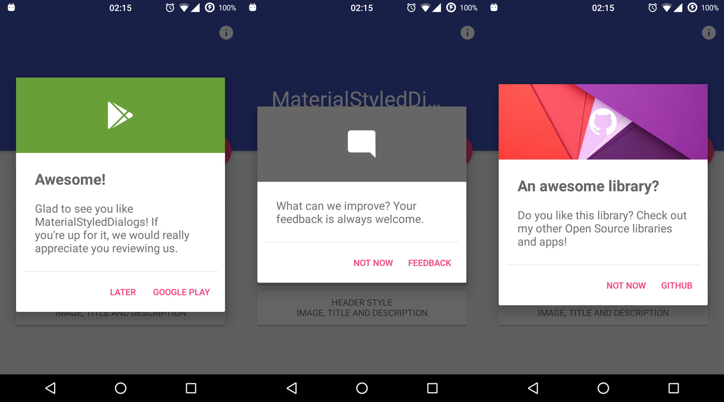
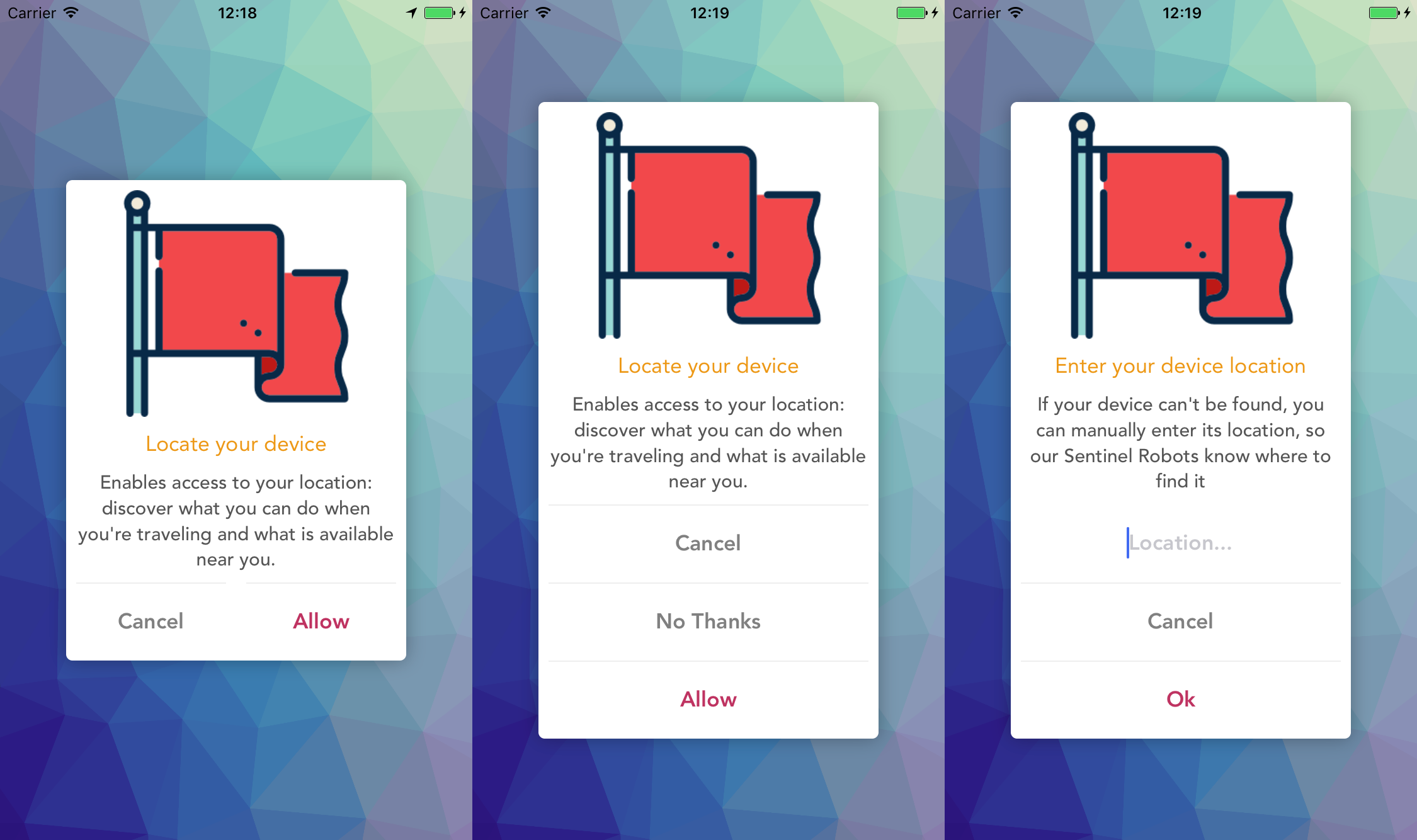
This library shows a beautiful and customizable designed dialog with header.
| Android: MaterialStyledDialogs |
|---|
 |
| iOS: PMAlertController |
|---|
 |
$ yarn add react-native-styled-dialogs
RN60 above please use
react-native-styled-dialogsV1 and above
- iOS
iOS Prerequisite: Please make sure
CocoaPodsis installed on your system
- Add the following to your `Podfile` -> `ios/Podfile` and run pod update:
  use_native_modules!

  pod 'RNStyledDialogs', :path => '../node_modules/react-native-styled-dialogs/ios'

  use_frameworks!

  pod 'PMAlertController', :git => 'https://github.com/prscX/PMAlertController', :branch => 'swift-version-fix'

  post_install do |installer|
    installer.pods_project.targets.each do |target|
      if target.name.include?('PMAlertController')
        target.build_configurations.each do |config|
          config.build_settings['SWIFT_VERSION'] = '4.2'
        end
      end
    end
  end
- Android
RN60 below please use
react-native-styled-dialogswV.0.*
$ react-native link react-native-styled-dialogs
- Android
Library id supported SDK 25 > above
Please add below snippet into your app build.gradle
allprojects {
    repositories {
        mavenLocal()
        jcenter()
        maven {
            url "https://jitpack.io"
        }
    }
}-
iOS
-
After
react-native link react-native-styled-dialogs, please verifynode_modules/react-native-styled-dialogs/ios/containsPodsfolder. If does not exist please executepod installcommand onnode_modules/react-native-styled-dialogs/ios/, if any error => trypod repo updatethenpod install -
After verification, open your project and create a folder 'RNStyledDialogs' under Libraries.
-
Drag
node_modules/react-native-styled-dialogs/ios/pods/Pods.xcodeprojectinto RNStyledDialogs, as well as the RNStyledDialogs.xcodeproject if it does not exist. -
Add the
PMAlertController.frameworkinto your project'sEmbedded Binariesand make sure the framework is also in linked libraries. -
Go to your project's
Build Settings -> Framework Search Pathand set$(inherited) to recursive.
-
import RNStyledDialogs from 'react-native-styled-dialogs';

RNStyledDialogs.Show({
  title: "Awesome!",
  description:
    "Glad to you like RNStyledDialogs! If you are up for it, we would like to appreciate you receiving us.",
  positiveText: "Go",
  neutralText: "Close",
  negativeText: "Later",
  onPositive: () => { },
  onNeutral: () => { },
  onNegative: () => { },
  onCancellable: () => { }
});- Props: Generic
| Prop | Type | Default | Note |
|---|---|---|---|
title |
string |
Specify title on dialogs | |
description |
string |
Specify description on dialog | |
positiveText |
string |
Specify positive button text | |
neutralText |
string |
Specify neutral button text | |
negativeText |
string |
Specify positive negative button text | |
headerBackgroundColor |
string - HEX COLOR |
#FFFFFF |
Specify header background color |
headerIcon |
string |
Specify header icon | |
dialogAnimation |
bool |
true |
Specify dialog animation (enable/disable) |
darkerOverlay |
bool |
false |
Specify dialog overlay (enable/disable) |
cancelable |
bool |
Specify cancelable of dialog behaviour (enable/disable) | |
autoDismiss |
bool |
false |
Specify dialog should get automatically dismiss or not (enable/disable) |
onPositive |
func |
Specify positive click callback function | |
onNeutral |
bool |
Specify netural click callback function | |
onNegative |
bool |
Specify negative click callback function | |
onCancellation |
bool |
true |
Specify cancellation callback function |
- Props: Android
| Prop | Type | Default | Note |
|---|---|---|---|
headerBackgroundImage |
string |
Specify header background image | |
headerTitle |
string |
Specify header title | |
headerIconAnimation |
bool |
true |
Specify header icon animation (enable/disable) |
scrollable |
bool |
false |
Specify description scrollable (enable/disable) |
maxLines |
number |
5 |
Specify description max number of lines |
- Props: iOS
| Prop | Type | Default | Note |
|---|---|---|---|
positiveTextColor |
string - HEX COLOR |
Specify positive button text color | |
positiveBackgroundColor |
string - HEX COLOR |
#FFFFFF |
Specify positive button background color |
neutralTextColor |
string - HEX COLOR |
Specify neutral button text color | |
neutralBackgroundColor |
string - HEX COLOR |
#FFFFFF |
Specify neutral button background color |
negativeTextColor |
string - HEX COLOR |
Specify negative button text color | |
negativeBackgroundColor |
string - HEX COLOR |
#FFFFFF |
Specify negative button background color |
Note: Since we are using native libraries, we have not found a solution in order to render RN Images in production, therefore please copy all your image assets in platform specific folders:
- Android: Please copy your image assets in app resource drawable folder
- iOS: Please copy your image assets in app resources folder
Please refer example application for the image usage.
- Android: Android: MaterialStyledDialogs
- iOS: iOS: PMAlertController
Have an idea? Found a bug? Please raise to ISSUES. Contributions are welcome and are greatly appreciated! Every little bit helps, and credit will always be given.
If you are using this library in one of your projects, add it in this list below. ✨
This library is provided under the Apache License.
RNStyledDialogs @ prscX
I open-source almost everything I can, and I try to reply everyone needing help using these projects. Obviously, this takes time. You can integrate and use these projects in your applications for free! You can even change the source code and redistribute (even resell it).
However, if you get some profit from this or just want to encourage me to continue creating stuff, there are few ways you can do it:
-
Starring and sharing the projects you like 🚀
-
If you're feeling especially charitable, please follow prscX on GitHub.
Thanks! ❤️
prscX.github.io
</ Pranav >


