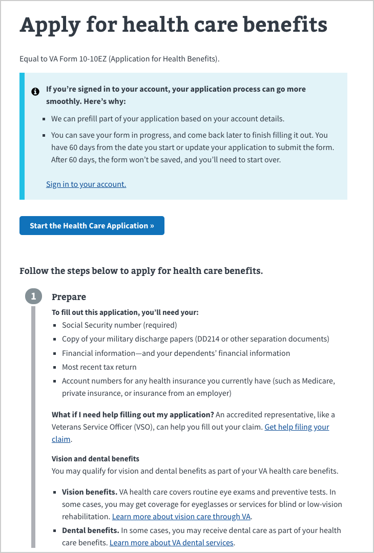
List of Available of Form Features
The following features are currently in the stable release of the library. See below for screenshots and more information about each of these features.
For additional information about how to implement these features in your form, please reference "Available form features and usage guidelines" in the technical documentation.
| List Number | Feature | Description |
|---|---|---|
| 1 | Form Instructions | Provide important information, warnings, or step-by-step instructions |
| 2 | Form Footer | Footer on every page of form (if multi-page) |
| 3 | Progress Bar | Non-interactive, sectioned progress bar which indicates to the user how much of a multi-chapter or multi-page form they've completed |
| 4 | Title | Title of Form |
| 5 | Subtitle | Appears below title of form |
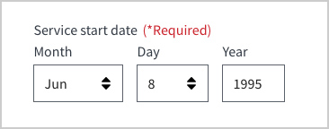
| 6 | Date | Date picker with validations |
| 7 | Alerts | Indicate a warning, an error, or contextual information. Many colors and icons. |
| 8 | Hidden Contextual Information | Hide and show contextual information |
| 9 | Radio Button Group | User selects one option from a group |
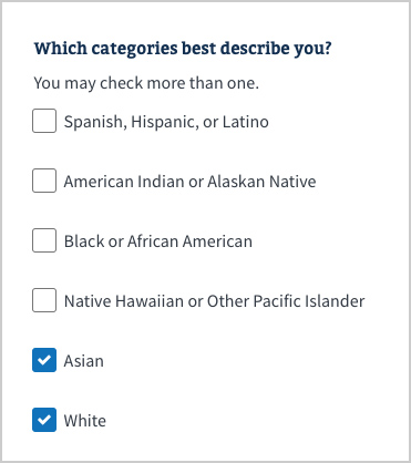
| 10 | Checkbox Group | User selects any number of options from a group |
| 11 | Contextual Error Message | Field validation, including option for custom message |
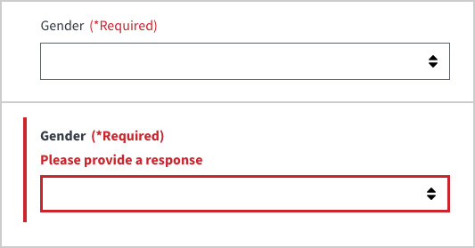
| 12 | Required Field | Require any field. Validation is included. |
| 13 | Action Buttons | Section navigation (Proceed / Return) or Submit Form |
| 14 | Password | Description TBD |
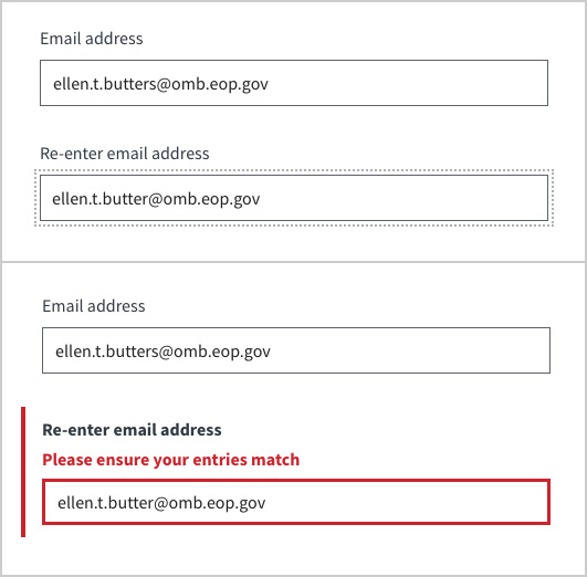
| 15 | Password (or any duplicate field) Validation | User enters duplicate data in two field. Validation included. |
| 16 | Conditional Form Fields | Subsequent questions will appear only if the user provides particular answer |
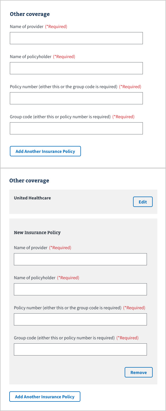
| 17 | Sequential Duplicate Form Groups | Collect multiple items with the same form questions |
| 18 | Linear Form Sections | Break form into sections. Automatically tied to Progress Bar (#3) |
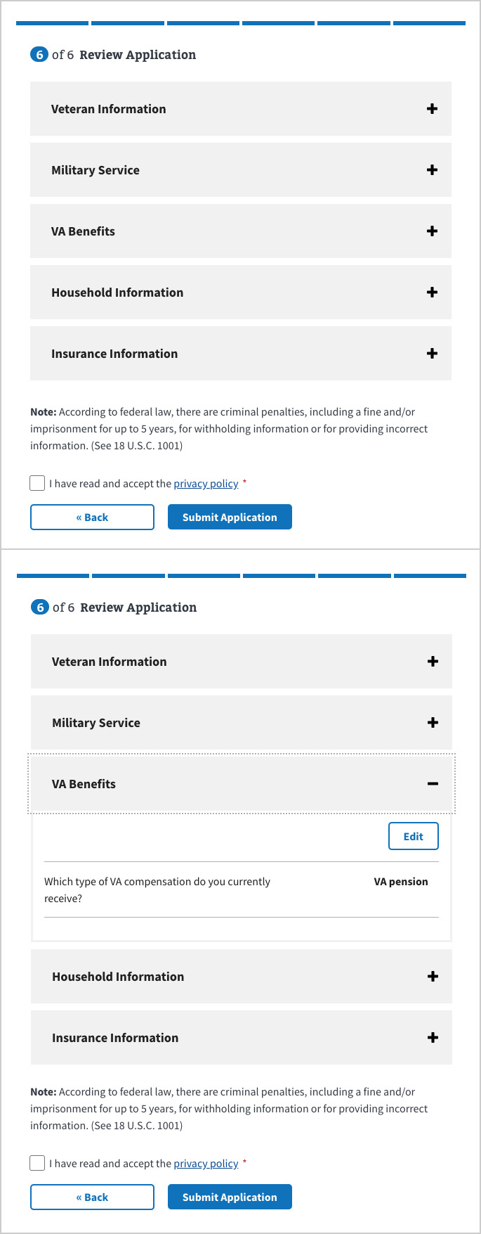
| 19 | Review Page | User can edit all their entered data at end of form. Validation included. |
| 20 | Required Checkbox Before Form Submission | User must read a text and validate reading it. Validation included. |
This widget allows you to provide important information, warnings, or step-by-step instructions to users before they fill out a form.
This widget appears at the bottom of every page of a multi-page form. It is not required.

This widget indicates to the user where they are in the process of the form. It includes a non-interactive, sectioned progress bar, a number to indicate how many pages there are within each section, and a title of that section.


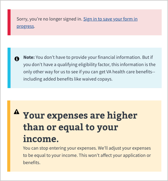
This feature can be used in several color variations, with or without icons, to indicate a warning, an error, or contextual information.
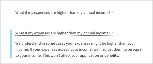
8. Hidden Contextual Information
This feature hides contextual info so that the user is not distracted by it unless they don't understand the question.
A group of options where the user can only select a single item.

A group of options where the user can select multiple items.
This indicates to the user that they have either not filled out a required field or they have not done so within the form's parameters. You can set a custom error message to help the user progress with the form.
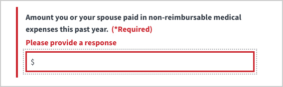
You can require a user to fill out any discrete form item. If user does not fill the item, they will automatically get an contextual error message (see above).
You can use buttons to proceed to another form section, return to a previous form section, or submit the form.

When you need a user to re-enter the same information (e.g. password or email) in subsequent form fields and need to validate that they correctly entered that info, use this feature.
You can set follow up questions to appear only if the user answers a form question a particular way.
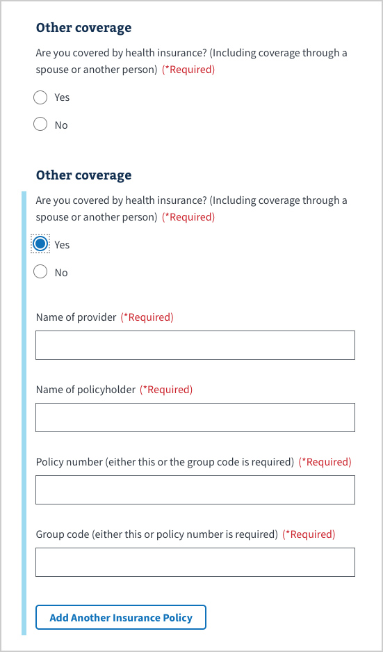
When you need to collect multiple items with the same form questions, such as Addresses in a time period, Jobs in a time period, or Employment in a time period, you can use this feature.
When you have a long form, or a form that has a lot of conditional questions, you can break up your form into sections that make it less overwhelming for users. The sections you designate will automatically correspond to the Progress Bar feature (see #3 above).
When you build a form with more than one section (shown by the segments in a progress bar), the review page lets users edit all of their entered form data without having to go back one page at a time.
If your form requires a user to indicate they have read Terms & Conditions, a Privacy Policy, or any other text before submitting the form, you can use this feature. It includes a checkbox and short-form text that can include relevant link/s to the full text on separate page/s on your site.
