Material Charts is a Flutter package designed to offer versatile, customizable chart components that adapt to a variety of use cases. It supports Line Charts, Pie Charts, Bar Charts, CandleStick Charts, and Gantt Charts, with extensive customization, smooth animations, and real-time data updates.
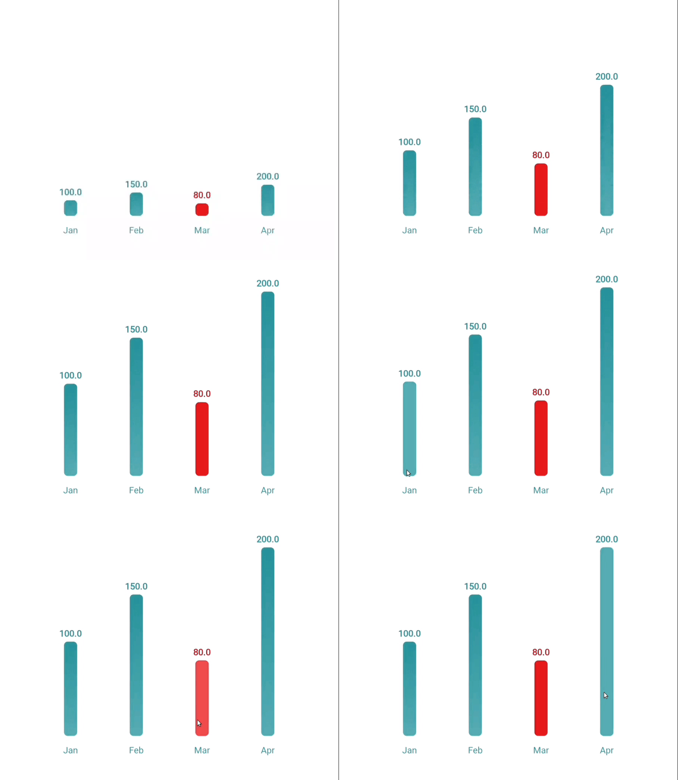
A beautiful, interactive, and animated bar chart, ideal for visualizing discrete data categories and comparisons.
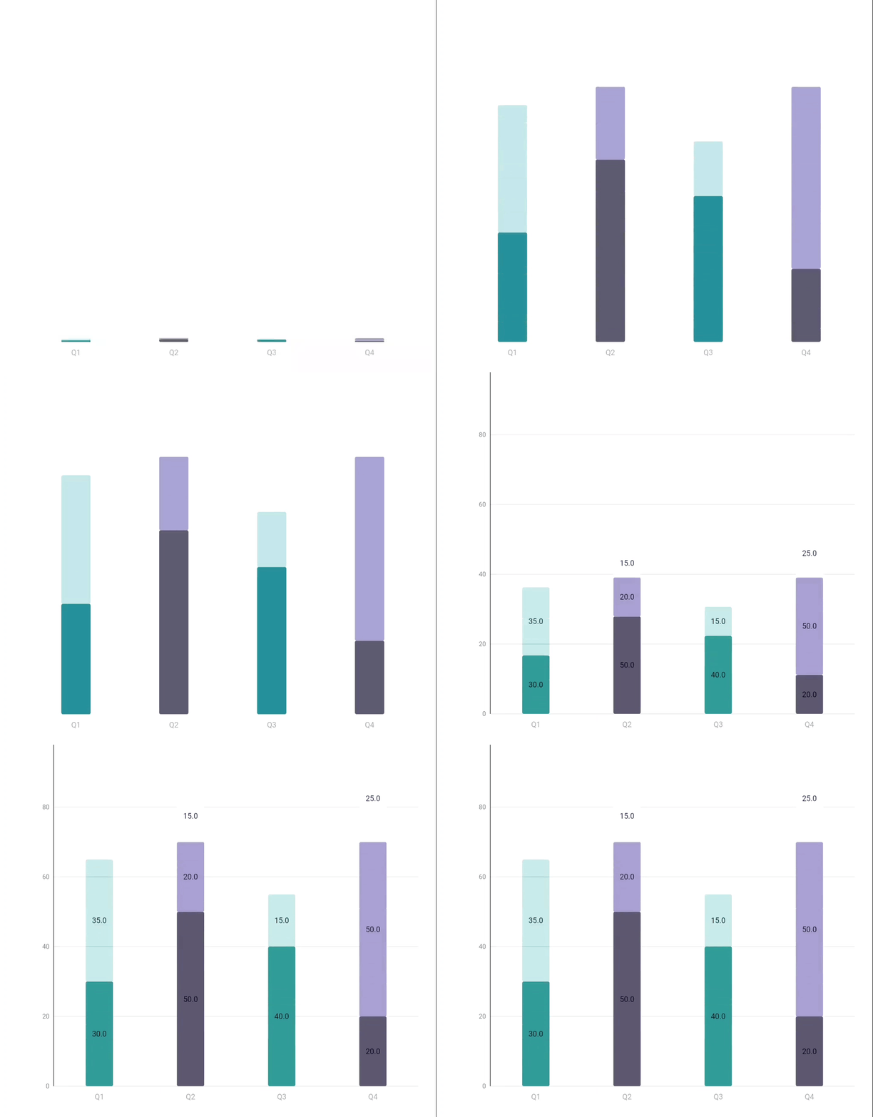
A versatile bar chart that visually represents comparisons, progress, featuring customizable colors and interactive elements.
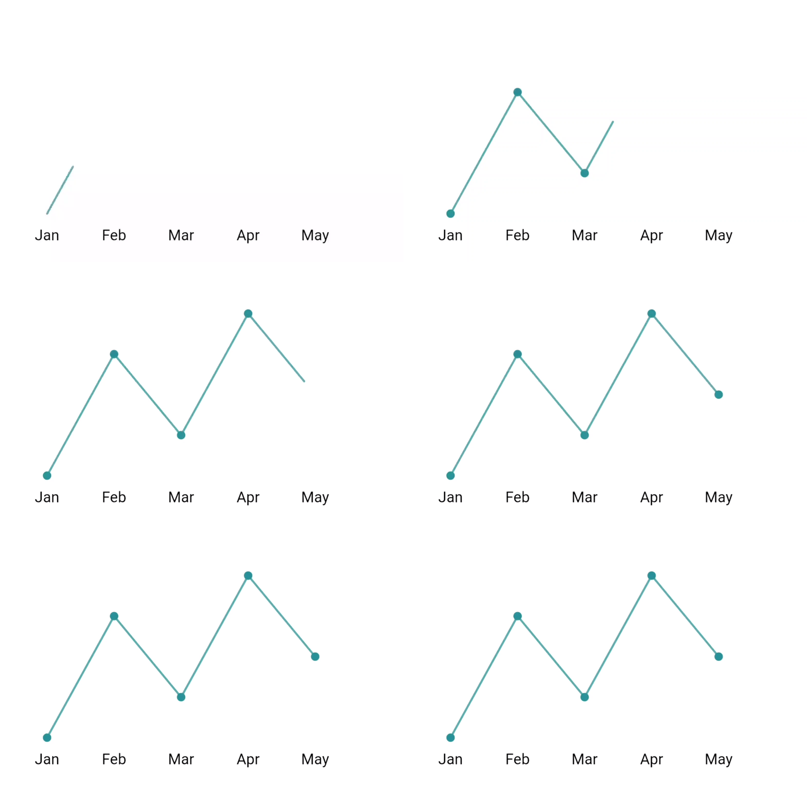
An animated line chart with customizable styling, perfect for showing trends and time series data.
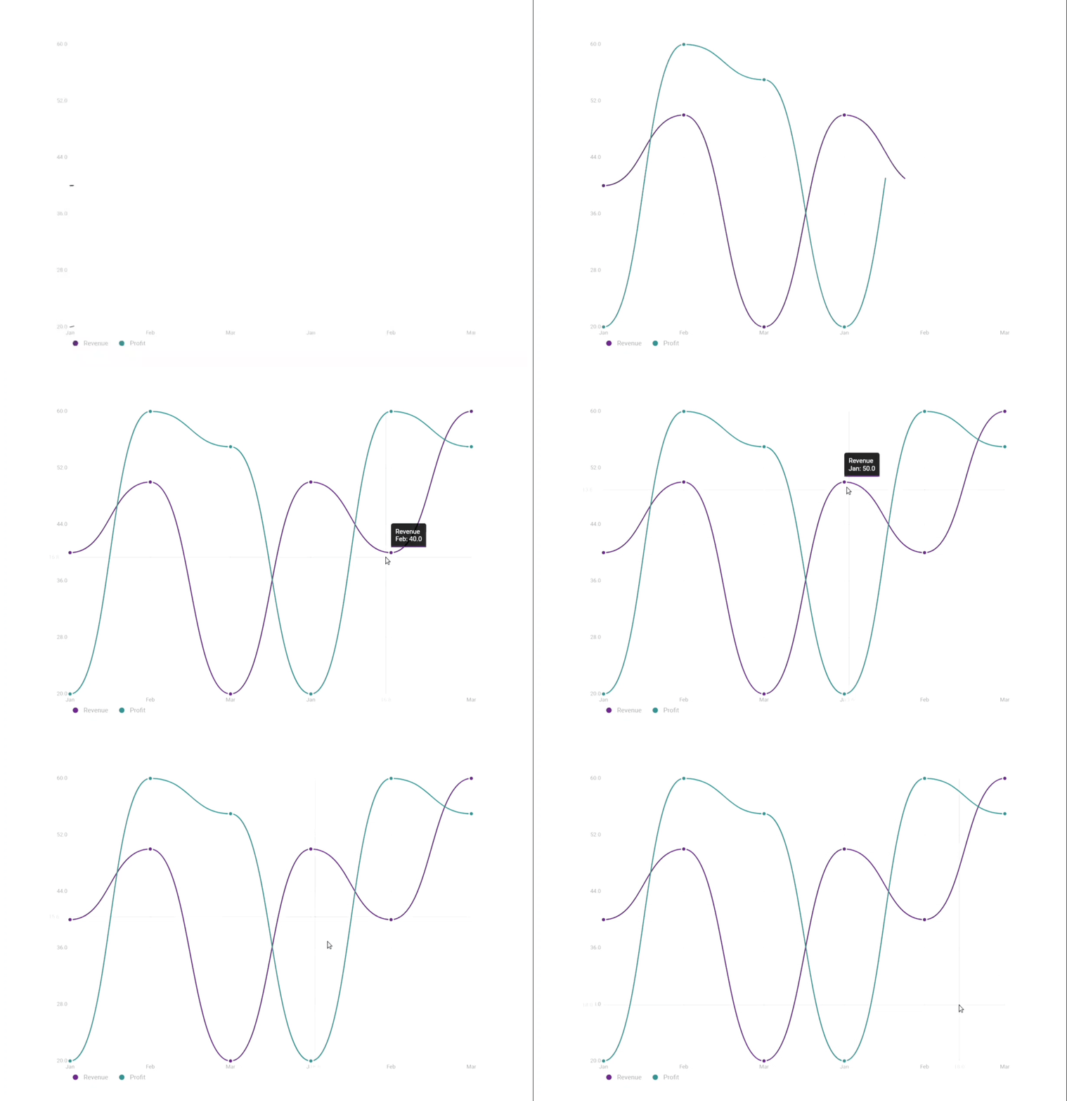
A customizable Flutter widget for displaying multiple line series in a chart, with support for tooltips, legends, animations, and interactions like zoom and pan.
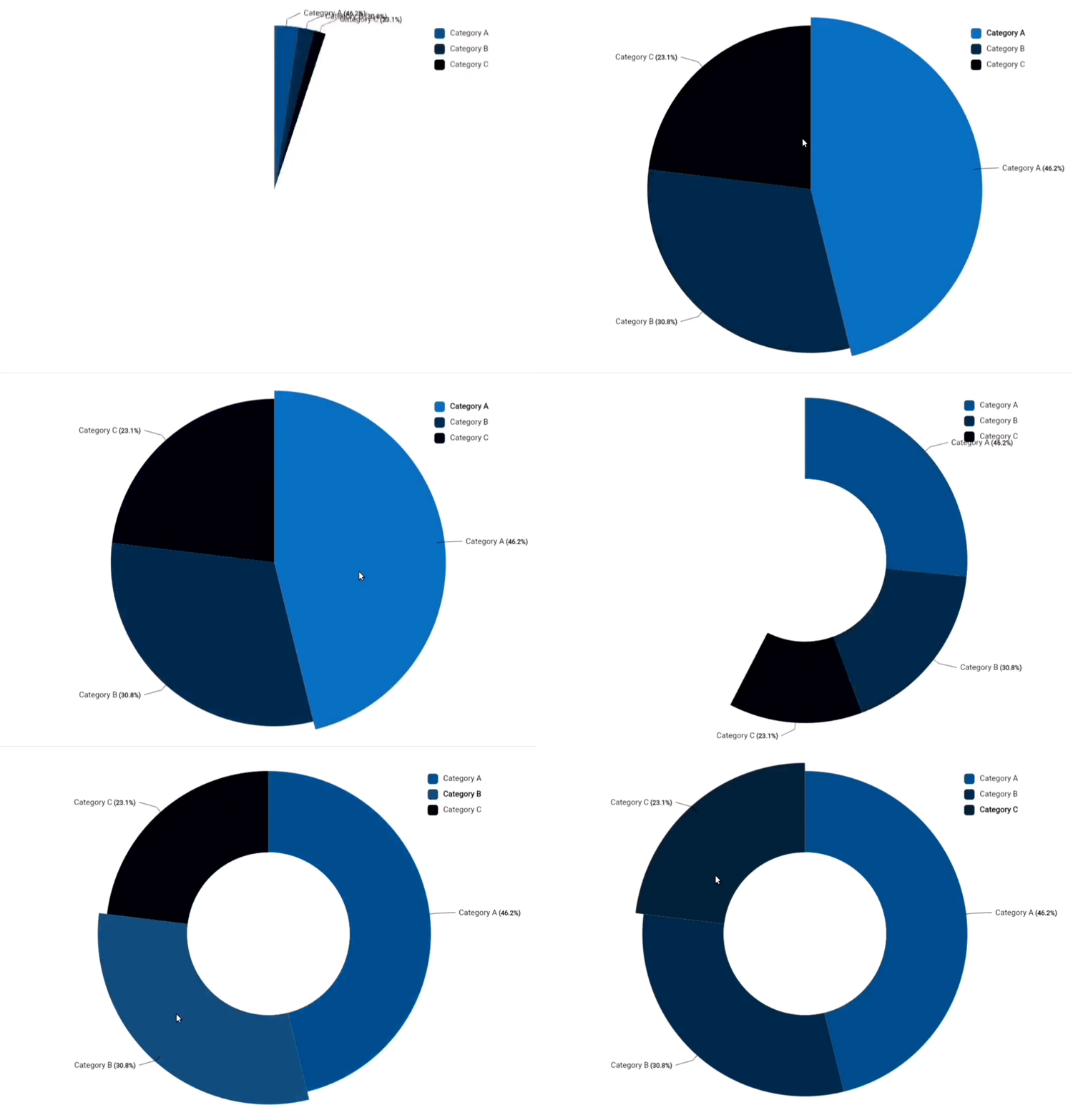
A customizable Flutter widget for displaying a pie chart with multiple segments, supporting animations, interactivity, and customizable styling options.
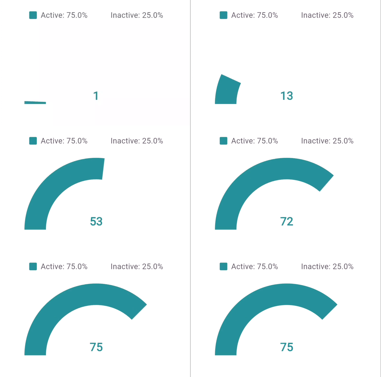
A customizable progress meter in a hollow semi-circle format, ideal for displaying percentages and progress.
A versatile Gantt chart that visually represents task timelines and progress, featuring customizable colors and interactive elements.
 |
 |
|---|
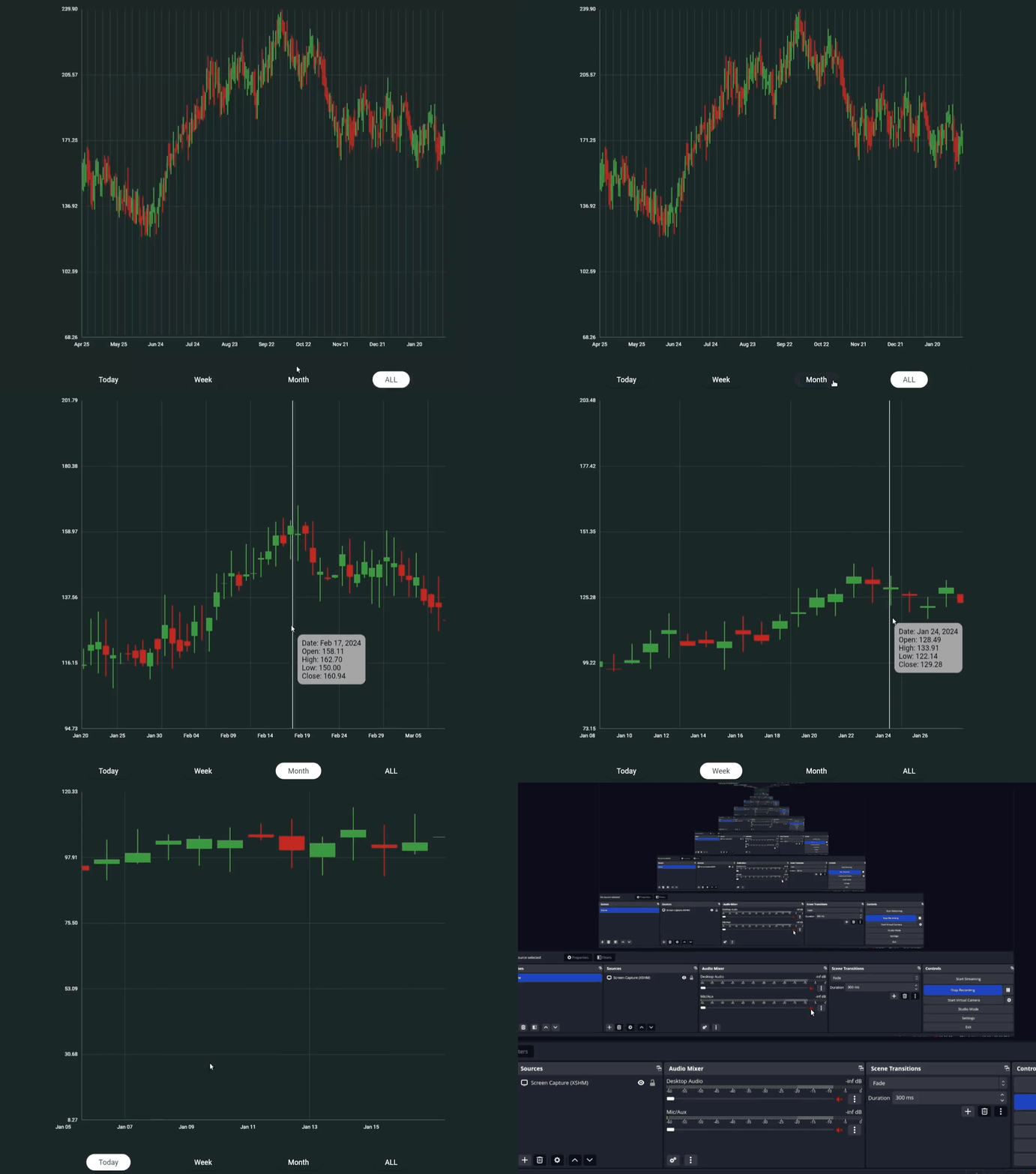
A Flutter widget that represents financial data in the form of candlestick charts, suitable for visualizing stock price movements over time.
- 🎨 Material Design aesthetics
- ✨ Smooth animations with configurable duration and curves
- 📊 Responsive and adaptive layouts
- 🎭 Customizable color schemes
- 💫 Animation completion callbacks
- 📱 Mobile-friendly design
- ♿ Accessibility support
- 📊 Animated bars with hover and tap interactions
- 🏷️ Customizable bar colors and labels
- 📏 Optional gridlines and padding
- 🕒 Animation support with curve control
- 🌈 Gradient or solid color options
- 📊 Dynamic Stacking
- 🎨 Customizable Segment Colors
- 🏷️ Segment Labels
- 📏 Adjustable Bar Widths and Spacing
- 📅 Animation Support
- 📏 Optional Gridlines
- 📐 Padding Control
- 🌈 Gradient and Solid Color Options
- 🛠️ Custom Y-axis Configuration
- 📊 Responsive Sizing
- 📈 Interactive data points
- 📏 Optional gridlines
- 🏷️ Customizable labels
- 📊 Automatic scaling
- 🎯 Point highlighting
- 📈 Multiple Series Support
- ✨ Smooth Line Transitions
- 🎨 Customizable Color Palettes
- 🔍 Interactive Tooltips
- 📊 Clickable Legends for Series Selection
- 🗺️ Panning and Zooming Capabilities
- 📏 Grid Lines for Easy Reading
- 🔄 Animated Drawing of Lines
- 🗓️ Crosshair for Precision Tracking
- 📅 X and Y-Axis Label Customization
- 📊 Segment Visualization
- 🎨 Customizable Colors
- 🔄 Smooth Animations
- 📏 Interactive Hover Effects
- 🏷️ Dynamic Labels and Values
- 📋 Legend Support
- 🔗 Connector Lines
- 📅 Animation Duration Customization
- 🗺️ Label Positioning
- ♿ Accessibility Features
- 📊 Percentage display
- 🎯 Legend support
- 📏 Adjustable hollow radius
- 🎨 Active/inactive segment styling
- 📝 Custom formatters
- 🗓️ Task Timeline Visualization
- 📊 Interactive Task Bars
- 🏷️ Customizable Labels
- 🔄 Drag-and-Drop Functionality
- 🎨 Custom Color Schemes
- 📅 Date Range Filtering
- 🕒 Animation Support
- ♿ Accessibility Support
- 🎯 Highlighting Current Tasks
- 🌟 Custom Milestones
- 📊 Interactive Candlestick Visualization
- 📈 Bullish and Bearish Color Coding
- 🎨 Customizable Candle and Wick Width
- 📅 Date and Price Axis Configuration
- 🌈 Tooltip Styling Options
- 🔄 Animation Support with Curved Transitions
- 📏 Adjustable Spacing Between Candles
- 📊 Optional Gridlines for Clarity
- 📏 Configurable Y-axis and X-axis Dimensions
- 🖌️ Custom Price and Date Formatting
- 📉 Vertical Line Indicators
Add the dependency to your pubspec.yaml:
dependencies:
material_charts: latest_versionimport 'package:flutter/material.dart';
import 'material_charts/bar_chart.dart';
MaterialBarChart(
data: [
BarChartData(value: 30, label: 'Apples', color: Colors.red),
BarChartData(value: 70, label: 'Oranges'),
BarChartData(value: 50, label: 'Bananas', color: Colors.yellow),
],
style: BarChartStyle(
gridColor: Colors.grey.shade300,
backgroundColor: Colors.white,
labelStyle: TextStyle(fontSize: 14, color: Colors.black),
valueStyle: TextStyle(fontSize: 12, color: Colors.blueGrey),
barSpacing: 0.3,
cornerRadius: 6.0,
gradientEffect: true,
gradientColors: [Colors.purple, Colors.cyan],
animationDuration: Duration(milliseconds: 1200),
),
showGrid: true,
showValues: true,
);| Property | Type | Description | Default |
|---|---|---|---|
value |
double |
Value of the bar | Required |
label |
String |
Name of the bar | Required |
color |
Color? |
Color of the bar | Colors.blue |
| Property | Type | Description | Default |
|---|---|---|---|
gridColor |
Color |
Color of the grid | Colors.grey |
backgroundColor |
Color |
Chart background color | Colors.white |
labelStyle |
TextStyle? |
Text style for bar labels | null |
valueStyle |
TextStyle? |
Text style for bar values | null |
barSpacing |
double |
Spacing between bars (0.0 - 1.0) | 0.2 |
cornerRadius |
double |
Corner radius of bars | 4.0 |
barColor |
Color |
Default color for bars | Colors.blue |
gradientEffect |
bool |
Enables gradient on bars | false |
gradientColors |
List<Color>? |
Colors for gradient effect | null |
animationDuration |
Duration |
Animation duration for the bars | Duration(milliseconds: 1500) |
animationCurve |
Curve |
Animation curve for transitions | Curves.easeInOut |
import 'package:flutter/material.dart';
import 'package:material_charts_tests/material_charts.dart';

final data = [
  const StackedBarData(
    label: 'Q1',
    segments: [
      StackedBarSegment(
          value: 30,
          color: Color.fromRGBO(46, 142, 149, 1),
          label: 'Product A'),
      StackedBarSegment(
          value: 35,
          color: Color.fromRGBO(46, 142, 149, 0.342),
          label: 'Product B'),
    ],
  ),
  const StackedBarData(
    label: 'Q2',
    segments: [
      StackedBarSegment(
          value: 50, color: Color(0xFF605e70), label: 'Product A'),
      StackedBarSegment(
          value: 20, color: Color(0xFFa19dc7), label: 'Product B'),
      StackedBarSegment(
          value: 15, color: Color(0xFFf3f2fe), label: 'Product C'),
    ],
  ),
  const StackedBarData(
    label: 'Q3',
    segments: [
      StackedBarSegment(
          value: 40,
          color: Color.fromRGBO(46, 142, 149, 1),
          label: 'Product A'),
      StackedBarSegment(
          value: 15,
          color: Color.fromRGBO(46, 142, 149, 0.342),
          label: 'Product B'),
    ],
  ),
  const StackedBarData(
    label: 'Q4',
    segments: [
      StackedBarSegment(
          value: 20, color: Color(0xFF605e70), label: 'Product A'),
      StackedBarSegment(
          value: 50, color: Color(0xFFa19dc7), label: 'Product B'),
      StackedBarSegment(
          value: 25, color: Color(0xFFf3f2fe), label: 'Product C'),
    ],
  ),
  // Add more StackedBarData items...
];
MaterialStackedBarChart(
  showGrid: true,
  horizontalGridLines: 5,
  showValues: true,
  data: data,
  width: 400,
  height: 300,
  style: StackedBarChartStyle(
    gridColor: Colors.black,
    // showSegmentLabels: true,
    cornerRadius: 3,
    barSpacing: .7,
    valueStyle: const TextStyle(
      // backgroundColor: Color.fromARGB(68, 255, 255, 255),
      color: Colors.black87,
    ),
    labelStyle: const TextStyle(
      color: Colors.grey,
    ),
    yAxisConfig: YAxisConfig(
      minValue: 0,
      maxValue: 100,
      divisions: 5,
      showGridLines: false,
      labelFormatter: (value) => '${value.toInt()}',
      labelStyle: TextStyle(
        fontSize: 12,
        color: Colors.grey[600],
      ),
    ),
  ),
);
| Class | Description |
|---|---|
StackedBarSegment |
Represents a single segment in a stacked bar, defined by its value, color, and an optional label. |
StackedBarData |
Represents the complete data for a single bar, consisting of multiple segments with a common label. |
YAxisConfig |
Configuration class for customizing the Y-axis, including min/max values, grid lines, and label styles. |
StackedBarChartStyle |
Configuration class for customizing the appearance of the stacked bar chart, including colors, spacing, and animations. |
| Property | Type | Description |
|---|---|---|
value |
double |
The numerical value of the segment contributing to the total. |
color |
Color |
The color used to render this segment in the chart. |
label |
String? |
An optional label to describe the segment, used for tooltips/legends. |
| Property | Type | Description |
|---|---|---|
label |
String |
Label describing the entire bar, often used for X-axis/legend. |
segments |
List<StackedBarSegment> |
List of segments that make up this bar. |
totalValue |
double |
Computes the total value by summing all segment values. |
| Property | Type | Description |
|---|---|---|
minValue |
double? |
Minimum value displayed on the Y-axis (default: 0). |
maxValue |
double? |
Maximum value displayed on the Y-axis (defaults to largest total). |
divisions |
int |
Number of divisions on the Y-axis (default: 5). |
showAxisLine |
bool |
Whether to display the vertical axis line (default: true). |
showGridLines |
bool |
Whether to display horizontal grid lines (default: true). |
labelStyle |
TextStyle? |
Text style for Y-axis labels. |
axisWidth |
double |
Width allocated for rendering the Y-axis (default: 50.0). |
labelFormatter |
String Function(double) |
Custom formatter for Y-axis values. |
| Property | Type | Description |
|---|---|---|
gridColor |
Color |
Color of the grid lines (default: Colors.grey). |
backgroundColor |
Color |
Background color of the chart container (default: Colors.white). |
labelStyle |
TextStyle? |
Text style for bar labels. |
valueStyle |
TextStyle? |
Text style for value labels displayed on segments. |
barSpacing |
double |
Spacing between bars as a fraction (default: 0.2). |
cornerRadius |
double |
Corner radius applied to bars (default: 4.0). |
animationDuration |
Duration |
Duration of the animation when rendering bars (default: 1500ms). |
animationCurve |
Curve |
Animation curve applied during rendering (default: Curves.easeInOut). |
yAxisConfig |
YAxisConfig? |
Optional Y-axis configuration for detailed control. |
import 'package:flutter/material.dart';

void main() => runApp(MyApp());

class MyApp extends StatelessWidget {
  @override
  Widget build(BuildContext context) {
    return MaterialApp(
      home: Scaffold(
        appBar: AppBar(title: Text('Line Chart Example')),
        body: LineChartWidget(),
      ),
    );
  }
}

class LineChartWidget extends StatelessWidget {
  final List<ChartData> data = [
    ChartData(value: 10, label: 'Jan'),
    ChartData(value: 30, label: 'Feb'),
    ChartData(value: 50, label: 'Mar'),
    ChartData(value: 40, label: 'Apr'),
  ];

  final LineChartStyle style = LineChartStyle(
    lineColor: Colors.green,
    pointColor: Colors.red,
    strokeWidth: 3.0,
    animationDuration: Duration(milliseconds: 1000),
    animationCurve: Curves.fastOutSlowIn,
  );

  @override
  Widget build(BuildContext context) {
    return Center(
      child: Text(
        'Line Chart Placeholder',
        style: TextStyle(fontSize: 18, fontWeight: FontWeight.bold),
      ),
    );
  }
}| Property | Type | Description | Default |
|---|---|---|---|
value |
double |
Value of the data point | Required |
label |
String |
Label associated with the data point | Required |
| Property | Type | Description | Default |
|---|---|---|---|
lineColor |
Color |
Color of the chart line | Colors.blue |
gridColor |
Color |
Color of the chart grid | Colors.grey |
pointColor |
Color |
Color of the data points | Colors.blue |
backgroundColor |
Color |
Background color of the chart | Colors.white |
labelStyle |
TextStyle? |
Text style for labels | null |
strokeWidth |
double |
Width of the chart line | 2.0 |
pointRadius |
double |
Radius of the data points | 4.0 |
animationDuration |
Duration |
Duration of the line chart animation | Duration(milliseconds: 1500) |
animationCurve |
Curve |
Curve for animation transitions | Curves.easeInOut |
final series = [
    const ChartSeries(
      name: 'Revenue',
      dataPoints: [
        ChartDataPoint(value: 40, label: 'Jan'),
        ChartDataPoint(value: 50, label: 'Feb'),
        ChartDataPoint(value: 20, label: 'Mar'),
        ChartDataPoint(value: 50, label: 'Jan'),
        ChartDataPoint(value: 40, label: 'Feb'),
        ChartDataPoint(value: 60, label: 'Mar'),
      ],
      color: Color.fromRGBO(116, 46, 149, 1),
    ),
    const ChartSeries(
      name: 'Profit',
      dataPoints: [
        ChartDataPoint(value: 20, label: 'Jan'),
        ChartDataPoint(value: 60, label: 'Feb'),
        ChartDataPoint(value: 55, label: 'Mar'),
        ChartDataPoint(value: 20, label: 'Jan'),
        ChartDataPoint(value: 60, label: 'Feb'),
        ChartDataPoint(value: 55, label: 'Mar'),
      ],
      color: Color.fromRGBO(46, 142, 149, 1),
    ),
  ];

  final style = MultiLineChartStyle(
    backgroundColor: Colors.white,
    colors: [Colors.blue, Colors.green, Colors.red],
    smoothLines: true,
    showPoints: true,
    animation: const ChartAnimation(
      duration: Duration(milliseconds: 5000),
    ),
    tooltipStyle: const MultiLineTooltipStyle(
      threshold: 20,
    ),
    forceYAxisFromZero: false,
    crosshair: CrosshairConfig(
      enabled: true,
      lineColor: Colors.grey.withOpacity(0.5),
    ),
  );

  return MultiLineChart(
    series: series,
    style: style,
    height: 700,
    width: 800,
    enableZoom: true,
    enablePan: true,
    // startYAxisFromZero: true,
    onPointTap: (point) {
      print('Tapped point: ${point.value}');
    },
);| Class | Description |
|---|---|
ChartDataPoint |
Represents a single data point with a value, optional label, and color. |
MultiLineTooltipStyle |
Configures the appearance of tooltips shown on the chart. |
ChartSeries |
Represents a series of data points, with optional line smoothing, colors, and line width. |
MultiLineChartStyle |
Styling configuration for the chart, including colors, grid settings, and animations. |
_LegendItem |
Internal class representing a legend item with text and color. |
LegendPosition |
Enum defining the position of the legend (top, bottom, left, right). |
ChartAnimation |
Configures animation settings for the chart rendering. |
CrosshairConfig |
Configures crosshair display settings, including color, width, and label visibility. |
MultiLineChart |
The main widget for displaying multiple line series with interactive and styling options. |
| Property | Type | Description |
|---|---|---|
value |
double |
The Y-axis value of the data point. |
label |
String? |
Optional label associated with the data point. |
color |
Color? |
Optional color for the data point. |
| Property | Type | Description |
|---|---|---|
textStyle |
TextStyle |
Style for tooltip text. |
backgroundColor |
Color |
Background color for the tooltip. |
padding |
double |
Padding inside the tooltip. |
threshold |
double |
Distance threshold for showing tooltip. |
borderRadius |
double |
Radius for rounded tooltip corners. |
shadowColor |
Color |
Color of the tooltip shadow. |
shadowBlurRadius |
double |
Blur radius for tooltip shadow. |
indicatorHeight |
double |
Height of the indicator shown on tooltip hover. |
| Property | Type | Description |
|---|---|---|
name |
String |
Name of the series. |
dataPoints |
List<ChartDataPoint> |
List of data points in the series. |
color |
Color? |
Color of the series line. |
showPoints |
bool? |
Whether to show points on the line. |
smoothLine |
bool? |
Whether to smooth the line between points. |
lineWidth |
double? |
Width of the line. |
pointSize |
double? |
Size of points if showPoints is enabled. |
| Property | Type | Description |
|---|---|---|
colors |
List<Color> |
Colors used for multiple series. |
defaultLineWidth |
double |
Default width for series lines. |
defaultPointSize |
double |
Default size for data points. |
gridColor |
Color |
Color of grid lines. |
backgroundColor |
Color |
Background color for the chart area. |
labelStyle |
TextStyle? |
Style for axis labels. |
legendStyle |
TextStyle? |
Style for legend text. |
smoothLines |
bool |
Enable smooth lines for all series. |
padding |
EdgeInsets |
Padding around the chart. |
showPoints |
bool |
Whether to display points on lines. |
showGrid |
bool |
Whether to show grid lines. |
showLegend |
bool |
Whether to show the legend. |
gridLineWidth |
double |
Width of grid lines. |
horizontalGridLines |
int |
Number of horizontal grid lines. |
animation |
ChartAnimation |
Configuration for chart animations. |
legendPosition |
LegendPosition |
Position of the legend on the chart. |
crosshair |
CrosshairConfig? |
Configuration for crosshair display. |
forceYAxisFromZero |
bool |
Whether to start Y-axis from zero. |
tooltipStyle |
TooltipStyle |
Style configuration for tooltips. |
| Property | Type | Description |
|---|---|---|
duration |
Duration |
Duration of the animation for rendering. |
curve |
Curve |
Curve of the animation. |
enabled |
bool |
Whether to enable the animation. |
| Property | Type | Description |
|---|---|---|
lineColor |
Color |
Color of the crosshair line. |
lineWidth |
double |
Width of the crosshair line. |
enabled |
bool |
Whether to enable the crosshair. |
showLabel |
bool |
Whether to display labels on crosshair. |
labelStyle |
TextStyle? |
Style for crosshair labels. |
| Property | Type | Description |
|---|---|---|
series |
List<ChartSeries> |
List of series to display in the chart. |
style |
ChartStyle |
Styling configuration for the chart. |
height |
double? |
Height of the chart widget. |
width |
double? |
Width of the chart widget. |
onPointTap |
ValueChanged<ChartDataPoint>? |
Callback for point tap interaction. |
onChartTap |
ValueChanged<Offset>? |
Callback for tapping anywhere on the chart. |
enableZoom |
bool |
Enables zoom functionality on the chart. |
enablePan |
bool |
Enables pan functionality on the chart. |
final data = [
    PieChartData(
        value: 30,
        label: 'Category A',
        color: Color.fromARGB(255, 24, 86, 136)),
    PieChartData(
        value: 20, label: 'Category B', color: Color.fromARGB(255, 28, 60, 87)),
    PieChartData(
        value: 15, label: 'Category C', color: Color.fromARGB(255, 15, 27, 37)),
  ];

  return MaterialPieChart(
    data: data,
    width: 400,
    height: 300,
    padding: EdgeInsets.all(50),
    style: PieChartStyle(
      backgroundColor: const Color.fromARGB(255, 223, 219, 219),
      // holeRadius: 0.5, // Creates a donut chart
      showLabels: true,
      showValues: true,
      showLegend: true,
    ),
);| Class | Description |
|---|---|
PieChartData |
Represents a single segment of the pie chart, including value, label, and optional color. |
PieChartStyle |
Configures the appearance and behavior of the pie chart, including colors, labels, and animations. |
LabelPosition |
Enum defining the position of labels (inside or outside the pie segments). |
MaterialPieChart |
The main widget for rendering the pie chart with interactive and styling options. |
| Property | Type | Description |
|---|---|---|
data |
List<PieChartData> |
List of pie chart segments. |
width |
double |
Width of the pie chart widget. |
height |
double |
Height of the pie chart widget. |
style |
PieChartStyle |
Styling configuration for the pie chart. |
padding |
EdgeInsets |
Padding around the pie chart. |
onAnimationComplete |
VoidCallback? |
Callback for when the animation completes. |
interactive |
bool |
Whether the pie chart supports interactivity. |
| Property | Type | Description |
|---|---|---|
value |
double |
The value represented by the pie segment. |
label |
String |
The label associated with the pie segment. |
color |
Color? |
Optional color for the pie segment. |
| Property | Type | Description |
|---|---|---|
defaultColors |
List<Color> |
Default colors used for the pie segments. |
backgroundColor |
Color |
Background color for the pie chart. |
labelStyle |
TextStyle? |
Style for segment labels. |
valueStyle |
TextStyle? |
Style for segment values. |
startAngle |
double |
Starting angle for the first pie segment. |
holeRadius |
double |
Radius for a donut hole (0 for a full pie chart). |
animationDuration |
Duration |
Duration of the animation for rendering the chart. |
animationCurve |
Curve |
Curve of the animation. |
showLabels |
bool |
Whether to show labels on the segments. |
showValues |
bool |
Whether to show values on the segments. |
labelOffset |
double |
Offset distance for labels from the segments. |
showLegend |
bool |
Whether to display the legend. |
legendPadding |
EdgeInsets |
Padding around the legend. |
labelPosition |
LabelPosition |
Position of the labels (inside or outside). |
showConnectorLines |
bool |
Whether to show connector lines from segments to labels. |
connectorLineColor |
Color |
Color of the connector lines. |
connectorLineStrokeWidth |
double |
Width of the connector lines. |
| Property | Type | Description |
|---|---|---|
inside |
LabelPosition |
Label is displayed inside the pie segment. |
outside |
LabelPosition |
Label is displayed outside the pie segment. |
import 'package:flutter/material.dart';
import 'material_charts/hollow_semi_circle.dart';

MaterialChartHollowSemiCircle(
  percentage: 75,
  size: 200,
  style: ChartStyle(
    activeColor: Colors.green,
    inactiveColor: Colors.grey.shade300,
    percentageStyle: TextStyle(fontSize: 24, color: Colors.black),
    animationDuration: Duration(milliseconds: 1000),
    animationCurve: Curves.fastOutSlowIn,
  ),
  onAnimationComplete: () {
    print('Animation Completed');
  },
);| Property | Type | Description | Default |
|---|---|---|---|
percentage |
double |
The percentage value to display | Required |
size |
double |
Diameter of the chart | Required |
style |
ChartStyle |
Configuration for styling the chart | ChartStyle() |
onAnimationComplete |
VoidCallback? |
Callback invoked after animation completes | null |
| Property | Type | Description | Default |
|---|---|---|---|
activeColor |
Color |
Color for the active segment of the chart | Colors.blue |
inactiveColor |
Color |
Color for the inactive portion | Color(0xFFE0E0E0) |
textColor |
Color? |
Optional color for percentage text | null |
percentageStyle |
TextStyle? |
Style for percentage text | null |
legendStyle |
TextStyle? |
Style for the legend text | null |
animationDuration |
Duration |
Duration of the animation | Duration(milliseconds: 1500) |
animationCurve |
Curve |
Curve used for animation | Curves.easeInOut |
showPercentageText |
bool |
Whether to show the percentage text | true |
showLegend |
bool |
Whether to display a legend | true |
percentageFormatter |
String Function(double)? |
Formatter for percentage text | null |
legendFormatter |
String Function(String, double)? |
Formatter for legend entries | null |
import 'package:flutter/material.dart';
import 'package:material_charts_tests/material_charts.dart';

MaterialGanttChart exampleChart() {
  // Example timeline data points
  final timelineData = [
    GanttData(
      startDate: DateTime(2024, 1, 1),
      endDate: DateTime(2024, 1, 15),
      label: 'Project Start',
      description: 'Initial project planning phase',
      color: Colors.blue,
      icon: Icons.start,

      tapContent:
          'Additional details for the project start phase...', // Optional tap content
    ),
    GanttData(
      startDate: DateTime(2024, 1, 16),
      endDate: DateTime(2024, 1, 20),
      label: 'Kickoff Meeting',
      description: 'Project initiation and goal setting.',
      color: Colors.blue,
      icon: Icons.event,
    ),
    GanttData(
      startDate: DateTime(2024, 1, 20),
      endDate: DateTime(2024, 2, 1),
      label: 'Design Phase',
      description: 'UI/UX design and prototype creation.',
      color: Colors.orange,
      icon: Icons.design_services,
    ),
    GanttData(
      startDate: DateTime(2024, 2, 1),
      endDate: DateTime(2024, 3, 20),
      label: 'Development Phase',
      description: 'Implementation of core features.',
      color: Colors.green,
      icon: Icons.code,
    ),
    GanttData(
      startDate: DateTime(2024, 3, 21),
      endDate: DateTime(2024, 4, 5),
      label: 'Testing & QA',
      description: 'Bug fixing and quality checks.',
      color: Colors.red,
      icon: Icons.bug_report,
    ),
    GanttData(
      startDate: DateTime(2024, 4, 6),
      endDate: DateTime(2024, 4, 15),
      tapContent: "Tap",
      label: 'Release',
      description: 'Deployment and client delivery.',
      color: Colors.purple,
      icon: Icons.rocket_launch,
    ),
  ];

  // Timeline chart styling
  const style = GanttChartStyle(
    lineColor: Color.fromRGBO(96, 125, 139, 1),
    lineWidth: 8,
    pointRadius: 6,
    connectionLineWidth: 3,
    showConnections: true,
    pointColor: Colors.blue,
    connectionLineColor: Colors.grey,
    backgroundColor: Colors.white,
    labelStyle: TextStyle(
        fontSize: 14, fontWeight: FontWeight.bold, color: Colors.black87),
    dateStyle: TextStyle(fontSize: 12, color: Colors.grey),
    animationDuration: Duration(seconds: 2),
    animationCurve: Curves.easeInOut,
    verticalSpacing: 90.0, // Adjust spacing for readability
    // horizontalPadding: 120.0,
  );

  // Create the timeline chart widget
  return MaterialGanttChart(
    data: timelineData,
    width: 700,
    height: 800,
    style: style,
    onPointTap: (point) {
      debugPrint('Tapped on ${point.label}');
    },
  );
}
| Property | Type | Description | Default |
|---|---|---|---|
startDate |
DateTime |
Start date of the task | Required |
endDate |
DateTime |
End date of the task | Required |
label |
String |
Name or label of the task | Required |
description |
String? |
Optional description of the task | null |
color |
Color? |
Color used to represent the task | null |
icon |
IconData? |
Icon associated with the task | null |
tapContent |
String? |
Content displayed when tapping the task | null |
| Property | Type | Description | Default |
|---|---|---|---|
lineColor |
Color |
Color of the timeline lines | Colors.blue |
pointColor |
Color |
Color of data points along the timeline | Colors.blue |
connectionLineColor |
Color |
Color of connecting lines between tasks | Colors.grey |
backgroundColor |
Color |
Background color of the chart | Colors.white |
labelStyle |
TextStyle? |
Text style for task labels | null |
dateStyle |
TextStyle? |
Text style for date labels | null |
descriptionStyle |
TextStyle? |
Text style for task descriptions | null |
lineWidth |
double |
Thickness of the timeline lines | 2.0 |
pointRadius |
double |
Radius of data points | 4.0 |
connectionLineWidth |
double |
Width of connecting lines | 1.0 |
animationDuration |
Duration |
Duration of animation transitions | Duration(milliseconds: 1500) |
animationCurve |
Curve |
Curve used for animations | Curves.easeInOut |
showConnections |
bool |
Whether to display connections between tasks | true |
dateFormat |
DateFormat? |
Format for displaying dates | null |
verticalSpacing |
double |
Space between timeline rows | 120.0 |
horizontalPadding |
double |
Padding between tasks and chart boundaries | 32.0 |
labelOffset |
double |
Offset for task labels | 25.0 |
timelineYOffset |
double |
Offset for the vertical position of the timeline | 60.0 |
import 'package:flutter/material.dart';
import 'package:material_charts_tests/material_charts.dart';


List<CandlestickData> volatileStockData = [
    CandlestickData(
      date: DateTime(2024, 1, 1),
      open: 100,
      high: 110,
      low: 95,
      close: 105,
    ),
    ...
  ];
MaterialCandlestickChart(
    data: volatileStockData,
    width: 400,
    height: 300,
    backgroundColor: Color.fromRGBO(39, 50, 51, 1),
    style: const CandlestickStyle(
      verticalLineColor: Colors.white,
      verticalLineWidth: 1,
      bullishColor: Color.fromARGB(255, 66, 148, 69),
      bearishColor: Color.fromARGB(255, 185, 51, 42),
      candleWidth: 2,
      spacing: 0.2,
      tooltipStyle: TooltipStyle(
        backgroundColor: Colors.grey,
        textStyle: TextStyle(
          fontWeight: FontWeight.w500,
          color: Colors.black,
        ),
        borderRadius: 10,
      ),
    ),
    axisConfig: const ChartAxisConfig(
      labelStyle: TextStyle(
        color: Colors.white,
        fontSize: 10,
        fontWeight: FontWeight.w500,
      ),
      priceDivisions: 5,
      dateDivisions: 6,
    ),
    showGrid: true,
);| Class | Description |
|---|---|
CandlestickData |
Represents data for a single candlestick, including opening, high, low, closing prices, and optional volume. |
TooltipStyle |
Configuration class for styling tooltips displayed on the chart. |
CandlestickStyle |
Configuration class for customizing the appearance of the candlestick chart, including colors and sizes. |
ChartAxisConfig |
Configuration for chart axes, including divisions, label styles, and custom formatters. |
MaterialCandlestickChart |
The main widget that renders the candlestick chart with data, styles, and configuration options. |
| Property | Type | Description |
|---|---|---|
data |
List<CandlestickData> |
List of candlestick data to render. |
width |
double |
Width of the chart. |
height |
double |
Height of the chart. |
backgroundColor |
Color? |
Optional background color for the chart. |
style |
CandlestickStyle |
Style configuration for the chart. |
axisConfig |
ChartAxisConfig |
Axis configuration for the chart. |
padding |
EdgeInsets |
Padding around the chart. |
showGrid |
bool |
Flag to show or hide the grid. |
onAnimationComplete |
VoidCallback? |
Callback executed when the animation completes. |
| Property | Type | Description |
|---|---|---|
date |
DateTime |
The date/time of the candlestick. |
open |
double |
The opening price of the candlestick. |
high |
double |
The highest price during the candlestick period. |
low |
double |
The lowest price during the candlestick period. |
close |
double |
The closing price of the candlestick. |
volume |
double? |
Optional volume data associated with the candlestick. |
isBullish |
bool |
Indicates whether the candlestick is bullish (green) or bearish (red). |
| Property | Type | Description |
|---|---|---|
backgroundColor |
Color |
Background color of the tooltip. |
borderColor |
Color |
Color of the tooltip border. |
borderRadius |
double |
Radius for rounded corners of the tooltip. |
textStyle |
TextStyle |
Text style used for displaying tooltip content. |
padding |
EdgeInsets |
Padding inside the tooltip. |
| Property | Type | Description |
|---|---|---|
bullishColor |
Color |
Color used for bullish candlesticks. |
bearishColor |
Color |
Color used for bearish candlesticks. |
candleWidth |
double |
Width of the candlestick. |
wickWidth |
double |
Width of the candlestick wick. |
spacing |
double |
Spacing between candlesticks. |
animationDuration |
Duration |
Duration of the animation for rendering the candlestick. |
animationCurve |
Curve |
Animation curve for rendering. |
verticalLineColor |
Color |
Color for the vertical line indicating the current price. |
verticalLineWidth |
double |
Width of the vertical line. |
tooltipStyle |
TooltipStyle |
Styling configuration for the tooltip. |
| Property | Type | Description |
|---|---|---|
priceDivisions |
int |
Number of price divisions on Y-axis. |
dateDivisions |
int |
Number of date divisions on X-axis. |
labelStyle |
TextStyle? |
Text style for axis labels. |
yAxisWidth |
double |
Width reserved for the Y-axis. |
xAxisHeight |
double |
Height reserved for the X-axis. |
priceFormatter |
String Function(double) |
Custom formatter for price labels. |
dateFormatter |
String Function(DateTime) |
Custom formatter for date labels. |
-
Responsive Design
- Use flexible widths and heights.
- Test on multiple screen sizes and orientations.
-
Performance
- Avoid datasets larger than 100 bars.
- Use smooth animations to improve UX.
-
Accessibility
- Provide labels and colors with proper contrast.
- Add meaningful alt-text where applicable.
-
Chart Not Rendering
- Verify that the
datalist is not empty. - Ensure valid size parameters are provided.
- Verify that the
-
Animation Issues
- Check if animation duration is reasonable.
- Confirm that the widget is disposed correctly.
-
Style Not Applying
- Verify the style properties and parent widget constraints.
We welcome contributions! Follow these steps:
- Fork the repository.
- Create a feature branch.
- Commit your changes.
- Push to your branch.
- Open a Pull Request.
Refer to our Contributing Guide for details.
- 🥧 Pie Chart
- 📈 Area Chart
- 🎯 Radar Chart
- 📊 Scatter Plot
BSD 3-Clause License

Copyright (c) 2024, Material Charts
All rights reserved.
Developed with 💙 by [vishnudas-bluefox]
Special thanks to all contributors!
This version includes all charts' information and styling details, ensuring completeness and consistency.


