Properties
Many component can be customized using client properties.
comp.putClientProperty(key, value);All properties can be found on weisj.github.io/darklaf-docs.
These properties also apply to JToggleButton.
| Property | ValueType | Possible Value | Default Value | Effect |
|---|---|---|---|---|
DarkButtonUI.KEY_VARIANT |
String |
DarkButtonUI.VARIANT_NONE, DarkButtonUI.VARIANT_ONLY_LABEL, DarkButtonUI.VARIANT_BORDERLESS_RECTANGULAR, DarkButtonUI.VARIANT_BORDERLESS
|
DarkButtonUI.VARIANT_NONE |
See below. |
DarkButtonUI.KEY_HOVER_COLOR |
Color |
any | null |
If the style is a borderless variant this is used as the background color when hovered. |
DarkButtonUI.KEY_CLICK_COLOR |
Color |
any | null |
If the style is a borderless variant this is used as the background color when clicked. |
DarkButtonUI.KEY_SQUARE |
boolean |
true, false
|
false |
If true the button aims to be square and the corner radius gets smaller |
DarkButtonUI.KEY_ROUND |
boolean |
true, false
|
false |
If true the the button will have corner arc that span the complete height. |
DarkButtonUI.KEY_ALT_ARC |
boolean |
true, false
|
false |
If true the respectively other arc is used based on the value of DarkButtonUI.KEY_SQUARE
|
DarkButtonUI.KEY_NO_ARC |
boolean |
true, false
|
false |
If true the border will be painted without an arc |
DarkButtonUI.KEY_THIN |
boolean |
true, false
|
false |
If true the the button will have smaller insets. |
DarkButtonUI.KEY_NO_BORDERLESS_OVERWRITE |
boolean |
true, false
|
false |
If true automatic borderless conversion is disabled. |
DarkButtonUI.KEY_CORNER |
AlignmentEx |
any | null |
Removes part of the border. Should be used in combination with the DarkButtonUI.KEY_X_NEIGHBOUR properties. See grouping buttons. |
DarkButtonUI.KEY_X_NEIGHTBOUR, X in [TOP_LEFT, TOP, TOP_RIGHT, LEFT, RIGHT, BOTTOM_LEFT, BOTTOM, BOTTOM_RIGHT]
|
JComponent |
any | null |
See grouping buttons. |
Visuals for some combinations of these properties:
Buttons that are not focusable and contain no text are automatically converted to the borderless variant.
JButton button = new JButton(icon);
button.setFocusable(false);
By utilising the DarkButtonUI.KEY_CORNER and DarkButtonUI.KEY_X_NEIGHBOUR properties one can created grouped buttons constructions.
-
DarkButtonUI.KEY_CORNERspecifies the shape of the button piece. e.g.AlignmentEx.NORTH_WESTwill produce a button that only has a border on the top and left side. - The
DarkButtonUI.KEY_X_NEIGHBOURproperties specify the relation between the buttons. This is needed for proper focus painting. e.g. In the case ofDarkButtonUI.KEY_CORNER = AlignmentEx.NORTH_WEST. The button would specify its three neighbours withDarkButtonUI.KEY_RIGHT_NEIGHBOUR,DarkButtonUI.KEY_BOTTOM_NEIGHTBOUR,DarkButtonUI.KEY_BOTTOM_RIGHT_NEIGHTBOUR.
Some examples:
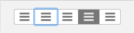
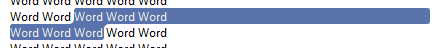
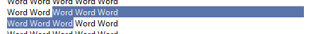
Buttons laid out in a row (GroupedButtonDemo):
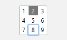
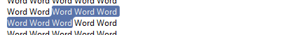
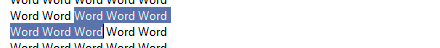
Buttons laid out in a 3x3 grid (GridButtonDemo):
Demo: ButtonDemo, GroupedButtonDemo, GridButtonDemo
| Property | ValueType | Possible Value | Default Value | Effect |
|---|---|---|---|---|
DarkToggleButtonUI.KEY_VARIANT |
String |
DarkToggleButtonUI.VARIANT_SLIDER |
null |
See below. |
Visuals for the DarkToggleButtonUI.KEY_VARIANT property:
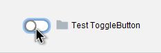
DarkToggleButtonUI.KEY_VARIANT = DarkToggleButtonUI.VARIANT_SLIDER
Demo: ToggleButtonDemo, GroupedButtonDemo
| Property | ValueType | Possible Value | Default Value | Effect |
|---|---|---|---|---|
DarkSpinnerUI.KEY_VARIANT |
String |
DarkSpinnerUI.VARIANT_PLUS_MINUS |
null |
If set to DarkSpinnerUI.VARIANT_PLUS_MINUS the up and down arrows are changed to +/- icons. |
Visuals for the DarkSpinnerUI.KEY_VARIANT property:


Demo: SpinnerDemo
| Property | ValueType | Possible Value | Default Value | Effect |
|---|---|---|---|---|
DarkSliderUI.KEY_VARIANT |
String |
DarkSliderUI.VARIANT_VOLUME |
null |
Theme dependent |
DarkSliderUI.KEY_SHOW_VOLUME_ICON |
boolean |
true, false
|
false |
If true and the volume variant is active a volume indicator is added, which doubles as a mute button. |
DarkSliderUIKEY_INSTANT_SCROLL |
boolean |
true, false
|
false |
If true the slider instantly scroll to the cursor position when clicked. |
Visuals for the DarkSliderUI.KEY_VARIANT and DarkSliderUI.KEY_SHOW_VOLUME_ICON properties:
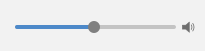
DarkSliderUI.VARIANT_VOLUME + DarkSliderUI.KEY_SHOW_VOLUME_ICON=true
Demo: SliderDemo
Any component that inherits from JTextComponent can use these properties.
| Property | ValueType | Possible Value | Default Value | Effect |
|---|---|---|---|---|
DarkTextUI.KEY_ROUNDED_SELECTION |
boolean |
true, false
|
true |
If true text selection is painted with rounded corners. |
DarkTextUI.KEY_EXTEND_LINE_SELECTION |
boolean |
true, false
|
false (For subclasses of JEditorPane: true) |
If true the selection highlight is extended to the end of the line |
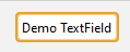
DarkTextUI.KEY_HAS_ERROR |
boolean |
true, false
|
false |
If true the focus border is painted in red |
DarkTextUI.KEY_HAS_WARNING |
boolean |
true, false
|
false |
If true the focus border is painted in orange |
DarkTextUI.KEY_DEFAULT_TEXT |
String |
any | null |
If set and the component contains no text the default text is painted instead. |
Visuals for the DarkTextUI.KEY_ROUNDED_SELECTION and DarkTextUI.KEY_EXTEND_LINE_SELECTION properties:
DarkTextUI.KEY_ROUNDED_SELECTION, DarkTextUI.KEY_EXTEND_LINE_SELECTION from top to bottom: true, true, true, false, false, true, false, false.
Visuals for the DarkTextUI.KEY_HAS_ERROR and DarkTextUI.KEY_HAS_WARNING properties:
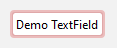
Visuals for the DarkTextUI.KEY_DEFAULT_TEXT property:

Demo: TextFieldDemo, PasswordFieldDemo, TextAreaDemo, TextPaneDemo, EditorPaneDemo
| Property | ValueType | Possible Value | Default Value | Effect |
|---|---|---|---|---|
DarkTextFieldUI.KEY_VARIANT |
String |
DarkTextFieldUI.VARIANT_SEARCH |
null |
If set to DarkTextFieldUI.VARIANT_SEARCH the text field will have a search field visual. |
DarkTextField.KEY_FIND_POPUP |
JPopupMenu |
any | null |
If set and the search visual is active the search icon doubles as a button to open the popup menu. |
DarkTextFieldUI.KEY_SHOW_CLEAR |
boolean |
true, false
|
false |
If true a clear button is shown. |
Visuals for the DarkTextFieldUI.KEY_VARIANT, DarkTextFieldUI.VARIANT_SEARCH and DarkTextFieldUI.KEY_SHOW_CLEAR properties:
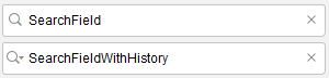
DarkTextFieldUI.KEY_SHOW_CLEAR and DarkTextFieldUI.KEY_VARIANT are true in both images. For the bottom picture DarkTextField.KEY_FIND_POPUP is specified with a valid JPopupMenu.
Demo: TextFieldDemo
| Property | ValueType | Possible Value | Default Value | Effect |
|---|---|---|---|---|
DarkPasswordFieldUI.KEY_SHOW_VIEW_BUTTON |
boolean |
true, false
|
false |
If true the password field gains an additional button which, while pressed, reveals the password |
Visuals for DarkPasswordFieldUI.KEY_SHOW_VIEW_BUTTON:
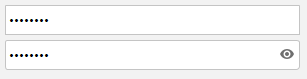
From top to bottom: false, true
Demo: PasswordFieldDemo
| Property | ValueType | Possible Value | Default Value | Effect |
|---|---|---|---|---|
DarkProgressBarUI.KEY_PASSED |
boolean |
true, false
|
false |
If true the progress color changes to green. |
DarkProgressBarUI.KEY_FAILED |
boolean |
true, false
|
false |
If true the progress color changes to red. This takes precedence over DarkProgressBarUI.KEY_PASSED
|
Visuals for the DarkProgressBarUI.KEY_PASSED and DarkProgressBarUI.KEY_FAILED property:
DarkProgressBarUI.KEY_PASSED, DarkProgressBarUI.KEY_FAILED from top to bottom: false, false, true, true, true, false, false, false (indeterminate), false, true (indeterminate), true, false (indeterminate)
Demo: ProgressBarDemo
| Property | ValueType | Possible Value | Default Value | Effect |
|---|---|---|---|---|
DarkSplitPaneUI.KEY_STYLE |
String |
DarkSplitPaneUI.STYLE_GRIP, DarkSplitPaneUI.STYLE_GRIP_BORDERLESS DarkSplitPaneUI.STYLE_LINE DarkSplitPaneUI.STYLE_INVISIBLE
|
DarkSplitPaneUI.STYLE_GRIP |
Changes the appearance of the divider. |
Visuals for the DarkSplitPaneUI.KEY_STYLE property:


From left to right: DarkSplitPaneUI.STYLE_GRIP, DarkSplitPaneUI.STYLE_GRIP_BORDERLESS DarkSplitPaneUI.STYLE_LINE DarkSplitPaneUI.STYLE_INVISIBLE
Demo: TabbedPaneDemo
| Property | ValueType | Possible Value | Default Value | Effect |
|---|---|---|---|---|
DarkTooltipUI.KEY_STYLE |
String |
DarkTooltipUI.VARIANT_PLAIN, DarkTooltipUI.VARIANT_BALLOON, DarkTooltipUI.VARIANT_PLAIN_BALLOON
|
DarkTooltipUI.VARIANT_PLAIN_BALLOON |
See below. |
DarkTooltipUI.KEY_CONTEXT |
ToolTipContext |
any | null |
Overwrites the default tooltip context when the style is DarkTooltipUI.VARIANT_BALLOON. See tooltip api. |
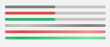
Visuals for the DarkTooltipUI.KEY_STYLE property:
From top to bottom: DarkTooltipUI.VARIANT_BALLOON, DarkTooltipUI.VARIANT_PLAIN_BALLOON, DarkTooltipUI.VARIANT_PLAIN.
Further information about the tooltip API can be found here.
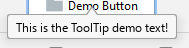
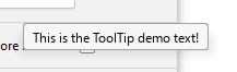
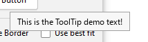
Demo: ToolTipDemo
| Property | ValueType | Possible Value | Default Value | Effect |
|---|---|---|---|---|
DarkTableUI.KEY_ALTERNATE_ROW_COLOR |
boolean |
true, false
|
false, (macOS: true) |
If true the row color is alternated. |
DarkTableUI.KEY_RENDER_BOOLEAN_AS_CHECKBOX |
boolean |
true, false
|
true |
If true boolean values will be rendered as a check box. |
DarkTableUI.KEY_BOOLEAN_RENDER_TYPE |
String |
DarkTableUI.RENDER_TYPE_CHECKBOX, DarkTableUI.RENDER_TYPE_RADIOBUTTON
|
DarkTableUI.RENDER_TYPE_CHECKBOX |
If DarkTableUI.KEY_RENDER_BOOLEAN_AS_CHECKBOX is true this specifies the used renderer. Either a checkbox or a radiobutton. |
Demo: TableDemo
| Property | ValueType | Possible Value | Default Value | Effect |
|---|---|---|---|---|
DarkListUI.KEY_ALTERNATE_ROW_COLOR |
boolean |
true, false
|
false, (macOS: true) |
If true the row color is alternated. This only works in VERTICAL, VERTICAL_WRAP or HORIZONTAL_WRAP layout mode. |
Demo: ListDemo
| Property | ValueType | Possible Value | Default Value | Effect |
|---|---|---|---|---|
DarkTreeUI.KEY_ALTERNATE_ROW_COLOR |
boolean |
true, false
|
false, (macOS: true) |
If true the row color is alternated. |
DarkTreeUI.KEY_RENDER_BOOLEAN_AS_CHECKBOX |
boolean |
true, false
|
true |
If true boolean values will be rendered as a check box. |
DarkTreeUI.KEY_BOOLEAN_RENDER_TYPE |
String |
DarkTreeUI.RENDER_TYPE_CHECKBOX, DarkTreeUI.RENDER_TYPE_RADIOBUTTON
|
DarkTreeUI.RENDER_TYPE_CHECKBOX |
If DarkTreeUI.KEY_RENDER_BOOLEAN_AS_CHECKBOX is true this specifies the used renderer. Either a checkbox or a radiobutton. |
DarkTreeUI.KEY_LINE_STYLE |
String |
DarkTreeUI.STYLE_LINE, DarkTreeUI.STYLE_DASHED, DarkTreeUI.STYLE_NONE
|
DarkTreeUI.STYLE_LINE |
Sets the style the tree lines are painted. |
Visuals for the DarkTreeUI.KEY_LINE_STYLE property:
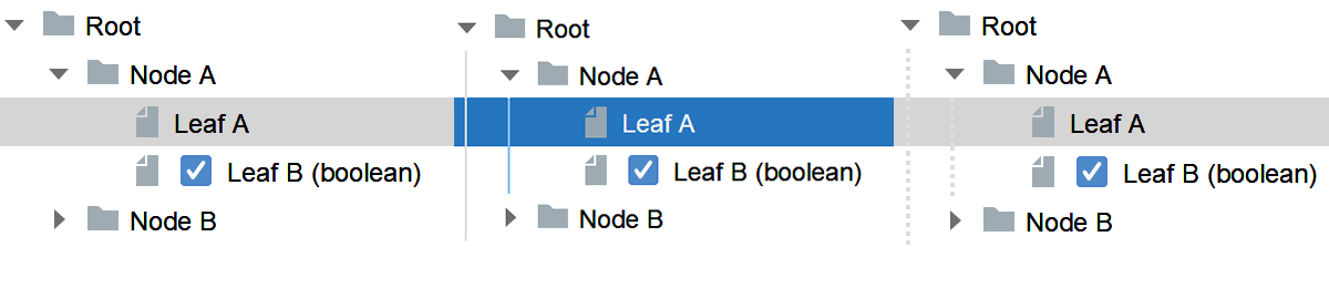
From left to right DarkTreeUI.STYLE_NONE, DarkTreeUI.STYLE_LINE, DarkTreeUI.STYLE_DASHED.
Demo: TreeDemo
| Property | ValueType | Possible Value | Default Value | Effect |
|---|---|---|---|---|
DarkRootPaneUI.HIDE_TITLEBAR |
boolean |
true, false
|
false |
If true the titlebar will be hidden. (Requires custom decorations to be enabled.) |
DarkRootPaneUI.KEY_UNIFIED_MENUBAR |
boolean |
true, false
|
ture |
If true the titlebar will be joined with the titlebar. (Windows only.) |