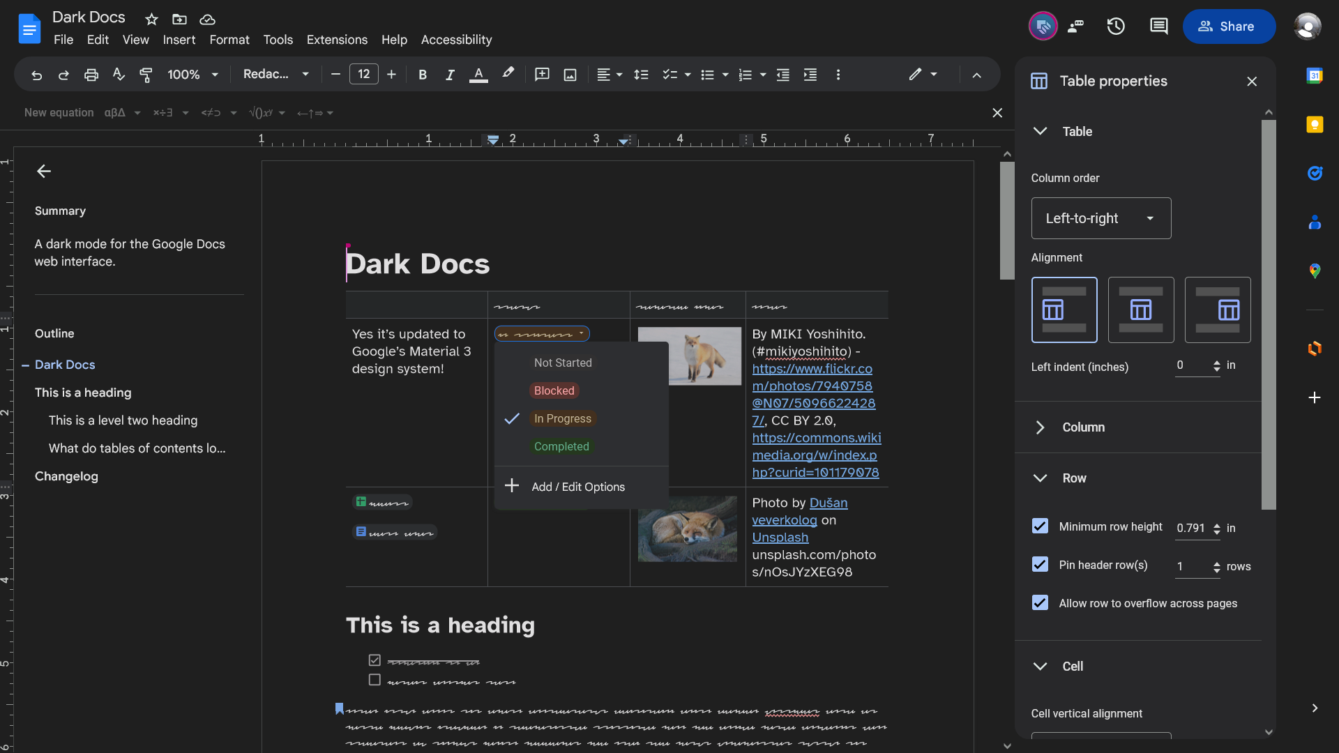
Matching dark themes for the Google Docs and Slides web apps, based on the appearance of dark modes in other Google products.
| Dark Docs | Shades & Slides |
|---|---|
If Stylus is installed on your browser,  |
If Stylus is installed on your browser,  |
 |
 |
| Install, rate and view ratings: Dark Docs on UserStyles.world |
Install, rate and view ratings: Shades & Slides on UserStyles.world |
-
By default, Dark Docs uses the Invert document filter so your document appears with an inverted colour scheme (approximately white on black). If you must view images un-inverted, you may change the document filter to “Dim” or “None” in the configuration dialog. For more info and another workaround to the photo bug, see issue #8.
-
Shades & Slides: If the presenter view opens with a white sidebar and top bar, close presenter view and re-open it from the slideshow view’s mini toolbar in the bottom left.
Dark Docs and Shades & Slides are written as UserCSS files and both use the {less} preprocessor. However, they are developed separately so code that works in one might not immediately work in the other.
Extra help is needed to make a dark mode for Google’s Duet AI features, since they’re not currently available in my country.
The intent is simple—to make a dark mode that is consistent with Google’s latest design, referencing Material 3 specs. Dark Docs and Shades & Slides include noticeable changes that update the full interface to Material 3; this was done for a more consistent appearance and so we don’t need to reference quite as much documentation with regards to colouring.
After I complete M3 Themes for Google Sheets (that’s right, it’ll be themable), I will re-base all three and make them all themable.
AI has not been used to develop Dark Docs and Shades & Slides. Some AI tools may have been trained on code not compatible with the GNU GPLv3 license or would otherwise put Dark Docs and Shades & Slides into legal trouble. Don’t use AI-written code on this project.