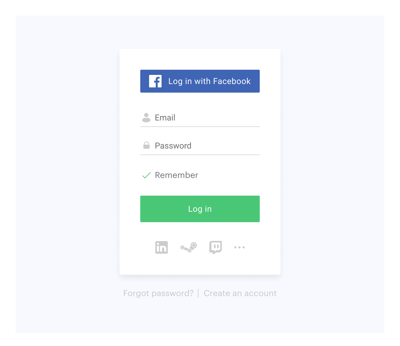
Currently SDK supports following types of authorization:
- via login/password
- via social networks
On this page you can see:
See documentation to find more.
This library allows you to quickly integrate Xsolla Login Widget with your website in following steps:
Connect Xsolla Login Javascript SDK using one of the following methods:
- If the project uses Bower, launch the console and run
bower install xsolla-login-js-sdk- If the package is not connected, add the following code to the
<head>tag of the HTML-page where the widget will be placed:
<script src="https://cdn.xsolla.net/xsolla-login-widget/sdk/2.2.6/xl.min.js"></script>Add the widget initialization code to the <body> tag.
<script type="text/javascript">
XL.init({
  projectId: '[Login ID]',
  callbackUrl: '[callbackUrl]',
  locale: 'en_US'
});
</script>
projectId
string
Login ID from Publisher Account. Required.
callbackUrl
string
URL to redirect the user to after registration/authentication/password reset. Must be identical to one of the Callback URL specified in Publisher Account in Login settings. Required if there are several Callback URLs.
You can pass several URL of the local server to make the widget available to the local build. For example https://localhost:9000.
locale
string
Language of the widget interface and region in the <language code>_<country code> format where:
- language code: language code in the ISO 639-1 format;
- country code: country/region code in the ISO 3166-1 alpha-2 format.
The following locales can be specified: Arabic (ar_AE), Bulgarian (bg_BG), Czech (cz_CZ), German (de_DE), Spanish (es_ES), French (fr_FR), Hebrew (he_IL), Italian (it_IT), Japanese (ja_JP), Korean (ko_KR), Polish (pl_PL), Portuguese (pt_BR), Romanian (ro_RO), Russian (ru_RU), Thai (th_TH), Turkish (tr_TR), Vientamese (vi_VN), Chinese Simplified (zh_CN), Chinese Traditional (zh_TW).
Also used for sorting social networks by the frequency of use in the chosen region.
fields
array of strings
List of parameters required for successful user registration/authentication. Example: 'email, promo_email_agreement'. The user will be asked to specify these parameters in the corresponding form.
theme
string
URL with the widget styles file. If the value is empty, styles uploaded to Publisher Account are used.
popupBackgroundColor
string
Widget background color in the fullscreen mode. The value can be in any of the CSS color formats. Default is RGBA(50, 150, 150, 0.1).
iframeZIndex
string
The stack order of the widget in the fullscreen mode. Default is 1000000.
Choose the widget placing on the website start page:
Add the button with the on-click event and the XL.show() function to the site.
<button onclick="XL.show()">Fullscreen widget</button>The fullscreen mode is closed by clicking outside the widget area.
Add the block with the widget to the <body> tag and set the block ID.
<div id="xl_auth"></div>Add the code and pass the parameter values as described below.
<script type="text/javascript">
var element_id = 'xl_auth';
var options = {
  width: 400,
  height: 550,
  route: XL.ROUTES.REGISTRATION
};
XL.AuthWidget(element_id, options);
</script>
element_id
string
ID of the block containing the Login Widget. Required.
options
object
Login Widget block settings. The object consists of the parameters listed below.
width
number
Block width in pixels. Default is 400.
height
number
Block height in pixels. Default is 550.
route
string
Widget start page. Can be:
XL.ROUTES.LOGIN— a login page via username/password. Used by default.XL.ROUTES.REGISTRATION— a registration page.XL.ROUTES.RECOVER_PASSWORD— a password reset page.XL.ROUTES.ALL_SOCIALS— a page with a list of social networks available for user authentication.
If you have already integrated Login, you can also try additional features of Xsolla Login Widget:
Xsolla Login Widget supports the OAuth 2.0 protocol-based user authentication. Follow the recipe to set it up.
By default, the widget looks like this:
You can customize the widget style by changing the following characteristics of its elements:
- Location on the screen
- Theme
- Size
- Background
Customization is based on CSS.
To customize:
- Go to Publisher Account > your Login project > Customization > Widget style, download the archive with styles and unpack it.
- Download and install Node.js. The version of Node.js must not be later than 10.x.x.
- Run
npm ifrom the unpacked styles folder. - Edit app/styles/themes/_default.scss.
- Run
npm run stylesfrom the unpacked styles folder. - Upload the file with a name resembling app.default.css from the dist folder to your Publisher Account.
For further widget UI customization, repeat steps 4–6.
NOTE
After publication, the widget will be changed for all the projects it was connected to.
You can collect widget statistics on the following events:
To start tracking the event, initialize and process the action as described below.
XL.on(XL.eventTypes.LOAD, function () {
    console.log('the widget has been loaded');
});XL.on(XL.eventTypes.CLOSE, function () {
console.log('user has closed the widget');
});XL.on(XL.eventTypes.REGISTRATION_REQUEST, function () {
console.log('registration form has been sent');
});