You can find a demo of this example in the source code via button-example.html.
To interact with the demo, load the page from your fork in a browser via:
file://[Medium Editor Source Root]/demo/button-example.html
As a simple example, let's create a button extension that will highlight the selected text by wrapping the selection in a <mark> element. Whenever the user selects text which is already within a <mark> tag, the button should appear as 'active'. If the text is already wrapped within a <mark> element, clicking the 'active' button will 'un-highlight' the text by removing the wrapping <mark> tag.
To start, we need to define the new extension and create a button which can appear in the toolbar:
var HighlighterButton = MediumEditor.Extension.extend({
  name: 'highlighter'
});
We now have an extension named 'highlighter' which we can pass into MediumEditor like this.
var editor = new MediumEditor('.editable', {
  toolbar: {
    buttons: ['bold', 'italic', 'underline', 'highlighter']
  },
  extensions: {
    'highlighter': new HighlighterButton()
  }
});
NOTE:
In order for the toolbar to look for a button to add to the toolbar, the name of the extension must be passed in the toolbar.buttons array.
Now that we have a base extension, we need to create an actual button element which can appear in the toolbar.
CODE:
var HighlighterButton = MediumEditor.Extension.extend({
  name: 'highlighter',

  init: function () {
    this.button = this.document.createElement('button');
    this.button.classList.add('medium-editor-action');
    this.button.innerHTML = '<b>H</b>';
  },

  getButton: function () {
    return this.button;
  }
});
PREVIEW:
Here, we're implementing the the init() method to create our button, and then implementing the getButton() method as an accessor for our created button element.
After all the extensions are created, the toolbar will loop through the list of the buttons passed in via the toolbar.buttons option. For each button name in that list, it will retrieve the extension with that name and see if it has implemented a getButton() method. If it has, it will take the element returned by this and append it to the toolbar.
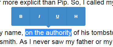
As a result, whenever we run our code and highlight some text, we now have 4 buttons: Bold, Italic, Underline, and our custom Highlighter button.
Since all of MediumEditor's built-in buttons have font-awesome icons, let's enable font-awesome icons and update our button to use a font-awesome icon as well as have a tooltip on hover.
CODE:
var HighlighterButton = MediumEditor.Extension.extend({
  name: 'highlighter',

  init: function () {
    this.button = this.document.createElement('button');
    this.button.classList.add('medium-editor-action');
    this.button.innerHTML = '<i class="fa fa-paint-brush"></i>';
    this.button.title = 'Highlight';
  },

  getButton: function () {
    return this.button;
  }
});

// Code for initializing MediumEditor
var editor = new MediumEditor('.editable', {
  toolbar: {
    buttons: ['bold', 'italic', 'underline', 'highlighter']
  },
  buttonLabels: 'fontawesome', // use font-awesome icons for other buttons
  extensions: {
    'highlighter': new HighlighterButton()
  }
});
PREVIEW:
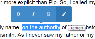
To change the apperances, we have:
- Changed the
innerHTMLof our button to be<i class="fa fa-paint-brush"></i>in theinit()method - Added 'Highlight' as a title attribute to enable the tooltip
- Passed the
buttonLabels: 'fontawesome'option when initializing MediumEditor to enable font-awesome icons for all buttons in the toolbar
Now let's make the button actually do something. To do this, we'll be using a great open source library called rangy created by Tim Down. We'll be using the CSS Class Applier Module which allows us to wrap the selection in a specific element type.
CODE:
rangy.init();
var HighlighterButton = MediumEditor.Extension.extend({
name: 'highlighter',
init: function () {
this.classApplier = rangy.createClassApplier('highlight', {
elementTagName: 'mark',
normalize: true
});
this.button = this.document.createElement('button');
this.button.classList.add('medium-editor-action');
this.button.innerHTML = '<i class="fa fa-paint-brush"></i>';
this.button.title = 'Highlight';
this.on(this.button, 'click', this.handleClick.bind(this));
},
getButton: function () {
return this.button;
},
handleClick: function (event) {
this.classApplier.toggleSelection();
// Ensure the editor knows about an html change so watchers are notified
// ie: <textarea> elements depend on the editableInput event to stay synchronized
this.base.checkContentChanged();
}
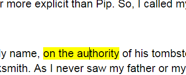
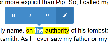
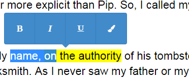
});BEFORE:
AFTER:
In order to initialize rangy, we've added a call to rangy.init() before the definition of our button extension, and we've also created an instance of the CSS Class Applier in the init() method. We're creating a CSS Class Applier which will create a <mark> element with a 'highlight' class on it.
In addition to initializing rangy, we've attached an event listener for the 'click' event of the button via the this.on() helper which we get by extending MediumEditor.Extension. Our 'click' handler will then call the toggleSelection() method of the CSS Class Applier, which will then wrap the selection in a <mark> element.
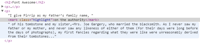
After highlighting the text and clicking the button, the text now appears highlighted (see above). You can see the resulting HTML below:
HTML:
NOTE:
A great convienience of using the toggleSelection() method of the CSS Class Applier is that it will also unwrap the selection. So, since we're always calling toggleSelection() when the button is clicked, if you highlight the same text and click the button again, the text will go back to normal and the <mark> element will be removed.
NOTE:
In handleClick the extra call to this.base.checkContentChanged is calling the core editor directly to notify it that the html may have changed. This is needed here so that any external dependencies that are watching for changes the HTML are notified. For example, you can pass a <textarea> as a editor element when initializing MediumEditor and the editor relies on knowing about changes to the html so it can keep the <textarea> synchronized with changes to the generated <div> that is displayed as the actual editor element.
The last piece of functionality we want is to have the button's appearance respond to what the user has selected. We want the button to appear as 'active' if the selection occurs inside of a <mark> element, and we want to the button to appear as inactive if the selection is outside of a <mark> element.
CODE:
rangy.init();

var HighlighterButton = MediumEditor.Extension.extend({
  name: 'highlighter',

  init: function () {
    this.classApplier = rangy.createClassApplier('highlight', {
        elementTagName: 'mark',
        normalize: true
    });

    this.button = this.document.createElement('button');
    this.button.classList.add('medium-editor-action');
    this.button.innerHTML = '<i class="fa fa-paint-brush"></i>';
    this.button.title = 'Highlight';

    this.on(this.button, 'click', this.handleClick.bind(this));
  },

  getButton: function () {
    return this.button;
  },

  handleClick: function (event) {
    this.classApplier.toggleSelection();
    this.base.checkContentChanged();
  },

  isAlreadyApplied: function (node) {
    return node.nodeName.toLowerCase() === 'mark';
  },

  isActive: function () {
    return this.button.classList.contains('medium-editor-button-active');
  },

  setInactive: function () {
    this.button.classList.remove('medium-editor-button-active');
  },

  setActive: function () {
    this.button.classList.add('medium-editor-button-active');
  }
});
SELECTION IS HIGHLIGHTED:
SELECTION IS NOT HIGHLIGHTED:
As shown above, now our button responds to what the user has selected. To make this final piece work, we've implemented 4 extension methods:
- isAlreadyApplied(node)
- This will be called on each element which contains the user's selection, starting with the lowest element and climbing its ancestors. If any of these elements are a
<mark>element, we returntruesince that means the selection is higlighted.
- isActive()
- This should return whether the button is already active. We check this by seeing if the
'medium-editor-button-active'class already exists on the toolbar button.
- setActive()
- This is called when we should make our button active (add the '
medium-editor-button-active'class)
- setInactive()
- This is called when we should make our button inactive (remove the
'medium-editor-button-active'class)
Since a lot of the built-in buttons for MediumEditor do very similar things, we can leverage a large portion of the existing button code to help reduce the amount of code we need for our extension. To take advantage of this, we can extend from the MediumEditor.extensions.button extension and re-use much of the functionality. You can find this code in button.js.
The result is a HighlighterButton extension which requires significantly less custom code:
rangy.init();

var HighlighterButton = MediumEditor.extensions.button.extend({
  name: 'highlighter',

  tagNames: ['mark'], // nodeName which indicates the button should be 'active' when isAlreadyApplied() is called
  contentDefault: '<b>H</b>', // default innerHTML of the button
  contentFA: '<i class="fa fa-paint-brush"></i>', // innerHTML of button when 'fontawesome' is being used
  aria: 'Highlight', // used as both aria-label and title attributes
  action: 'highlight', // used as the data-action attribute of the button

  init: function () {
    MediumEditor.extensions.button.prototype.init.call(this);

    this.classApplier = rangy.createClassApplier('highlight', {
      elementTagName: 'mark',
      normalize: true
    });
  },

  handleClick: function (event) {
    this.classApplier.toggleSelection();
    this.base.checkContentChanged();
  }
});
The built-in functionality we were able to take advantage of includes:
- getButton()
- The default button implementation will ensure the button is created using configurable custom options
- Button element properties
contentDefault: default innerHTML of the buttoncontentFA: innerHTML of the button when 'fontawesome' is being usedaria: used as both the aria-label and title attributes of the buttonaction: the value of thedata-actionattribute of the button
- handleClick
- The default button implementation will attach the
handleClickmethod as an event listener to the 'click' event of the button. We've overriddenhandleClick()to do our own custom logic using the CSS Class Applier.
- isAlreadyApplied() and tagNames
- The default implementation of
isAlreadyApplied()will use thetagNamesarray of element names to decide whether the button is implemented or not. If a node with one of thesetagNamesis found, the button will be activated.
- isActive(), setActive(), and setInactive()
- The default button extension implements each of these methods, using whatever css class is configured as the
activeButtonClassin MediumEditor ('medium-editor-button-active'by default)