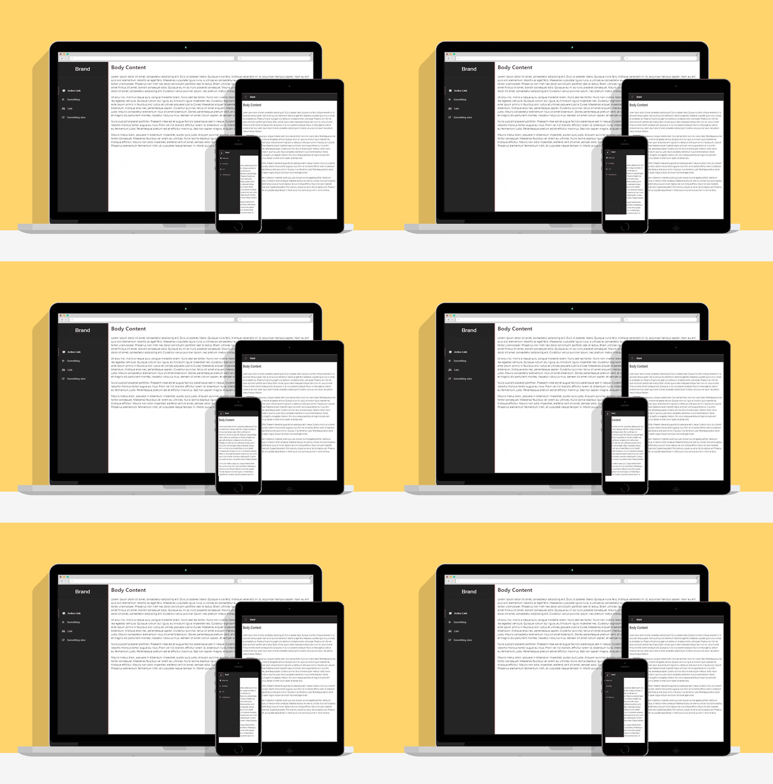
This is a responsive side-bar template for Boostrap 4 with slide in/out interactive animations. It comes in two themes which are dark and light. Dark theme is the default theme.
The side-bar hides in smaller screen and can be toggled with help of button in navbar. You do not need to make navbar separately, a part of side-bar it self is navbar which appears on smaller screen. Just follow the code pattern described below and you will be good to go. For proper examples, have a look at index.html and light.html.
In the demo font-awesome icons are being used, but you can use any.
Zoom in to view how it would look in mobile and try toggling the sidebar!
The code structure for sidebar is as follows :
<div class="side-bar">
<!-- add class "side-bar-light" here for light version -->
<nav class="navbar navbar-inverse">
<!-- toogle button -->
<button class="navbar-toggler hidden-lg-up" type="button" id="toggler" aria-controls="list-container" aria-label="Toggle side-bar">
<span class="navbar-toggler-icon"></span>
</button>
<!-- brand name goes below -->
<a class="navbar-brand" href="#">Brand</a>
<div class="list-container">
<ul>
<!-- list of side bar elements goes here, example : -->
<li><a href="#" class="active"><span class="navIcon"><i class="fa fa-sticky-note"></i></span> Active Link</a></li>
</ul>
</div>
</nav>
</div>
<div class="bodyContent">
<!-- Body content here -->
</div>As mentioned in comments to switch to lighter theme of side-bar just add the class side-bar-light where class side-bar is being used. (Note that you need to add this class for light version not replace it)
This project is licensed under the terms of the MIT license
